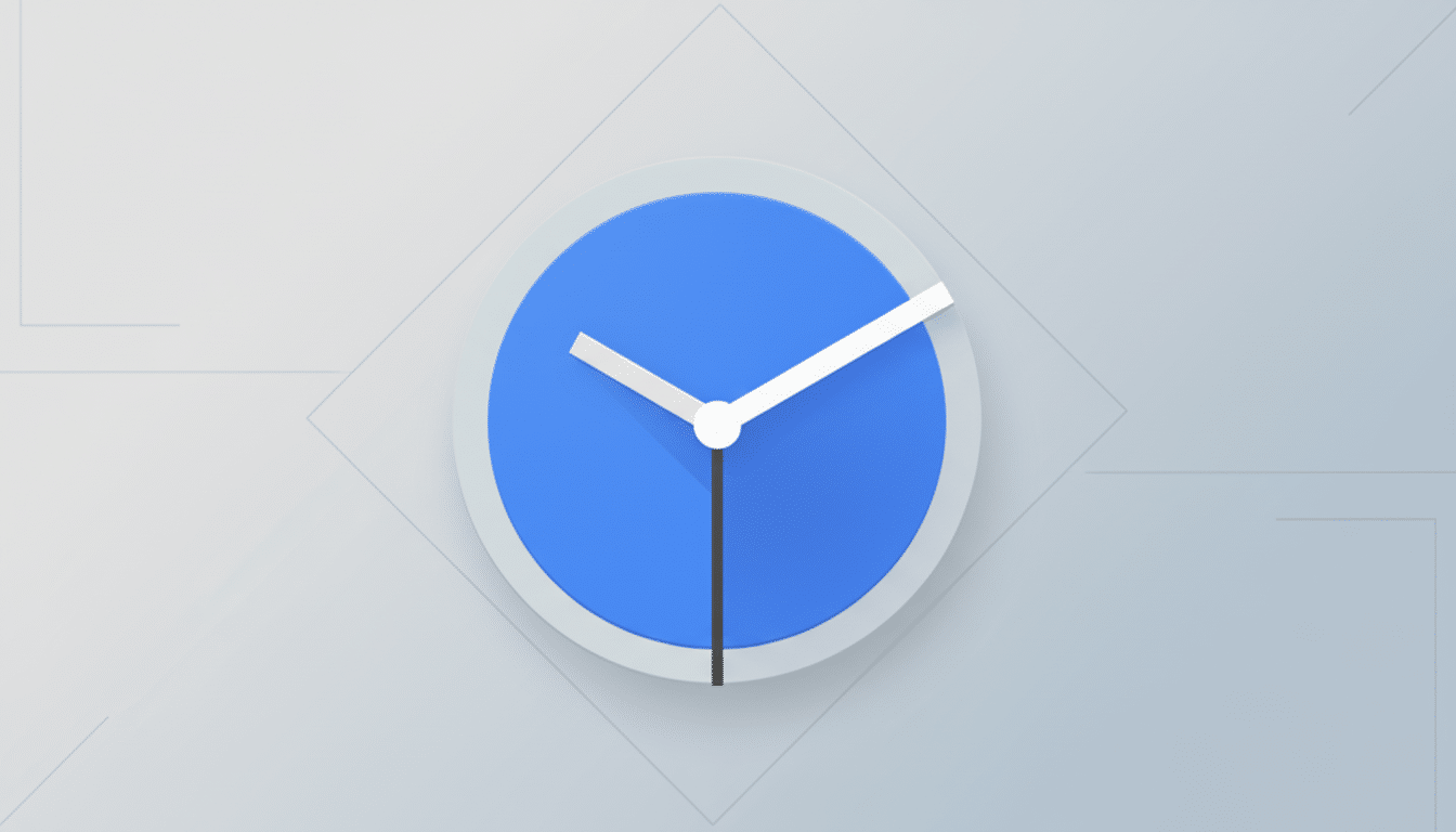
Google is rolling out a fresh update to its Clock app that adds a splash of color and a touch of ergonomics. Version 8.6 introduces new, full‑color weather icons in the World Clock and refines the alarm screen layout to make everyday interactions easier—subtle changes that signal ongoing polish to one of Android’s most-used system apps.
What’s New in Google Clock 8.6: Icons and Alarm Tweaks
The headline visual tweak arrives in the World Clock: previously monochrome weather indicators are now colorful, borrowing the same iconography style rolling out in the Pixel Weather experience. Sun, clouds, rain, and snow now pop at a glance, improving scannability when you track cities across time zones. It’s a small change with outsized daily utility for commuters, remote teams, and frequent travelers.
On the alarm screen, Google has nudged elements for better balance and reach. The primary clock readout sits a bit higher, creating cleaner spacing between the time, label, and controls. More importantly, the slider-based dismiss and snooze control is positioned closer to the bottom edge, reducing thumb travel—especially helpful when you’re half-awake and one-handing a large phone. If you use the button-based interface, placement remains unchanged.
This follows a recent quality-of-life reversal that restored the ability to swipe away alarms, addressing long-standing user feedback. Together, the adjustments reflect a continued push toward predictable, low-friction interactions in the moments that matter most.
Color Consistency Across Pixel Apps Improves Clarity
The new icons align Clock with the evolving visual language seen in Pixel Weather. Beyond aesthetics, this cohesion reduces cognitive load: when icon shapes and hues behave consistently across apps, recognition becomes instant. Google’s Material Design 3—and the more “expressive” treatments that landed in Clock last year—aim for exactly this kind of glanceable clarity layered over dynamic color from Material You.
Designers often cite reachability and Fitts’s Law when justifying control placement. By dragging the alarm slider nearer to the bottom, Google is following a broader industry trend championed since Android 12: put the most-tapped actions within the natural arc of the thumb, especially on 6‑inch‑plus screens. The result isn’t dramatic, but it’s measurably less effort, morning after morning.
Why It Matters for Millions of Google Clock Users
Clock ships on most Android phones and shows “1B+ installs” on the Play Store, meaning even minor adjustments ripple out to massive daily usage. For people juggling multiple time zones, a colorful weather cue next to the city name cuts decision time: is it raining in London right now, or clear in Tokyo before your call? For heavy sleepers, a lower slider can mean one less fumble when snoozing.
These are the kinds of micro-optimizations that rarely headline keynotes yet quietly improve satisfaction scores. They also signal where Google is steering its first-party apps: tighter visual harmony across Pixel experiences, pragmatic ergonomics, and reduced friction in routine tasks.
Availability and How to Update to Google Clock 8.6
The changes are rolling out now with Google Clock version 8.6 via the Play Store. As with most Google app updates, availability may arrive in waves, so not everyone will see the new icons and layout immediately. You can check your installed version in App Info or search for “Clock” in the Play Store to trigger the update.
The new visuals pair nicely with devices running Android 12 or later, where Material You dynamic color informs accent shades across system UI and widgets. You don’t need to change any settings to benefit—the upgrade is automatic once the new build lands on your phone.
Bottom Line: Small but Meaningful Polish in Clock 8.6
Google Clock 8.6 isn’t a reinvention, but it is meaningful polish: brighter, Pixel-aligned weather icons and smarter alarm ergonomics. For an app you interact with multiple times a day—often when you’re least alert—those incremental gains add up.