A leaked build of Samsung’s One UI 8.5 suggests the company is, if nothing else, heading in a fresh visual direction with unmistakable iOS 26-style cues: like a bottom-anchored search bar, compact Settings lists, more depth courtesy of shadows and even a floating back button.
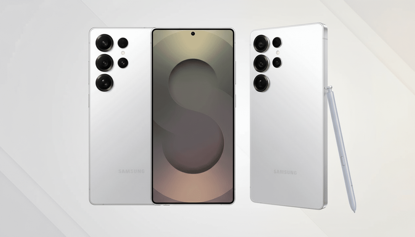
Photos shared by the enthusiast community and credited to SammyGuru purportedly provide a look at the software on a Galaxy S21 Plus through a port of a Galaxy S25 Ultra build, indicating that these tweaks are getting tried out in the wild in advance of the Galaxy S26 series.
Visual changes in detail across settings and navigation
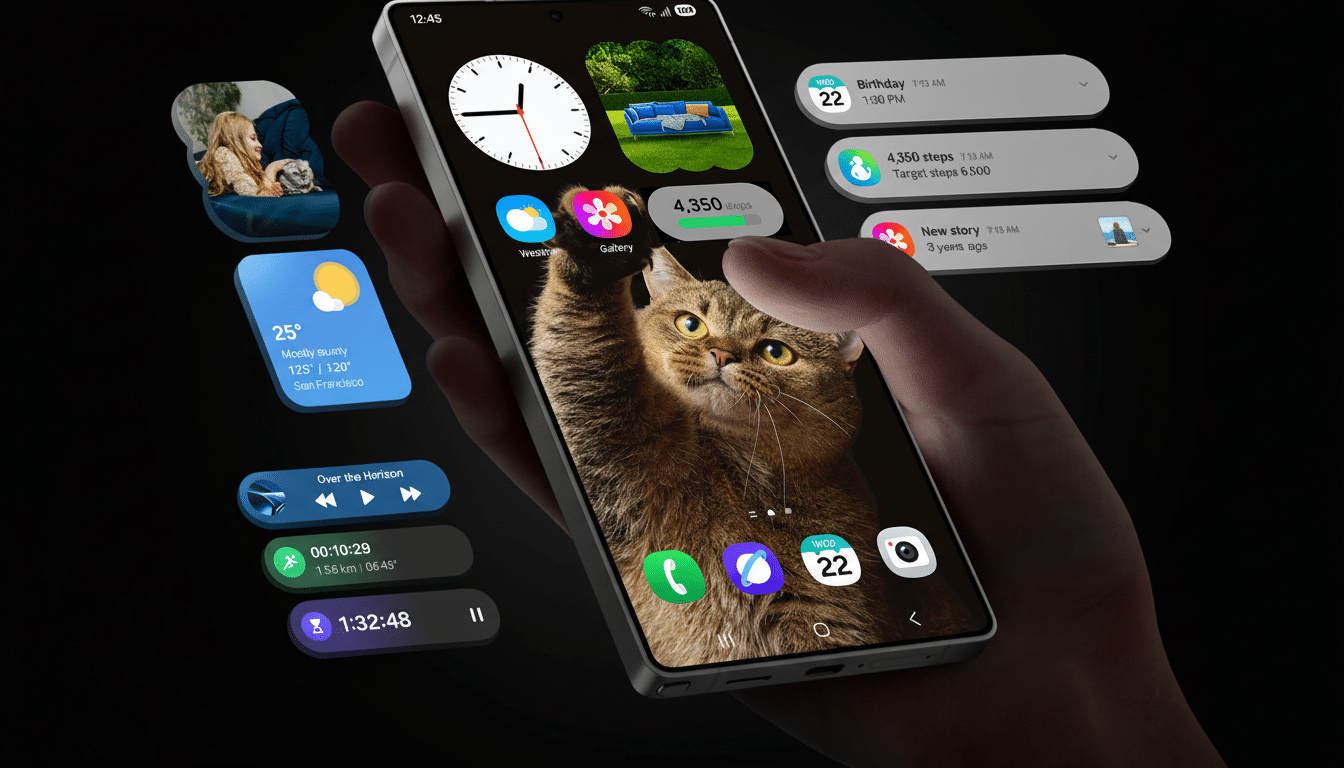
The most clear departure is the Settings landing page. Those pesky subtitles that appear for menu items have been taken away, resulting in a shorter, tighter list of more options to glance at. Cards and containers get heavy drop shadows, all framing over quiet top and bottom gradients, which create an “edge overflow” effect that helps guide the eye without hard dividers.
The search bar goes to the bottom of the screen, part of a wider industry shift toward thumb-friendly controls on taller screens. The expanded search view is also said to break categories into a three-column grid, so you can more easily scan results and head directly to deeper settings.
The most contentious of the new additions is a floating back button. Rather than exist solely in the top-left corner, or be dependent purely on edge gestures, the button is an on-screen control you can reach without a stretch — an approach with echoes of iOS 26’s navigation refinements.
Why Samsung might adopt iOS-like ergonomics
Not having to stretch means less accidental fumbling in an OS that has historically favored one-handed operation, from large headers all the way down to bottom sheets — a trend this leaked build only prioritizes further.
All of this, in addition to what we know from Nielsen Norman Group’s one-handed use guidelines and its familiar thumb zone maps, indicates that bottom-aligned inputs are the most optimal for comfort and very fast input. Bottom-first design is, as we cover more than a few sets of six inches or so and devices that start asking for new postures to be adopted, less just following the crowd and more pragmatic usability.
There’s also a stylistic pivot. Recent waves of Material Design have focused on depth, elevation and more forceful motion. Apple has been heading the same way, with more tactile textures and layered interfaces. Shadows and gradients in One UI 8.5 hint at Samsung’s desire for a clearer visual hierarchy that remains familiar but feels more contemporary.
What it means for the average Galaxy user
Small changes can add up. A search bar at the bottom of Settings could reduce how many taps are required to arrive at buried options, particularly for functions like battery optimization or privacy controls. The floating back button could help minimize gesture confusion with edge panels or third-party launchers, while giving comfort to those who still like explicit on-screen nav hints.
Assuming Samsung pushes this design to its first-party apps — as the leak suggests — you can expect a cohesive UI in areas such as Phone, Messages, Gallery and Files.
A three-column search UI, and card-like containers might also be scaled down nicely on tablets (or foldables), resulting in cleaner multi-pane views while affording touch targets.
For power users, reduced lists mean less scrolling and more scanning and the added depth should help to clear groupings of related controls. It’s the sort of polish that can smooth friction throughout your daily flows: fine-tuning Quick Share permissions, managing app defaults and adjusting notification channels.
Credibility, caveats and what’s still unknown
Remember to approach the leak with skepticism, just like you would any bit of pre-release software. The build was also apparently tweaked and ported, so some visuals may not be exact in the final product. UI flags are capable of flipping certain toggles on and off and Samsung has a history of iterating through designs in the beta, taking on feedback from its community before it locks down what’s going to ship.
That said, the direction is a good fit with Samsung’s playbook. Point releases have also often brought subtle layout changes, while keeping core interactions the same, and the company has typically unified patterns between apps after settling on a visual language. Should this look be the one that sticks, you can bet it will come first to the next-generation Galaxy S series and trickle down to recent flagships.
The bigger picture: strategy and market impact
According to trackers such as IDC and Counterpoint Research, Samsung hovers near the top of global smartphone share on a regular basis, so even relatively minor UI shifts have significance for an enormous number of users.
Embracing bottom-first navigation and more explicit visual hierarchy isn’t just mimicry of rivals; it’s an attempt to minimize cognitive load at scale, as we enter the years-long progression of switchers.
If the leak is accurate, One UI 8.5 may provide an evolutionary yet significant overhaul that focuses on comfort, speed and clarity. The question is not does it look like iOS — the question is whether these choices make a Galaxy feel faster and more intuitive. So far, those have been promising signs.