Google is giving Android’s Live Updates a visual tune-up, and while the changes are subtle, they point to a more polished and legible experience for real-time notifications. In the latest Canary build, Live Updates gain a full-width progress bar, a clearer action button, and a reorganized layout that holds together across the home screen, notification shade, and lock screen.
Live Updates, introduced last year as a way to surface ongoing activities like rides, deliveries, and navigation, already drew comparisons to iOS’s Live Activities. This new pass focuses on clarity, consistency, and touchability—small tweaks that matter when users glance at their phones for a second or two.

What changed in the latest Android Canary build
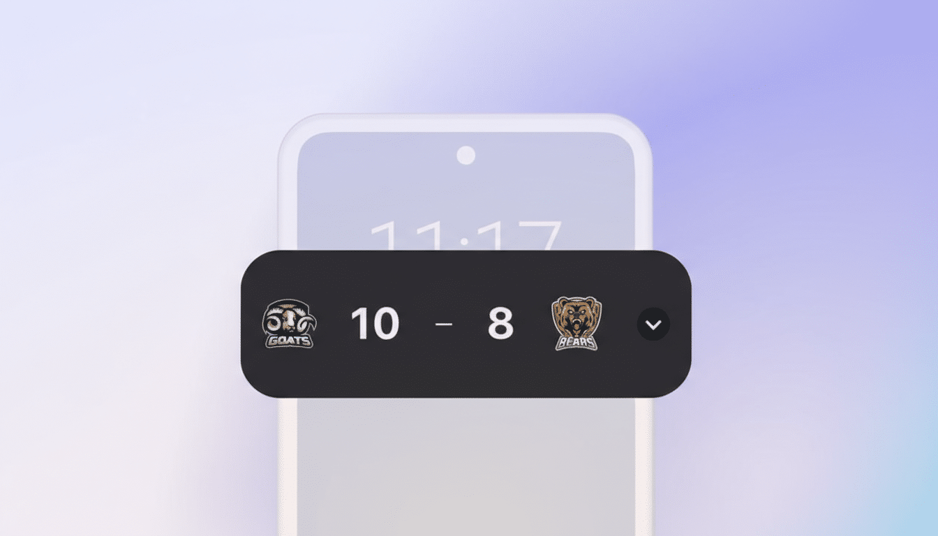
The most noticeable shift is layout. The app icon moves from the left edge to the top, freeing up horizontal space so the progress bar can stretch across the entire width of the tile. That single adjustment reduces visual clutter and makes the bar easier to parse at a glance, especially near camera cutouts where Live Updates can expand around the selfie lens.
Actionable elements also get a rethink. Instead of bare text, actions now sit inside a pill-shaped border, improving discoverability and touch targeting. The button isn’t fully filled in this build—suggesting Google is still tuning contrast and emphasis—but the framed treatment already reads as more tappable than the previous text-only approach.
Color and bar thickness appear unchanged, signaling this is a structural refresh rather than a full redesign. Importantly, the look is consistent across system surfaces, which helps users build a mental model of where to look and what to tap, regardless of context.
Why the refined Live Updates design changes matter
Glanceability is the currency of real-time updates. A bar that spans the full width gives progress more resolution, which is critical for tasks that change over minutes rather than hours. For navigation or deliveries, that added visual fidelity can reduce the need to open the app. Google’s Material Design guidance also recommends 48dp minimum touch targets; shifting to bordered pills moves Live Updates closer to that target, improving accessibility and reducing mis-taps in one-handed use.
There’s a cohesion play here, too. Material You emphasizes consistent shapes and affordances; making buttons look like buttons across notifications, widgets, and system trays trains users to act faster. It’s the same principle that made iOS Live Activities feel intuitive—familiar shapes, predictable placement, and generous spacing—adapted to Android’s more flexible surfaces.
Where Android’s Live Updates really shine in use
Live Updates were pitched for ride-hailing and food delivery, but Google has already trialed them in navigation to visualize traffic segments along a route. That’s a clever expansion: turning the bar into a compact timeline that encodes congestion, time remaining, or step transitions. Transit apps could map GTFS-Realtime feeds into the bar, fitness apps could show interval progress, and event apps could run check-in windows—without dragging users into full-screen contexts.
The move to clearer action pills also hints at richer, one-tap flows: “Share ETA,” “Call Driver,” “Add Stop,” or “Pause Timer.” Reducing cognitive load on those controls matters. Industry studies on notification engagement repeatedly show that recognizable actions increase interaction rates, and while figures vary by category, the direction is consistent across reports from mobile analytics firms.
Implications for developers building Live Updates
Right now, the polish looks UI-layer only. There’s no indication of new developer-facing APIs in this Canary build, and Google hasn’t published updated guidance that would change implementation patterns. That’s good news for teams already experimenting: if your Live Update uses a progress bar and one or two actions, you should benefit from the redesign automatically as system components update.
Developers should still sanity-check a few basics: ensure action labels are short and verb-led, verify accessible names for assistive tech, and test touch targets against Material’s 48dp guidance. If your design relies on icon-only actions, consider adding labels; the bordered pill treatment rewards concise text with clearer intent.
Rollout timeline and what to watch for in coming builds
Because these changes are surfacing in a Canary build, they remain subject to iteration before any wider release. Google often lands UI refinements via system components and Play system updates, so devices can receive them outside of full OS upgrades. Expect gradual availability, with Pixels typically leading and OEM skins layering their own styling choices on top.
The tell for readiness will be consistency: filled versus outlined action treatments, final icon alignment, and whether the progress bar gets adaptive colors for better contrast across wallpapers and themes. Keep an eye on Google’s developer documentation and release notes for confirmation—small as they are, these changes add up to a more confident and coherent Live Updates experience.