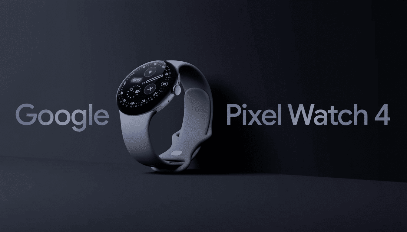
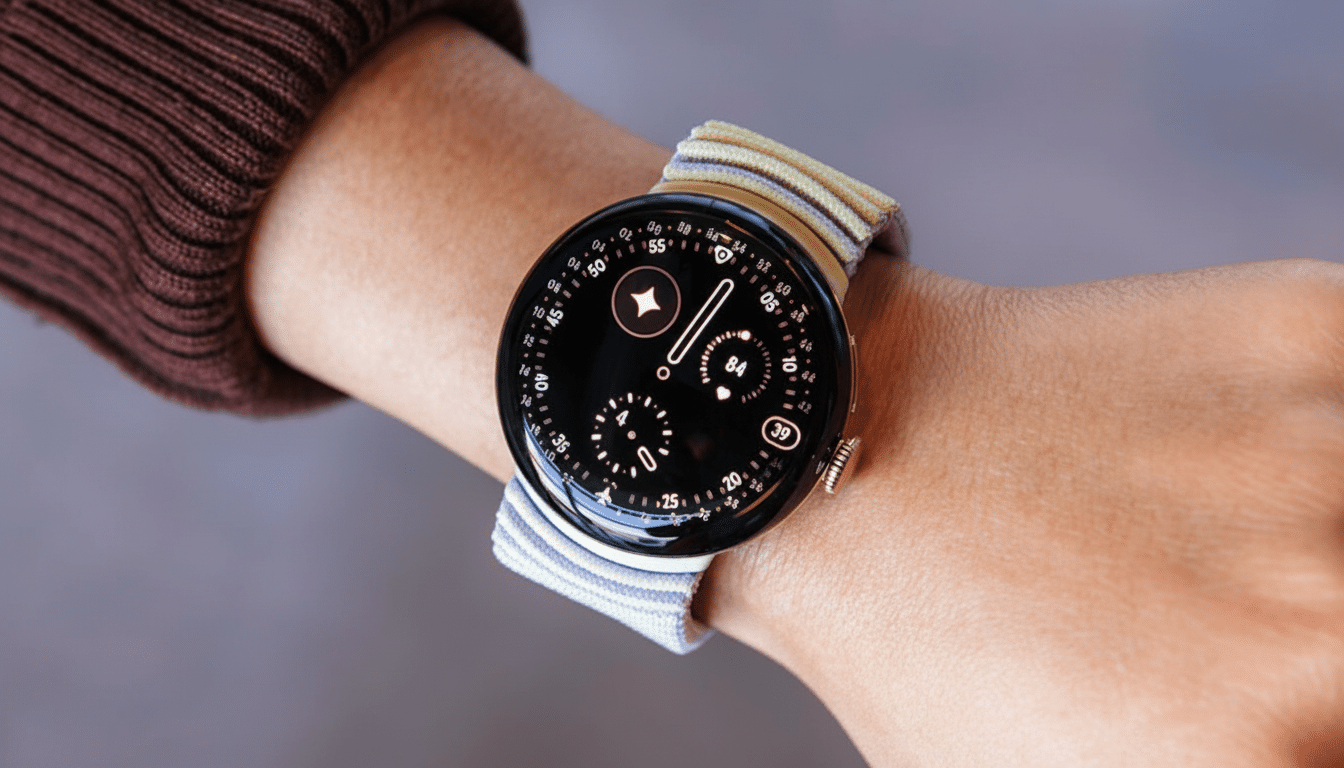
An early glance at the software on the Pixel Watch 4 has revealed eight new watch faces that show us where Google’s mind is going in terms of design, lots of information at a glance, and battery-saving display features on Wear OS 6. Extracted from the Watch Face APK of a lucky early buyer, the selection runs from minimal analog styles to number- and data-heavy dashboard offerings and strongly reflects the signature modern aesthetic embodied by the Watch Face Format that Google has been rallying behind for optimization and efficiency.
The Eight Watch Faces Revealed for Pixel Watch 4
Reveal is a nice, easy-to-read hybrid that puts the clock front and forward with gentle layering for information. Look for a restrained palette and at-a-glance complications — calendar, weather — nestled in unobtrusive zones. It’s the sort of face that can work for every day without screaming at you for attention.

Rushhour reads like a dynamic, activity-driven face that was made to be scanned quickly on the go. Large numerals or bold tick marks should make it easy enough to read mid-commute, and complications for transit, steps, or upcoming events are practical. It seems purpose-built if you are someone who juggles schedules a lot.
Bold, as its name implies, lays a finger on high-contrast typography and chunky graphics. This is the face you select when you want to maximize legibility in bright light or see all your fitness stats at a glance as you pump out sprints or lifts. Think big type, clean layouts, and a few high-value complications (say, heart rate or battery) that pop immediately.
Expedition implies an outdoor look, progress arcs, elevation-driven layers, or compass bearings. Details may change, but it’s a natural choice for anyone who wants to see activity metrics front and center — distance, pace, or elevation gain included — along with location and weather data for hiking and trail runs.
Modular: it’s the data grid for power users. Look for several complication slots, minimal design, and a layout that rewards information density while avoiding clutter. It should work well with health data from Fitbit services, reminders, and third-party complications for productivity and smart home controls.
Pride introduces colorful gradients and inclusive palettes that pay homage to LGBTQ+ communities. Google usually provides seasonal and year-round colorways, and this particular face is likely customizable so that you can dial in the hues while maintaining important metrics (time, date, heart rate) as legible text.
Arts and Culture emphasizes editorial design, probably with some combination of typography or illustration or gallery-like compositions. Call it a rotating window with artful complication placements, so that the watch remains practical while retaining artistic integrity.
Concentric appears to plan on using rings as stages for a progress display — steps or goals, perhaps battery life — with an analog or hybrid time readout at its center. Round, ring-shaped faces are popular because they turn fitness goals into an instant visual statement: you can see where you stand in a single glance.

Customization and Performance in Wear OS 6 Watch Faces
They come pre-bundled for Wear OS 6 and are designed with a Google-built platform called Watch Face Format, which is a declarative way of building faces that the Android Developers team released to provide simplified rendering and lower power draw. Since the system takes care of most drawing and animations, watch faces can provide fluid complications, always-on variants, and rich color without having to wake up the CPU more often than necessary — and this is crucial for a small device with an always-on display.
Look for the standard pillars of customization: color themes in line with Material You, multi-complication slots to work with the Wear OS Complications API, and an always-on mode that smartly simplifies elements to preserve AMOLED panels and limit wear and tear on the battery. This is in line with recent Google advice, calling for sharp transitions to and from active/ambient states with burn-in-safe layouts.
For wellness-type users, the ability to pin Fitbit metrics like heart rate zones, Active Zone Minutes, and sleep score at a glance on watch faces — including Modular or Concentric — helps avoid app dives and makes the watch feel more responsive to daily life.
Compatibility and Sideloading Caveats to Consider
The watch faces are sourced from the Pixel Watch 4’s Watch Face APK and are intended for Wear OS 6. Early tinkerers indicate that sideloading can get the faces to show up in the picker on older Wear OS builds, though actually applying them might not work — a pattern consistent with how the platform has evolved in recent releases. If you try, tread lightly: sideloading from untrusted places can bring about security and stability issues, and behavior might vary on devices and OS versions.
Why These Faces Matter for Pixel Watch 4 Users
“Watch faces are the most personal aspect of a smartwatch, so for this series, we focused on bringing bold and graphic designs to life.” The offering ranges from simple interfaces that prioritize clarity for daily wear (Reveal), to chaotic ones with densely packed information you want at a glance (Modular) — all while trying its best to respect people who use watch faces as an opportunity for self-expression by translating them into high-res graphics.
This collection has:
- A classic progress-first layout that comes upgraded out of the box
- Designs inspired by culture and nature
- A classic minimal look designed to keep your essentials discreetly close at hand
Combined, these eight faces are representative of a larger theme on Wear OS: contemporary style paired with the efficiency improvements brought by Watch Face Format, deeper integration with complications, and customization that makes your watch uniquely yours. We’ll have to wait until there’s more Pixel Watch 4 out in the wild to see which ones really become day-to-day go-tos — and how developers riff on that same groundwork to create yet more creative designs.

