Since its introduction, Apple’s Liquid Glass look has been something of a conversation piece, combining translucency and blur in a way that feels modern — even if it is not exactly universally beloved. If you dig the look but prefer your interface elements a bit less see-through, iOS 26.1 has you covered with an easy fix: just flip an extra switch that adds a subtle tint for better contrast — without compromising the design language.
What the New Tinted Liquid Glass Switch Changes
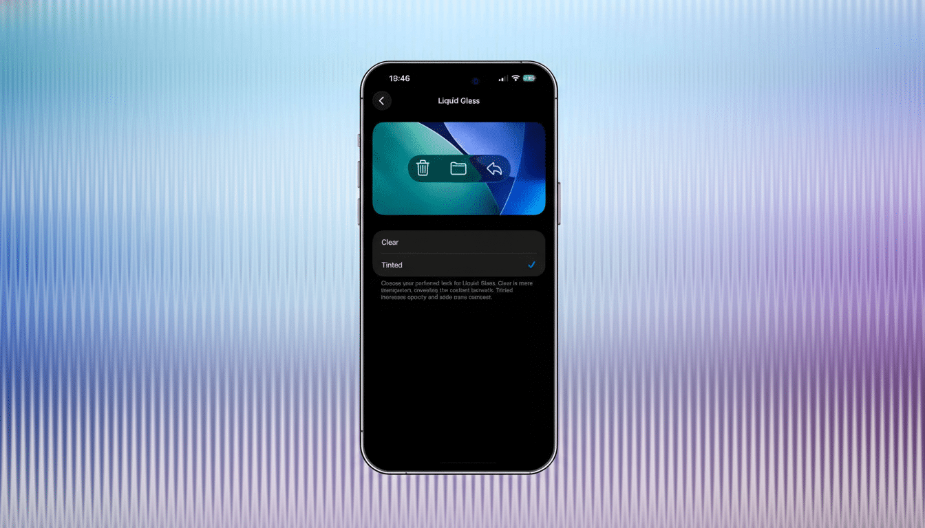
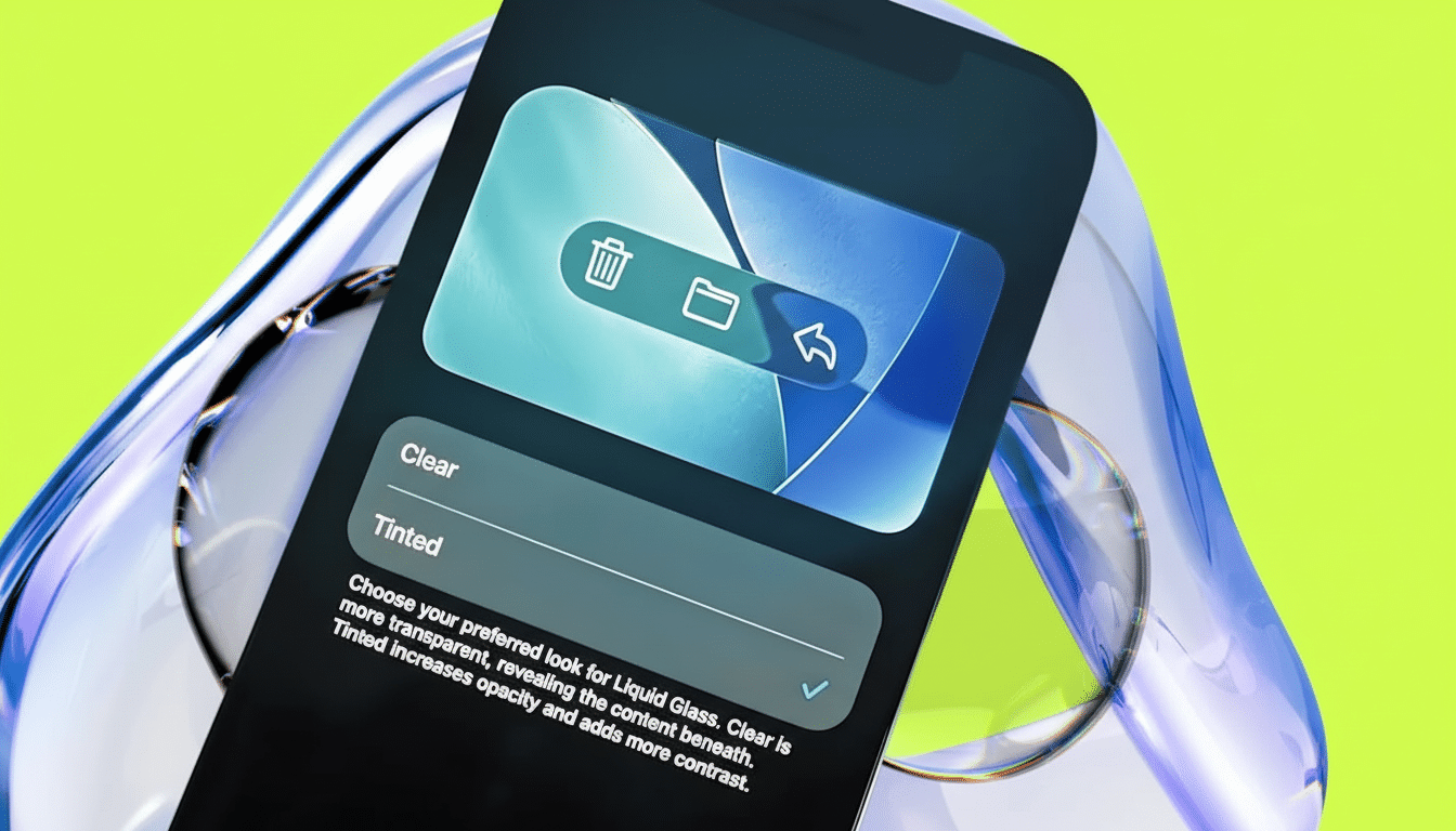
Out of the box, Liquid Glass leans on the side of clarity and depth, allowing background colors/wallpapers to leak through panels, notifications, and widgets. The new choice in iOS 26.1 allows you to go from Clear to Tinted, darkening the glass enough that icons, labels, and controls will stand out distinctly more.
- What the New Tinted Liquid Glass Switch Changes
- How to turn on Tinted Liquid Glass in iOS 26.1
- Now try it in the public beta for iOS 26.1
- Why This Is Good For Accessibility And Comfort
- What you can’t change about Liquid Glass in iOS 26.1
- Coming to your other Apple devices in upcoming updates
- Bottom line on Tinted Liquid Glass in the iOS 26.1 update
Call it a way of adding another layer of neutral density to the UI. Control Center panes, Home Screen folders, and context menus all keep their glassy blur, but the increased tint reduces visual noise in busy wallpapers and helps text and glyphs stand out more for at-a-glance scanning.
How to turn on Tinted Liquid Glass in iOS 26.1
On your iPhone, go to Settings, tap Display & Brightness, then select Liquid Glass. You’ll be presented with two options: Clear and Tinted. Choose Tinted to have the more solid style applied throughout. And you can switch back to the original appearance in an instant, if that’s your preference.
- Open Settings > Display & Brightness > Liquid Glass.
- Select Tinted instead of Clear.
- You can switch back to Clear at any time.
Other early testers found the same toggle on other Apple platforms that use Liquid Glass, such as iPad and Mac in their current betas. There’s going to be Apple Watch alignment, but nothing has been officially laid out by Apple for timing.
Now try it in the public beta for iOS 26.1
If you want to try Tinted Liquid Glass before the stable release, go ahead and install iOS 26.1’s public beta now. On your non‑primary device, select Settings > General > Software Update and then choose Beta Updates to install iOS 26.1 Public Beta. Once the update is installed, you will see a Liquid Glass option under Display & Brightness.
- On a non‑primary device, go to Settings > General > Software Update.
- Tap Beta Updates, then choose iOS 26.1 Public Beta.
As always, back up first and expect some rough edges. The feature is a toggle, so it’s low-risk experimenting — turn it on, live with it for a day, see if the additional contrast helps how you work.
Why This Is Good For Accessibility And Comfort
Transparency is nice, but it can reduce legibility at the point foreground color meets and blends with background color. According to the Web Content Accessibility Guidelines (WCAG) 2.1 from W3C (The World Wide Web Consortium), regular text should have a minimum contrast ratio of 4.5:1. OSes themselves don’t — for whatever reason, we’ve already covered that with this infobox! 🙂 — but the principle still stands: better separation improves reading and reduces eye strain.
Design researchers at the Nielsen Norman Group have long pointed out that very transparent “glassmorphism” can make quick scanning difficult when backgrounds are busy. Apple’s Human Interface Guidelines recommend adequate contrast and depth cues. The new Tinted option is very much in line with those (best practices) principles, keeping background clutter at bay without sacrificing visual identity.
What you can’t change about Liquid Glass in iOS 26.1
iOS 26.1 offers no complete off switch for Liquid Glass. For more steps, go to Settings > Accessibility > Display & Text Size and turn on Reduce Transparency and Increase Contrast. These system controls are still the most powerful way to knock back translucency and highlight edges and text.
- Settings > Accessibility > Display & Text Size
- Enable Reduce Transparency and Increase Contrast.
Clarity can also be increased by using a darker or desaturated wallpaper, bolder app icons, and larger text sizes. Those little changes, when combined with Tinted Liquid Glass, are enough to result in a calmer, more readable interface — especially on smaller screens or in sunlight.
Coming to your other Apple devices in upcoming updates
Since Liquid Glass is cross-platform, the tint control is also cropping up in betas for iPadOS and macOS simultaneously. You’ll find similar controls in System Settings for Mac when the update arrives. That it is bringing standardized personalization across platforms says that Apple realizes this design looks best when users can drink its milkshake or not at all.
Bottom line on Tinted Liquid Glass in the iOS 26.1 update
If Liquid Glass has been a touch too clear for your liking, Tinted in 26.1 strikes the right balance — maintaining depth and polish while refreshing contrast. It’s a little thing, but it goes a long way toward the comfort and clarity of using your iPhone — and it makes Apple’s most significant UI flourish easier to live with if you’re using that every day.