We have all sat through that presentation.
The speaker is confident. The topic is interesting. The slide deck looks clean and modern.
Then, they click to the next slide to show a crucial piece of data.
It’s a disaster.
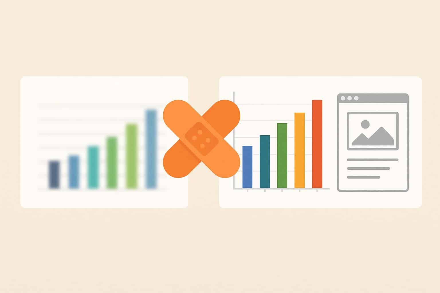
The chart is a pixelated, blurry mess. The numbers on the X-axis are unreadable smudges. The lines of the graph look like jagged staircases.
The speaker awkwardly apologizes: “I know this graph is a bit blurry, but…”
In that moment, credibility takes a hit.
In the professional and academic world, clarity is currency. If your audience cannot read your data, they cannot trust your data. A blurry image screams “lazy” or “unprepared.”
The problem is that we often source data from the wild. We screenshot charts from PDF reports, copy diagrams from old websites, or snip UI elements from software. These assets are usually low resolution (72 DPI). When you stretch them to fill a slide on a 4K projector or a massive conference screen, they fall apart.
You don’t have to redraw every chart in Excel. You don’t have to apologize for bad pixels anymore. With the help of an AI image upscaler, you can transform low-quality data visualizations into crisp, boardroom-ready assets in seconds.
The “Projector Test”: Why Web Images Fail
Why do images that look fine on your laptop look terrible on the big screen?
It comes down to Scaling.
When you view a 500px chart on your laptop, it takes up 2 inches of screen space.
When you project that same slide in a lecture hall, that image might be 5 feet wide.
PowerPoint stretches the pixels to fit. Without new data, the software just makes the pixels bigger. The result is “compression artifacts”—fuzzy noise around text and jagged lines.
To pass the “Projector Test,” your images need to have a high pixel density. You need to use an image upscaler to boost the resolution by 400% before you drop it into your slide deck.
Scenario 1: The “Old PDF” Dilemma (Academic Research)
Researchers and students face a specific nightmare: Legacy Data.
You are writing a thesis or preparing a defense. The pivotal graph you need comes from a scanned journal article from 1998.
The PDF is grainy. If you take a screenshot, the text is barely legible.
The Fix:
Do not paste the screenshot directly.
- Capture: Screenshot the graph from the PDF.
- Upscale: Run it through imgupscaler.ai.
- Refine: The AI detects the geometry of the text and the axis lines. It straightens the lines and separates the text from the noisy paper background.
- Result: You get a clean, white-background image where the numbers are sharp. It looks like you generated the graph yourself, preserving the academic rigor of your presentation.
Scenario 2: SaaS Demos and UI Screenshots
For product managers and consultants, presentations often involve showing software interfaces (screenshots).
“Here is how our dashboard looks.”
If you take a screenshot on a standard 1080p monitor and paste it into a Keynote presentation on a 4K screen, the text on the buttons will look soft.
If you crop in to show a specific feature (like a dropdown menu), it gets even worse.
The Workflow:
Treat screenshots like photos.
Use the tool to sharpen image details on your screenshots.
- Text Clarity: The AI sharpens the UI fonts (like Helvetica or Roboto), making them look native to the slide.
- Icon Definition: It cleans up the edges of small icons.
Upscaling your screenshots ensures that when you zoom in during your presentation, the audience sees a crisp, high-fidelity interface, which reflects well on the quality of your software.
Scenario 3: Diagrams and Flowcharts
Flowcharts are notoriously hard to resize. They contain thin lines and arrows.
If you stretch a low-res flowchart, the arrows disappear or become jagged “steps.”
Traditional resizing methods (Bicubic interpolation) act like a blur filter. They make the thin lines gray and fuzzy.
An AI image upscaler uses “Vector-like” processing. It recognizes that a line should be a line. It fills in the missing pixels to create a solid, continuous stroke. This is essential for engineering diagrams, organizational charts, or architectural floor plans where precision is the whole point.
Scenario 4: The “Dark Mode” Presentation
Dark Mode presentations are trendy. They look sleek and are easier on the eyes in dim rooms.
However, Dark Mode is unforgiving to JPEG Artifacts.
If you paste a white-background chart onto a black slide, you often see “mosquito noise”—ugly grey speckles around the letters. It looks dirty.
Imgupscaler.ai has powerful denoising capabilities.
- Upload your “dirty” chart.
- Upscale it.
- The AI wipes the background clean, turning the “noisy white” into “pure white.”
- (Optional) Use a “Remove Background” tool afterwards. The upscaler makes the edge detection much easier for background removers, allowing you to seamlessly blend the chart into your dark slide.
Don’t Redraw: Upscale
I have seen interns spend hours “redrawing” a chart in Excel just to make it look high-res. They manually type in the data points to recreate the graph.
This is a waste of time and introduces the risk of data entry errors.
Efficiency Hack:
Use the AI to sharpen image fidelity instead.
It takes 10 seconds to upload and download.
The result is 95% as good as a redraw, with 0% of the effort. You preserve the original data source’s authenticity while fixing its visual quality.
How to Handle “Infographics”
Marketing professionals often need to include sections of a long vertical infographic in a slide.
Cropping a small section of an infographic results in a low-resolution pixel soup.
The Strategy:
- Upscale the entire infographic first using the image upscaler.
- Then crop the section you need.
By upscaling the source file before you crop, you ensure the specific statistic or icon you are highlighting retains maximum clarity.
Conclusion: Respect Your Audience
Your audience is giving you their time. They are straining their eyes to read your slides.
Making your visuals legible is a form of respect. It keeps them engaged. It prevents cognitive load (brain strain) caused by trying to decipher blurry text.
A blurry chart says, “I copied this at the last minute.”
A sharp chart says, “I am an expert.”
Don’t let bad pixels undermine your hard work. Before your next big pitch, defense, or quarterly review, take a few minutes to process your assets.
Visit imgupscaler.ai, scrub the noise, boost the resolution, and sharpen image details. Make your slides as sharp as your ideas.