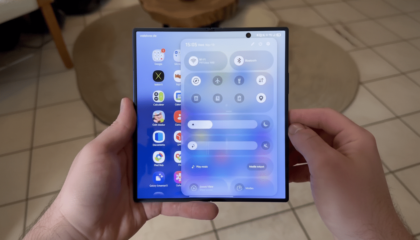
Samsung looks poised to address one of the longest-standing grievances with dark mode on its Galaxy phones: glaring home-screen icons that don’t obey dark themes from apps. And in a new leak, One UI 8.5 appears to be bringing dark icons systemwide, meaning at long last your home screen won’t feel like it butts heads with the rest of the system after hours.
Dark mode support appears to be in the works, as a very brief video posted by dependable leaker Galaxy Techie demonstrates that icons will change dynamically when you switch to the darker appearance and receive an ever so slight 3D refresher with soft drop shadows.
If what ships looks like this, it would solve the patchwork of bright tiles problem that has been undermining dark mode for years.
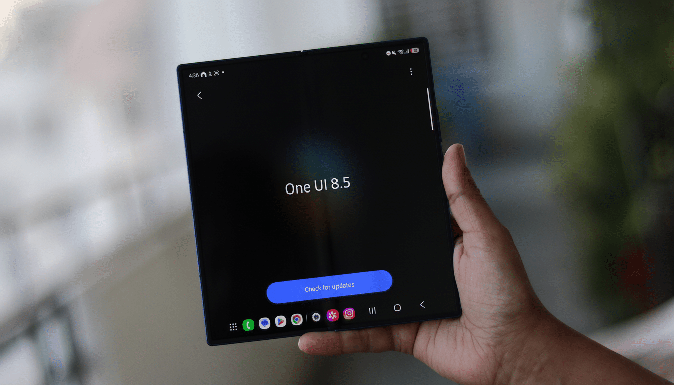
What’s changing in One UI 8.5 for dark icons?
The update seems to achieve two things at once. First, it mandates dark-friendly app icons — even for apps that never got around to providing such an asset — so the entire grid aligns with the system theme. Second, Samsung is apparently experimenting with subtle 3D icons in both light and dark modes, applying some sparing use of shadows to provide a sense of depth without returning us all to skeuomorphism.
Most important, the background plates and icon shapes finally appear to complement dark mode rather than fight it. Practically speaking, that generally translates into fewer blinding white squares when you unlock in bed at night and a cleaner, more cohesive home screen — one that seems like it was actually designed to be low light all along.
Why dark icons matter for Galaxy phones at night
Dark mode isn’t merely a vibe. On an OLED screen — the current standard for recent Galaxy flagships, if you’re curious — pixels that turn black get turned off and thus sip less power. Google previously showed at an Android developer session for a dark theme that power usage could be cut by 63% on OLED compared with the lightest of whites whether on maximum brightness or not, and it will vary depending on what’s displayed.
Home screens cluttered with large colorful disobedient icons will tend to push the average picture level up anyway and erode some of those gains, as well as causing more eye strain in a darkened environment. Color codes don’t just matter for power; they also do work in terms of usability: When everything operates under the same tonal logic, scanning and targeting icons is faster and less cognitively taxing.
How Google’s policy changes opened the door for theming
This aligns with Google’s ongoing push to unify and set standardization in using icon theming across Android. The firm revised Play Store rules to make it mandatory for developers to support automatic theming, leveraging Material You and the Themed Icons program introduced in past Android versions. Whereas Pixels rolled the feature toward a somewhat monochromatic, adaptive iconography, Samsung’s implementation hints at taking it a step further by making dark-ready versions for stragglers.
There are branding issues — some companies worry that duller icons can lead to weaker brand recognition — but platform-level consistency tends to win out when the alternative is visual cacophony. Anticipate Samsung to maintain familiar glyphs but use a system-provided background and tint, so they still stick with company identity in consistent dark theming.
What to expect in the rollout and device availability
The exposed build hints that the feature is still a work in progress. (There might be rendering issues with a handful of icons at first, and third-party launchers could take time to adopt the new behavior.) Previous devices sometimes include a toggle in settings for some visual features, so a full-color icon toggle may show up if you still prefer to keep things the way they were.
As with previous One UI updates, recent Galaxy flagships and foldables should see the change first, then midrange equipment. For anyone who uses dark mode, it’s a positive change you’ll feel right away: fewer blinding tiles, less visual noise, and a home screen that finally feels as considered as Samsung’s polished quick settings and system apps.
A small tweak with outsized payoff for dark mode
Samsung has already gotten dark mode right throughout most of One UI, from menus to widgets. Icons were one of the last, highly visible holdouts. By auto-theming hard-headed app icons and adding a tasteful 3D stipple, One UI 8.5 could make dark mode go from “nearly complete” to totally seamless — without costing performance or diluting brand legibility.
Should the feature ship as is shown in leaks, Galaxy owners can begin to look forward to a home screen that appears as though it was crafted on one run, rather than assembled from parts that don’t seem completely aligned. For dark mode diehards, that’s the kind of quality-of-life fix that you appreciate every single time your phone lights up.