Google is rolling out new Material 3 Expressive animations in the Play Store, giving download and loading states a livelier look. Early sightings show a wavy, crinkled progress ring around app icons during downloads and a playful loading indicator when opening the Downloads page, signaling a subtle but noticeable design refresh.
What’s Changing in the Play Store’s Download and Loading UI
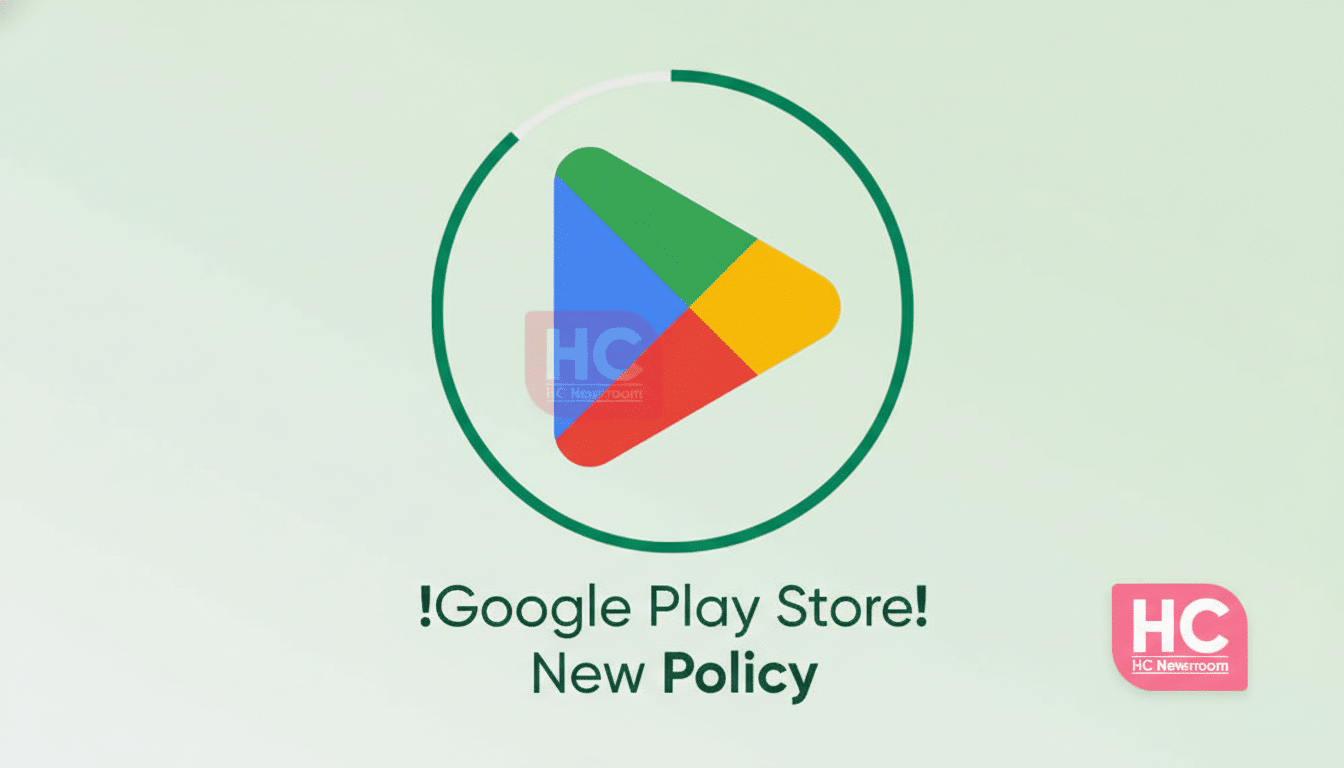
The familiar circular progress ring that wraps around app icons as they install or update is being replaced with a wiggly, hand-drawn style ring. It animates as the download advances, making progress feel more organic than the old sterile circle.
Users are also spotting a new loading animation when switching into the Downloads section. It fits the newer, bouncier motion language Google has been weaving into first‑party apps, providing a clearer sense of “something is happening” while the page populates.
This appears to be a server-side change and a staged rollout. Reports from Telegram user FeDeveloper95 and Threads user Ishan Wankhade show the updated visuals live, though many devices still display the older indicators.
A Measured Step in Material 3’s Expressive Shift
The update aligns with Google’s broader Material 3 push, which emphasizes motion, personality, and state clarity. Material’s motion guidance encourages “expressive” animations to convey feedback without overwhelming users. The crinkled ring is a microinteraction that draws the eye to progress while keeping the interface approachable.
We’ve seen this design language surface across Gmail, Google Photos, and other core apps over the past year. Instead of flashy redesigns, Google often opts for iterative polish—tuning iconography, shapes, and motion so everyday tasks feel smoother and more human.
How to Know If You Have the New Play Store Animations
Because this is a staged rollout, the new animations may arrive on your device without an app update. To check, open the Play Store, start an app update, and watch the icon’s progress ring. If it wiggles with a crinkled outline rather than a perfect circle, you’ve got it. You can also open the Downloads page to see if a new loading animation appears while content populates.
If you don’t see the change yet, try updating the Play Store, clearing its cache, or restarting. That said, Google often flips these features on via server flags, and wider availability can take weeks. Patience is part of the process.
Why These New Play Store Animations Matter to Users
Progress indicators are more than decoration; they influence how fast an app feels. Human–computer interaction research and industry UX guidelines from groups like Nielsen Norman Group note that well-tuned motion and feedback can improve comprehension and reduce perceived waiting time. In the Play Store—where millions of users watch downloads tick along every day—microinteractions that clarify state and add a touch of delight can meaningfully improve the experience.
There’s also a practical angle. When multiple apps update at once, distinct motion and shape cues help you parse which items are in progress, queued, or completed at a glance. On a platform with over 3 billion active Android devices, according to Google, small tweaks at this scale can add up to a lot of saved friction.
What to Expect Next as the Play Store Rollout Expands
Assuming this rollout follows Google’s usual cadence, more users should see the expressive animations in the coming weeks. Don’t be surprised if additional Material 3 touches land in adjacent parts of the Play Store—think refined transitions on app detail pages or livelier states for ratings, reviews, and search.
For now, the new progress ring and loading indicator are a small but telling signal of where Android’s visual language is headed—less rigid geometry, more personality, and motion that works for you, not against you.