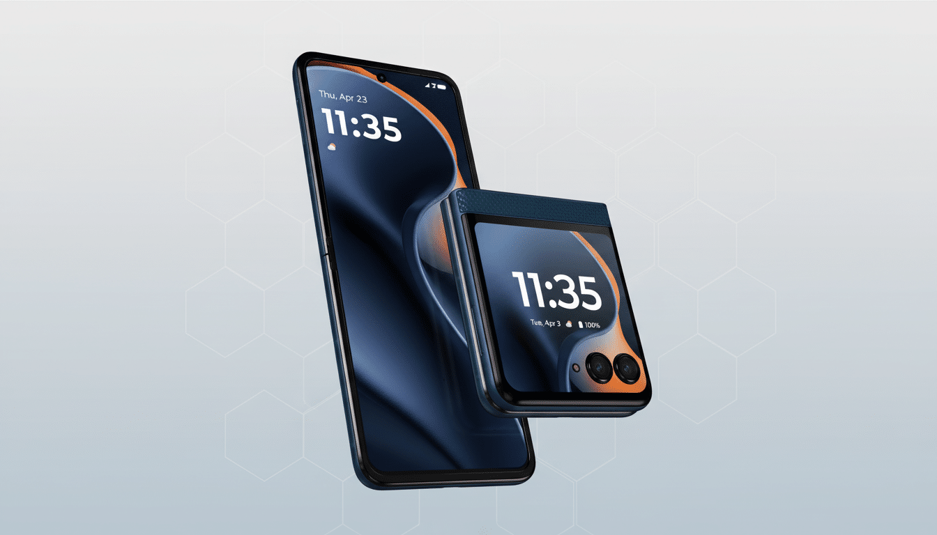
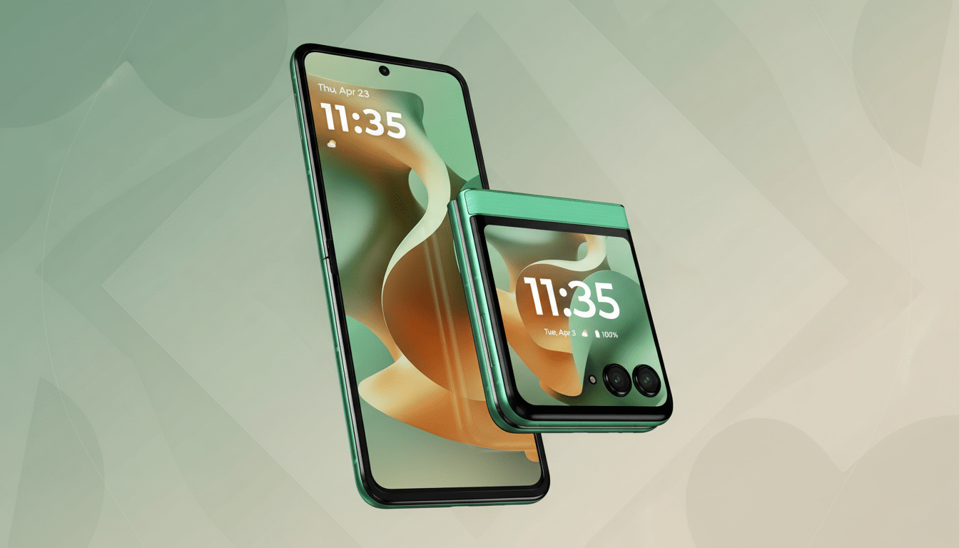
A good leak indicates Pantone’s 2026 Color of the Year is looking to be more on the powder blue end of things, going by the catalog description for a Motorola that may already have made it to store shelves. If true, the brand’s continued collaboration with Pantone would lend it a rare leg up in one of consumer tech’s most widely covered color trends.
The Leak and the Shade Behind Pantone 2026 Pick
Veteran tipster Evan Blass reports that Pantone’s next signature shade will be Lightest Sky, code-named 11-4804 TPG.

It skews soft, misty blue-gray and reads calming rather than cold. Annotations by NotebookCheck echo the statement, mentioning that the shade is an understated, desaturated shade.
Here’s the twist: Motorola already offers a phone in Lightest Sky. The Razr (2025), the company’s less expensive foldable, is available in that very color with a textured light-reflective finish that makes the muted blue pop under some lighting. One word on Lightest Sky from Pantone and Motorola’s catalog is essentially a prepackaged showroom.
Why It Matters for Motorola and the Pantone Partnership
The relationship between Motorola and the Pantone Color Institute goes back to 2022. And, while we can ignore co-branded finishes, Pantone Colour+ Validation to ensure display and camera colour accuracy on some models does give Motorola a legitimate tease when it comes to visual authenticity in a packed Android space.
Blass has been solid on this subject. He correctly guessed Mocha Mousse as the color of the year for 2025 before Pantone made its announcement, and Motorola promptly released versions like the Razr Plus (2025) and Edge 50 Neo in that shade. That history, in turn, bolsters the credibility of Lightest Sky and makes the case for a wider Motorola push if it pans out.
The Color of the Year appears in a range of products, packaging and storefronts across various industries. Prior choices would include Viva Magenta, as well as Peach Fuzz, to toggle back and forth between cross-category collaborations along with seasonal refreshes that many brands leveraged to stoke demand sans major hardware changes.
What If Lightest Sky Is Picked for Pantone 2026 Color
If the Lightest Sky report turns out to be true, we should expect Motorola to go beyond offering the colourway on just the Razr (2025) and onto halo devices such as the Razr Plus (2025) or a Christmas-friendly Razr Ultra (2025), and maybe even onto one of its mainstream product lines where an expansive selection of colourways can boost appeal.

Limited editions, matching accessories and coordinated retail materials would be the low-friction path to making a quick buck.
It’s not inconsequential when you’re trying to decide which phone to buy: design and finish. The design and the colour are always top of mind for consumers, and consumer surveys from Counterpoint Research consistently rank these two ‘factors’ as key purchase drivers, especially in the competitive mid-range segment where spec sheets tend to consolidate. A fashionable color can give a boost in shelf impact or conversion without having to change internal components.
And there’s a user-experience side: Softer, more muted finishes could help reduce smudges — and foldables can look less bulky. The low-saturation profile of Lightest Sky satisfies that brief, and the cool undertone complements the polished metal accents and vegan leather textures Motorola is into right now.
Confusing Signals and the Mood of the Market
Not everyone expects blue. A recent roundup in Forbes of designers predicting the future identified a drift toward green, with nods to nature-forward palettes and sustainability cues. Ellsbury says others hoped for calming neutral or cool bluish tones, which coincides with Lightest Sky’s comforting vibrational energy. Both camps mirror larger consumer mood trends monitored by the Pantone Color Institute.
The tension between them is a reminder of how color selections can double as cultural signals. Post-hype cycles in AI and consumer tech tend to tug palettes in the direction of reassurance and restraint. Lightest Sky’s murmuring softness would fill a spot in that macro story, just as the warm neutrality of Mocha Mousse did years ago.
The Larger Story in Tech Color Branding and Strategy
And while many phone makers indulge in seasonal hues (see Samsung’s Bora Purple or Apple’s spring color refreshes), few latch on to a single color authority so closely. Motorola’s Pantone play is becoming more of a brand signature, similar to mobile photography camera co-branding. It’s a differentiator that says as much about taste as tech.
For now, the Lightest Sky claim is unproven. If Pantone goes ahead, Motorola’s early bet would have been an astute move: the right color, on the right device, for a global design moment. In a market of fine margins, that could be a quietly potent one.

