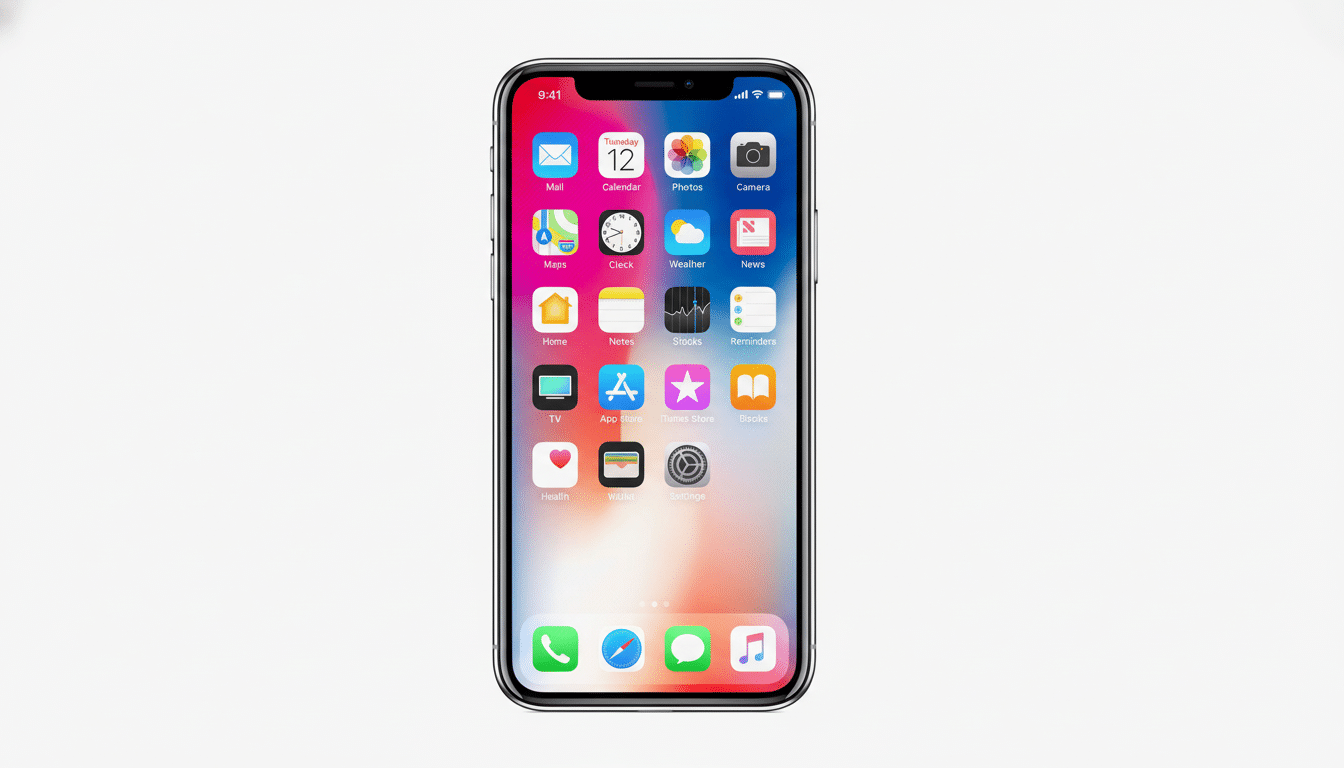
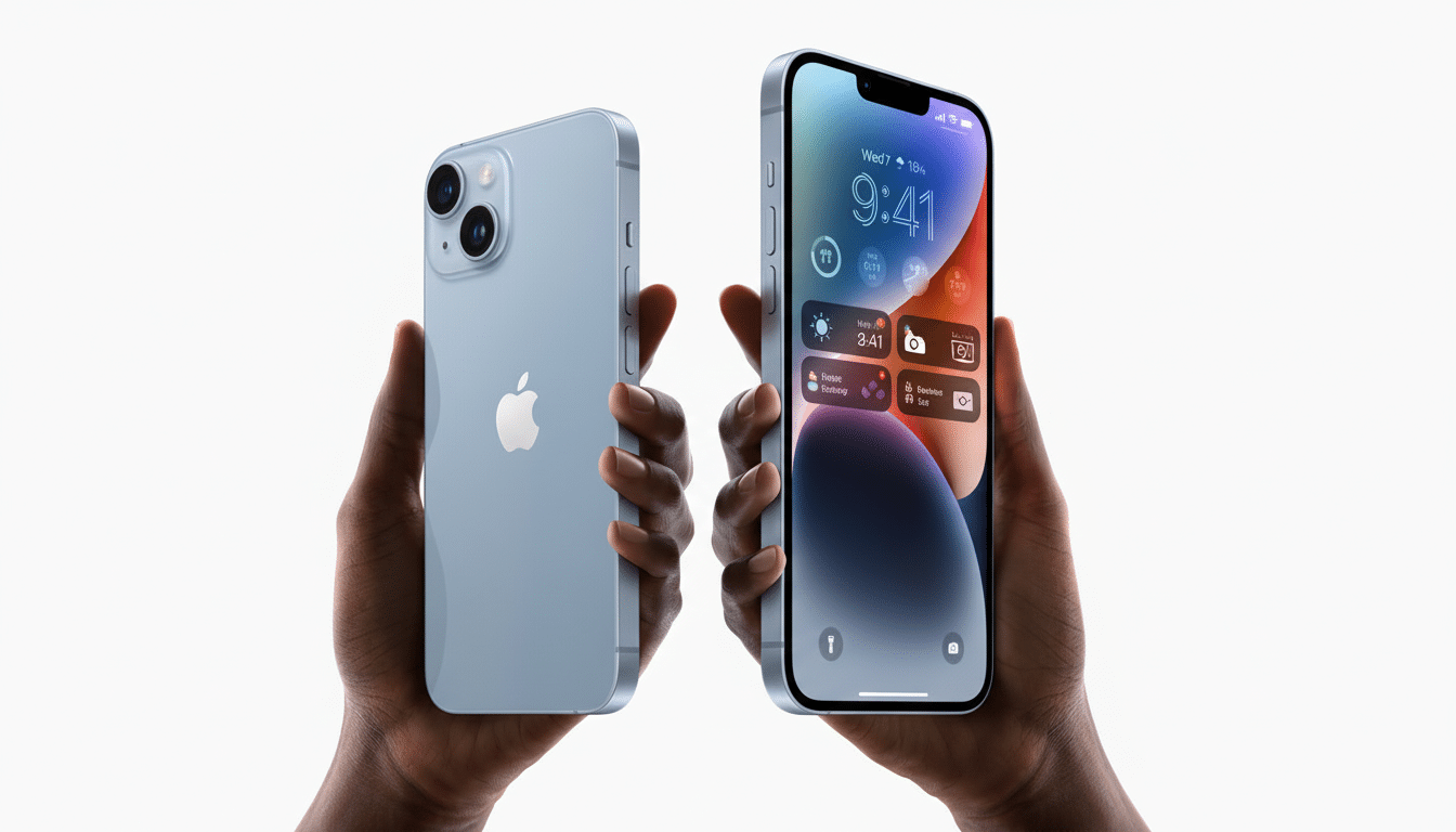
iOS 26 scrambles muscle memory by putting multiple search fields and address bars near the bottom of the screen. For those who like the old, top-of-screen search, things are mixed: You can set it back in Safari, but a lot of system-level search elements stay put. Here’s what you can actually move, what you can’t, and a few clever workarounds that will make the new design feel less clunky.
Why Apple placed search controls at the screen bottom
Apple’s move reflects a decade of research into ergonomics that showed the bottom third of a display is easiest to reach on these bigger phones. “For a long time, Human Interface Guidelines for the company have recommended that primary controls be placed in areas accessible to where thumbs would rest,” Ionescu has said. Further supporting the notion, independent research finds half of users use their phones one‑handed (see Steven Hoober’s widely cited mobile study), and Nielsen Norman Group shows higher task success comes when most important actions fall within the “thumb zone.” It’s sensible design — but it contradicts years of learned behavior.
How to drag Safari’s address bar back to the top
If your primary gripe is web browsing, Safari has a built‑in switch that you can use to bring back the old layout. Go to Settings, click on Safari, and then scroll down to the Tabs section. You’ll find three positions in which it can be placed, all listed beside the Address and Search Engines section name: Compact, Bottom, and Top.
Choose Top to make the URL and search bar appear at the top of the page again. Compact keeps it snug and centered; Bottom reflects Apple’s more recent, reach-enhancing design. Changes take effect right away; you don’t have to force-quit Safari.
Tip: If you use multiple devices, this setting applies to each device individually. It will not be synchronized via iCloud, so you’ll have to make the change on every iPhone or iPad you own.
Spotlight and system search: no top toggle (yet)
Outside Safari, iOS 26 doesn’t offer a system‑wide switch to relocate search fields to the top. Spotlight, while on the Home Screen and searching in many Apple apps, also features bottom‑aligned text. There is no setting to put those back in the old location.
You can, however, adjust visibility. To avoid the persistent search pill on your Home pages, head to Settings > Home Screen and toggle off Show on Home Screen. For privacy and for silencing Siri, you can visit Settings > Siri & Search to control Show Suggestions, whether it can appear in Spotlight and which apps get indexed. These are controls that tweak the search appearance a little, not its location on the bar.
Comfort and readability tweaks that make a difference
If the bar remains pinned to the bottom, you can make both the input field and its borders a little easier on the eyes and fingers. To change Text Size or turn on Bold Text, begin at Settings > Display & Brightness. Then go to Settings > Accessibility > Display & Text Size and experiment with Increase Contrast and Reduce Transparency (the latter can enhance readability over the translucent backgrounds ushered in by iOS 13’s redesigned visuals).
If movement distracts you during your search, switch on Reduce Motion in Settings > Accessibility > Motion. It becalms the rubber band animations that can make the new layout feel more chaotic, especially when initiating a search from the Home Screen.
And don’t forget gestures: a quick downward swipe on the Home Screen still brings up Spotlight instantly, and another off to the right from the first Home page opens Today View with a suggestion. More often than not these muscle-memory shortcuts feel quicker than taking aim at a static search hotspot.
What about third‑party apps and browsers?
App developers determine where their own search fields run. Most will follow Apple with its bottom-first pattern; some will leave search at the top. There is no global iOS switch that does this for an app.
To browse beyond Safari, examine your browser’s settings. Some of these browsers have offered a setting to swap the address bar from top to bottom and back; Chrome for iOS, for instance, is equipped this way. The specific language and placement can be different depending on the version—search for Address Bar, Toolbar, or Layout in the settings menu within the app. When a browser doesn’t offer a toggle, user feedback tends to drive rapid updates; developers monitor App Store reviews and community forums closely when new UI changes stir pushback.
Why this could have legs — and what might happen next
Apple has bowed to pressure in the past when a sufficient number of users requested it. After Safari initially moved its bar in a previous iOS update, the company made it selectable to relocate back on top following widespread criticism. And, knowing that history, a future iOS 26.x build could include additional placement controls, if the demand is there and loud enough.
For now, the solution is a practical hybrid: bring back Safari’s top bar because of course you should, configure what Spotlight shows (and where), and apply system-wide accessibility and typography adjustments to mitigate the pain when it crops up. It’s not the all-purpose toggle that everyone here is clamoring for, but it does bring day‑to‑day use closer to what we experienced in the classic era without fighting the new ergonomics-first design.