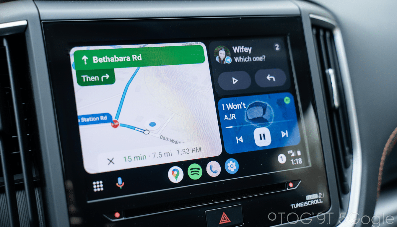
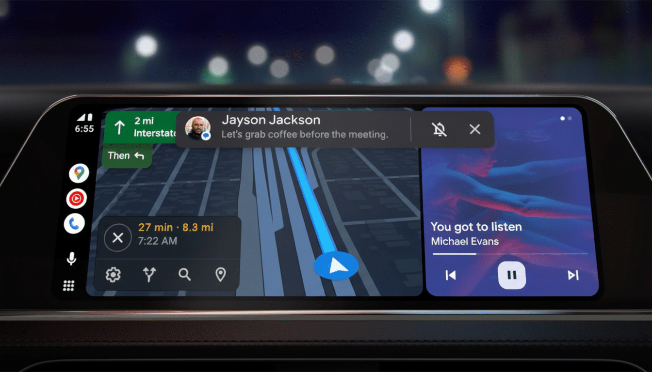
Android Auto is ramping up for a second generation of interface improvements, with home screen widgets also joining the fray in the next beta. Early leaks suggest multiple size granularities, more positioning flexibility, and an alternative navigation bar that’s designed to be less intrusive or distracting.
What the New Widgets Could Accomplish for Drivers
Testers have uncovered further controls to widgets beyond the simple scaling that we saw before in Android Auto 15.7.654604-release beta. A new height slider adds to the existing size options, allowing drivers to dial up taller cards for glanceable information like navigation, media, and upcoming appointments. There are also placement controls, so I would assume that you would be able to reposition widgets on the home canvas to fit different dashboards and screen sizes.

Internally, the widget work is labeled “Earth,” a code name that we’ve seen before mentioned in conjunction with the effort. A screenshot button tab has appeared as well in the UI for the configuration. It’s nonfunctional in current builds and probably just a tool for a look-see, but its existence suggests continued tuning of interface layouts across the cars’ increasingly varied array of touchscreens.
Used widely, these controls would augment the multi-panel “Coolwalk” approach by giving users a hand in bringing forward the information that’s personally most meaningful.
Imagine taller, richer navigation tiles on a road trip, or a compact music widget while directions occupy the main pane. Per-profile widget setups might be a subtle but potentially substantial quality-of-life improvement for multi-driver homes.
Testing Bottom Bar Layout Toggle in Android Auto
There is also an experimental bottom navigation layout in development. The layout today is a mix of elements on screen: from the clock in the left rail, to an app rail in the middle, even quick actions on a right rail. The new variant bunches the core controls toward the middle to get rid of that constantly visible clock and reveal one less app shortcut.
It’s a tradeoff that might pay off on bigger, wider displays by reducing reach and allowing tap targets to be concentrated where the driver is naturally looking. This is in line with the principles of Fitts’s Law applied to automotive HMI design: Placing interactive elements closer together allows a user to approach them more quickly and less accurately. Not everyone is going to be thrilled with no constant time readout, so look for Google to iterate at least once before opening this up to Joe User.
The Importance Of Layout For Safety And Usability
Interface changes in the car are never purely cosmetic. The National Highway Traffic Safety Administration recommends infotainment tasks to be made for quick glances — typically about 2 seconds or less — so drivers’ eyes stay on the road. The AAA Foundation for Traffic Safety, too, found that short visual-manual tasks can be two times as dangerous in terms of crash risk when drivers’ eyes are diverted.

Putting information where the eye expects it and reducing hunting and taps can be the product of smarter widgets and tighter control placement. Bigger tiles for turn-by-turn directions, or an explicit home for incoming calls, are small tweaks that would better reduce mental calculation when you’re on the move. And the greater mission is to express context at a glance, then return attention to the road.
How It Compares With Competitors in Car Interfaces
Apple’s CarPlay Dashboard has always been a small army of cells for navigating, playing media, and checking the calendar with little ability for users to control their layout. Moving toward a more modifiable height and location of widgets could be Android Auto’s edge in personalization, particularly with the ultrawide displays becoming mainstream in luxury vehicles. And native systems such as Mercedes MBUX and Ford Sync 4 have been experimenting with customizable cards in their designs, demonstrating that the industry is moving toward glanceable, modular design languages.
The phone-projection platforms’ key differentiator is speed. Features can reach millions of cars with head-spinning speed, irrespective of model year — think in-flight email that became pervasive before most airplanes rolled out seatback screens a decade ago or more — so tweaks like this often matter more than titanic redesigns.
When The Update Will Be Rolled Out to Users
As with most Android Auto changes, these adjustments are all server-side flags and staggered app updates. But what’s in a beta build is not an assurance of a short-term release. The transition to the current multi-panel look was deployed slowly, with on-and-off switches as Google tuned performance and compatibility.
The writing is on the wall, though: widget support is growing, layout flexibility gets a bump, and the navigation bar will be re-evaluated with reach and glanceability in mind. Expect to see further polish prior to a wide release, and there may be some options that debut first with beta testers or on certain screen sizes or vehicles.
Credit for the early eyes goes to freelance Android code hunters, who daily wade through new builds on the lookout for well-hidden flags and UI switches such as AssembleDebug. Their findings follow a larger trend in automotive UX: The next wave of improvements is less about flashy visuals and more about elegant ergonomics that help drivers keep eyes up and hands steady.

