Finding the right toggle on Android is about to get easier. The second Android 16 QPR3 beta introduces a refreshed system settings menu that groups related options under clear subheadings, a change first spotted in this year’s initial Canary build and now rolling out more broadly to beta testers.
This is not a flashy redesign, but it’s a meaningful usability improvement. By reorganizing sprawling lists into labeled clusters, Google is cutting down on the hunt-and-peck frustration that even seasoned users feel when digging through settings.
What Changed In The Android Settings Menu With QPR3
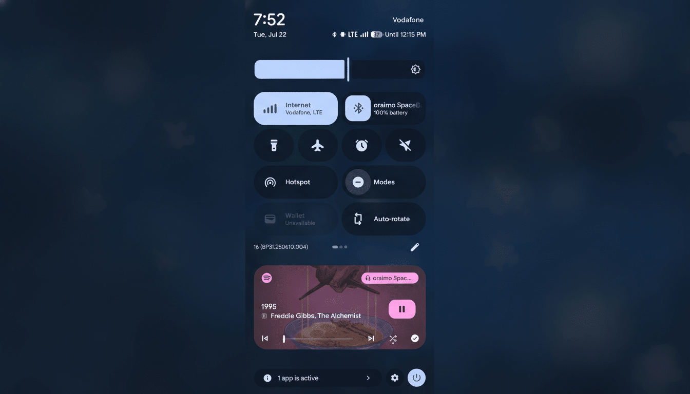
The headline tweak is the addition of subheadings that bundle similar controls into contextual sections. Early testers report an “Interaction” group that corrals keyboard preferences, gesture controls, and navigation mode—items that users frequently adjust together. The result is less scrolling and more scanning, with clearer wayfinding.
Google has dabbled with this approach before. Android 16 QPR2 already introduced subheadings inside specific pages like Notifications, Display and Touch, and Accessibility. QPR3 extends that philosophy to the system-level menu, aligning the top layer with the more structured feel of individual pages.
The search bar remains, and that’s important. Pixel phones have long offered robust, fuzzy-matched settings search. But search alone doesn’t solve every problem; sometimes you don’t know what a feature is called, only what it relates to. Subheadings bridge that gap by providing context cues that guide you to the right neighborhood even if you don’t have the exact term.
Visually, the menu now reads like a set of curated clusters rather than a monolithic list. That small structural shift improves “information scent”—the intuitive confidence that you’re heading toward the right option—without adding new taps.
Why This Design Change Matters For Android Usability
Android’s settings have grown rapidly as the platform absorbed features like advanced gesture customizations, satellite connectivity support, and richer accessibility tooling. When everything lives at the same hierarchy level, users spend more time scanning and second-guessing. Grouping related items reduces cognitive load and error rates, a pattern long documented by usability researchers such as Nielsen Norman Group.
Real-world example: switching from gesture navigation to the three-button bar often leads users into a maze—System, then Gestures, then Navigation. A top-level “Interaction” cluster makes that path more obvious. The same goes for keyboard tweaks, haptic strength, and other touch-centric preferences that tend to be adjusted together when you change how you use your phone.
For power users, this is a time saver. For less technical users, it lowers the barrier to personalization, which can increase satisfaction and reduce support friction. Enterprise IT teams also benefit when common settings are easier for employees to locate without help desk tickets.
How It Fits Android’s Broader Design Direction
The move builds on Material You’s emphasis on clarity and adaptability. Rather than new animations or colors, QPR3’s settings update is about information architecture—making the structure match how people think about tasks. It’s similar in spirit to the grouped categories you see on many modern platforms, but tuned to Android’s vocabulary and feature set.
The fact that the redesign surfaced in January’s Canary channel and is now present in Beta 2 suggests it is likely tracking toward a stable release in an upcoming Quarterly Platform Release, pending feedback. Google often ships menu refinements incrementally, calibrating labels and group boundaries as telemetry and user reports come in.
Availability And How To Try The New Settings Menu
The revamped menu appears in Android 16 QPR3 Beta 2 for devices enrolled in the Android Beta Program, primarily recent Pixel phones. As with many interface experiments, rollout can be staggered and controlled by server-side flags, so not every tester will see it immediately. Google’s platform release notes and community feedback channels are good barometers for when a feature graduates from test to default.
Beyond the settings overhaul, this beta also includes a change to the recents overview behavior and a handful of battery-related tweaks. Those are noteworthy, but the restructured settings page is the quality-of-life upgrade most users will notice first.
What To Watch Next As QPR3 Moves Toward Release
Expect iterative refinements: clearer subheading names, better localization, and accessibility polish for screen readers. If feedback is positive, similar grouping may expand to other dense areas of the OS, like privacy dashboards and connectivity panels.
The takeaway is simple: Android’s next quarterly update isn’t just adding features, it’s making the ones you already have easier to find. If you’ve ever spent a minute hunting for a toggle you swear you saw last week, this change is the kind of invisible upgrade that pays off every day.