Google One is about to make storage cleanup a swipe game. A new update to Storage Manager offers a Tinder-like interface that lets you flick through recommended photos, videos, and files to keep or delete — the laborious chore of freeing up space has never been so strangely satisfying.
What changed in Google One’s Storage Manager update
Rolling out with Google One v1.287.828055836, the update adds Material 3 Expressive styling to the cleanup panes for Google Photos and Google Drive. The design updates are understated, but functional: smaller thumbnails increase information density so you can see more items at a glance, filter chips have been squeezed into a one-line strip, and there’s now a top card to encourage knocking off low-value files first.
- What changed in Google One’s Storage Manager update
- Why a swipe-first approach works for storage triage
- Where it works in Google One and how to try it now
- Material 3 Expressive design at work in Storage Manager
- Why this matters for Google Photos and Google Drive
- Practical tips and caveats for using the swipe cleanup
When you tap one of the batches for review, that’s when the new swipe interface comes into play. Each item is held up front and center, which you can swipe to decide whether it stays or goes. It’s the same quick, binary decision-making pattern that dating apps have made ubiquitous — now repurposed for digital spring cleaning.
Why a swipe-first approach works for storage triage
Swipe-based decisions cut down on the taps and menus that normally bog you down. UX research for years, such as that from Nielsen Norman Group, has observed that gesture-first interactions can reduce interaction costs in the case of simple, repetitive decisions. Here, every photo, video, or document requires a yes-or-no vote — the type of decision that tends to benefit from momentum and muscle memory.
It also helps fend off decision fatigue. Rather than skimming through dense grids, hunting checkboxes, you stare at one item and attack it until you have a rhythm and move on. It’s a small nudge, but in practice it turns a chore into something you can spend five or so minutes doing and finish.
Where it works in Google One and how to try it now
The swipe-to-triage view is shown within the Google One app’s Storage Manager.
You can access this through the Clean Up card, which is available on the home screen, or via the Clean Up Space button in the Storage tab. The interface is live in the Google Photos pane for photos and videos, and in the Google Drive pane for all other file types. Rollout is, of course, gradual and — like everything else with Google apps — some aspects of the experience are server-side enabled, so you could potentially even see it before an update appears in the Play Store.
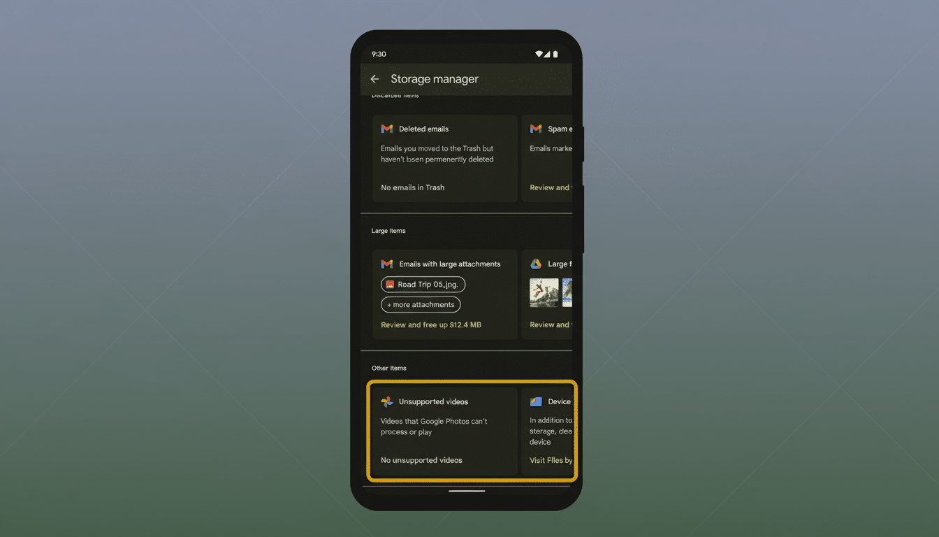
It is worth noting that the swipe view complements and does not replace traditional controls. And if you just love multi-select checkboxes, filter chips, and list views, those remain an option, now made even more compact to make larger libraries easier to scan.
Material 3 Expressive design at work in Storage Manager
The Material 3 Expressive refresh also brings the Storage Manager in line with Google’s new aesthetic. Look for heavier type, clearer signs of what is clickable or tappable, and a layout density built for utility rather than splendor. It’s all about productivity here; surfacing filters in a single row and shrinking thumbnails are marginal choices that make for faster triage times, especially when screens get smaller and usage transitions to one-handed use.
Why this matters for Google Photos and Google Drive
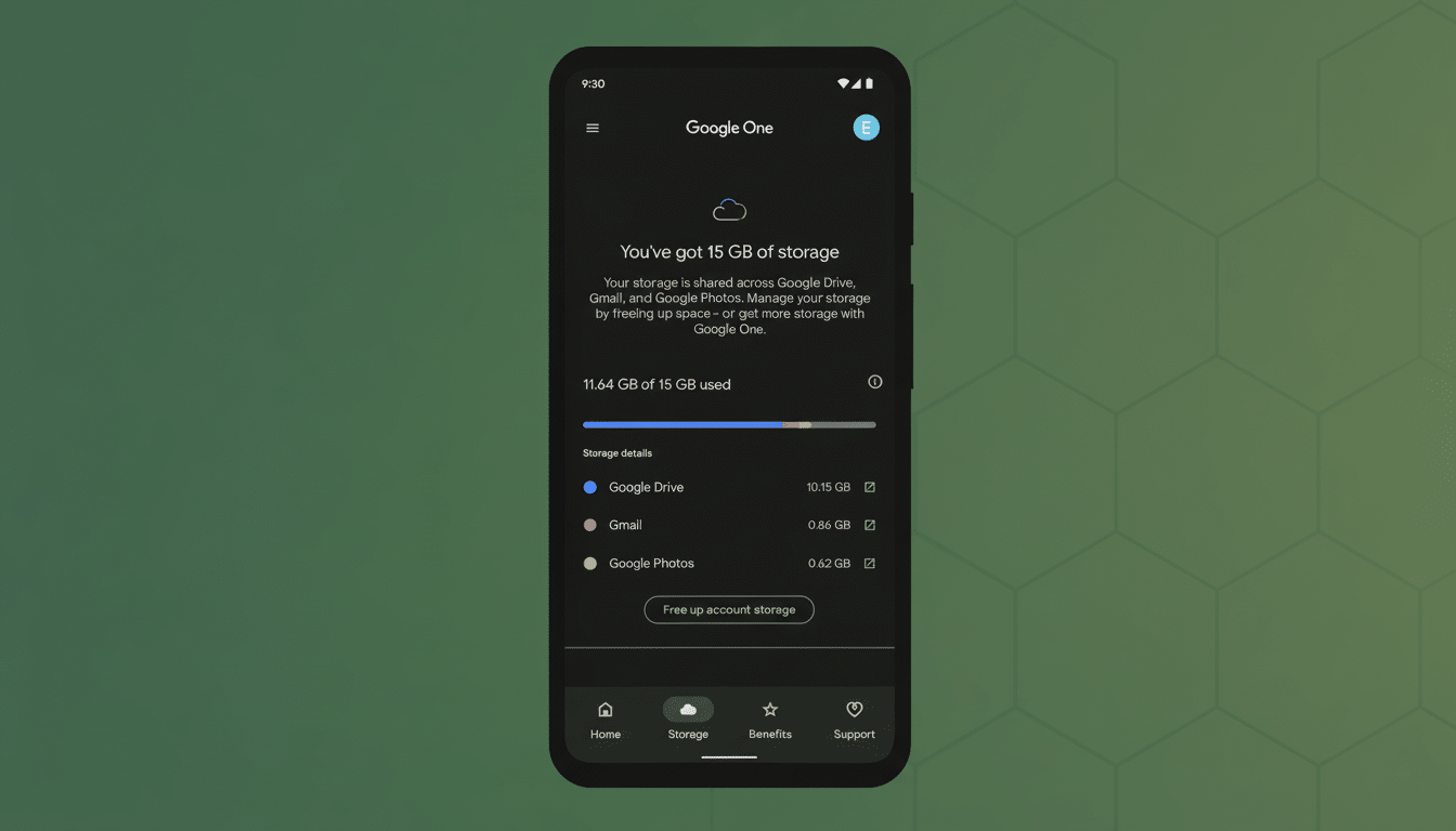
Google Photos and Drive are massive collections of files. Google has said in the past that Photos stores more than four trillion images, and users upload around 28 billion photos and videos every week. When just 15 GB of free storage is divvied up across Gmail, Drive, and Photos — along with paid hosting plans under the Google One roof — being able to tidy up quickly isn’t just a nicety, it’s a necessity.
The new interface also fits with bigger trends in productivity apps. A long time ago, email clients made swipe triage to archive, snooze, or delete messages standard in just seconds. It feels overdue to bring that same pattern to file management, and it reflects how we actually process large queues today — one-swipe-at-a-time.
Practical tips and caveats for using the swipe cleanup
Apply filter chips before swiping to concentrate on low-value targets: blurry photos, hefty videos, hoary downloads, or clearly redundant files. If you’re worried about mistakes, relax: your actions honor existing trash and undo flows in Photos and Drive, giving you a safety net while you adjust to the new rhythm.
For serious Google One users who regularly slam into their storage ceiling, the combination of cramped layouts and a swipe-first flow might be the quickest route to regaining gigabytes without making you feel like you just did paperwork.