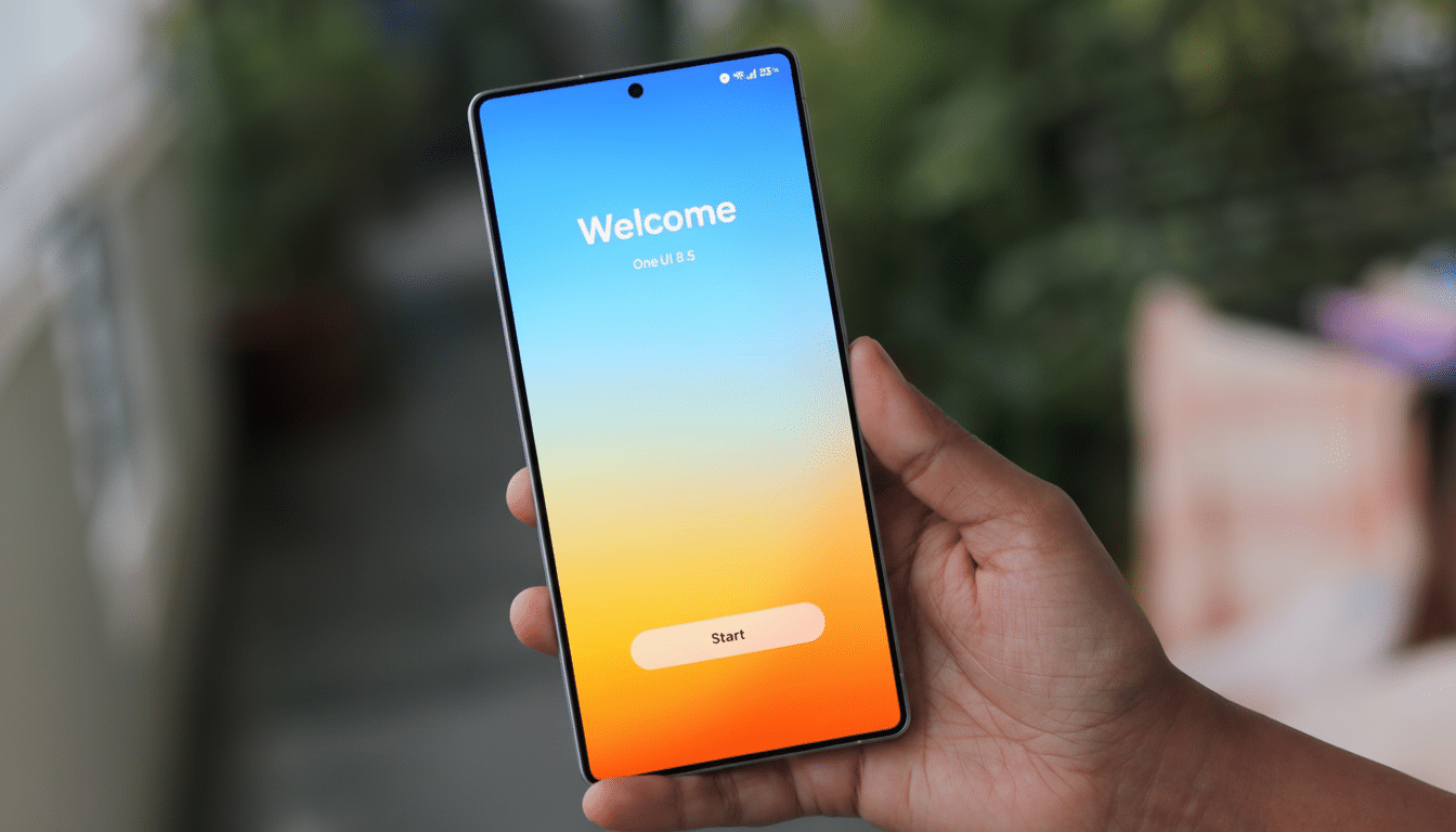
A new round of leaked screenshots indicates One UI 8.5 won’t just be a cosmetic touch-up, either, but rather a visual refresh across Samsung’s core apps that is nothing short of sweeping.
The images, which were published by sources including SamMobile and prominent leakers such as Tarun Vats and Ice Universe, suggest bolder colors, transparent layers, and subtle 3D cues that are a far cry from being just updated icons. If true, this would be Samsung’s most radical UI update in years — combining a modern, playful look and feel with genuinely useful usability tweaks.
Aesthetic Overhaul Makes It to Core Apps
The biggest change is a shift to soft, neomorphic 3D elements: buttons look raised with realistic shadows, and selected states feature gradients for differences in elevation levels.
It’s a throwback to the days of TouchWiz and its textured whimsy, refined for a flatter, cleaner age. Leaked builds also reveal more extensive use of translucency, a design cue that some observers may compare with Apple’s recent iOS vocabulary, laid over Samsung’s own theming and iconography.
Importantly, the new look goes beyond just launchers and icons. System apps — from what we’ve seen, including Calculator, Clock, and Samsung Internet — get the same 3D treatment and brighter palettes. Early looks suggest the effect dials down for dark mode, a smart concession to usable contrast and battery-friendly OLED rendering.
Calculator Gets Clipboard‑Smart with Scan Feature
It’s in Calculator where the changes are most noticeable. Screenshots shared by Tarun Vats depict individual keys with faint shadows and a bluish‑green gradient atop the active button, as well as smoother numeric entry animations. More notably, the app now seems to be able to scan the system clipboard for numbers or formulas you’ve recently copied — useful if you’re copying a number from an invoice, a measurement, or some account figures or physics.
On new Android builds, access to the clipboard causes a brief system notification and follows time-limited retention rules, which mitigate privacy concerns. You can bet that Samsung will be adding obvious prompts and toggles there, but a contextual “Paste suggestions” control would fit with the approach Samsung takes to granular productivity-based permissions.
Clock Gets More Colorful and Clearer for Quick Use
Ice Universe’s leaks depict a bolder Clock app that features punchier colors and sleeker dials for the timer and stopwatch. The world clock adds clear, boxed time-zone panels rather than simple text for improved glanceability. These aren’t mere paint jobs, either — there’s a tighter visual hierarchy that makes it easier to glance at the app and quickly figure out which mode or city you’re tapping on, especially if you have a larger display.
Given that Samsung has upped its game with fluid animations in One UI, it wouldn’t be odd to see haptic cues and micro-transitions receive some attention here as well. Those small touches — rings of highlights around a timer, sharp tick marks on the stopwatch — can really contribute to legibility day in and day out.
Samsung Internet Emphasizes Reachability
Samsung Internet seems to be experimenting with a redesigned address bar in the middle of the page, now with a soft shadow below it for depth and new background themes for the homepage. That mid-screen position reflects a wider industry migration to favor one-handed reach on tall phones. IDC figures that big-screen devices rule shipments worldwide, often above 70% by quarter, so it’s hardly a frivolous concern.
Superficial as they may be, these tweaks can result in less thumb travel and can make core actions — for example, entering URLs and switching tabs — seem snappier. These are the kinds of refinements you can expect in iterations. Features such as adjustable toolbar positioning are options added to satisfy different users with diverse screen configurations and user habits.
Design Direction and Competitive Context
For years, Samsung lent restraint and consistency to its interface while layering in strong customization through Color Palette and Material-style theming. One UI 8.5 is more resplendent: more volume, more color, more transparency — but still anchored by readable type and high-contrast controls. The result falls somewhere between whimsical and sober, an effort to stand out without being overwhelming.
This is also relevant for longevity. Samsung now provides extended software support on some of its flagships — up to seven years of OS upgrades — so it has more incentive to make sure the interface remains fresh across a device’s lifespan. A more comprehensive redesign coinciding with a mid-cycle “.5” launch could be a way to refresh the look of older phones without having to wait for a full-number revamp.
What to Watch Next as One UI 8.5 Nears Public Beta
Key questions remain. Will there be a system-wide option to tone down or outright disable the 3D accents for minimalists or those with accessibility requirements? How far-reaching will the redesign be in terms of first-party apps such as Notes, Phone, and Messages? And what about performance on midrange hardware if shadows and animations become richer? Samsung’s optimization history suggests any such overhead should be minimal, but we’ll have to see what beta testers report in the field.
Assuming the leaks are accurate, One UI 8.5 is shaping up to be a confident pivot in Samsung’s design narrative — more of a personality shift than a mere facelift. Watch for more app coverage, refined transparency effects, and a steady march of polish as pre-release testing opens up.