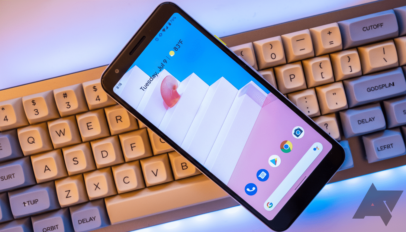
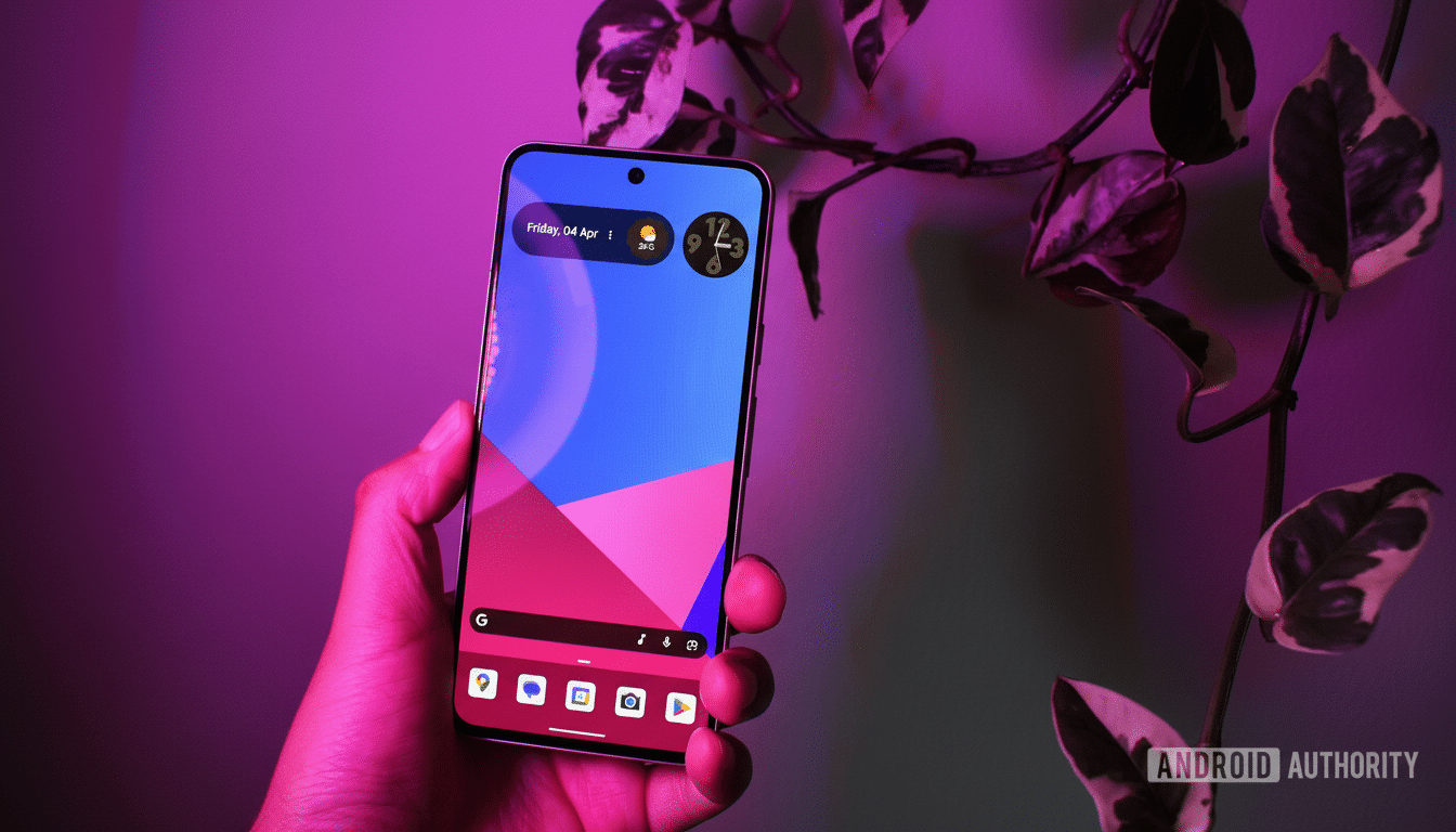
Readers are in the corner of Google’s default home screen, the one that came in higher than all of the popular third‑party competition in a recent poll with over 1,400 votes, and it offers some clues about what users really want on Android: a reliable home screen with useful defaults and enough customization options to get out of your way.
What the poll reveals about launcher use and preferences
Close to half also said they just stay with Pixel Launcher because it’s already got what they need when looking for something. Around one‑third do use alternatives, reflecting a healthy ecosystem, but about 14% conceded that they just don’t feel inspired to change. Another 5% didn’t even know they could replace the default launcher at all — a continuing discovery hole on Android.
- What the poll reveals about launcher use and preferences
- The secret sauce: At a Glance and integrated search
- Why you may feel it is smoother than third‑party rivals
- Where third‑party launchers win and still lose to Pixel
- The often‑requested features wishlist from our readers
- The bottom line on Pixel Launcher versus its rivals

Curiously, the home screen search bar is a key part of the Pixel experience, but another query revealed that 40% see it as wasted space. That push‑pull — the satisfaction in default, but the craving for more control — is where we find the Pixel Launcher’s line of strength and greatest room for growth.
The secret sauce: At a Glance and integrated search
Two features anchor the Pixel experience: At a Glance and Google’s prominent, universal search bar. It surfaces live, context‑aware info — whether it’s severe weather alerts, commute times, flight boarding gates, package tracking, or even gate changes — without opening an app. It taps into Android System Intelligence to surface the right card at the right time, and that “ambient utility” has been difficult to say goodbye to once I’ve lived with it.
The search bar, meanwhile, taps on‑device intelligence to find apps, contacts, settings, and shortcuts, and combines them with web results. It’s fast, consistent, and — crucially — integrated. Whether users love or hate that this space exists, it speeds up the path to action more reliably than many bolt‑on measures. Google’s own support documentation stresses the importance of this job, and it becomes clear when using the pair together.
What’s layered on top are Material You theming cues added with Android 12, fluid animations, and tight lock screen hand‑offs for things like Now Playing. Combined, they provide a sense of coherence and unity which third‑party launchers find difficult to match without resorting to extensive system hooks.
Why you may feel it is smoother than third‑party rivals
Being first‑party matters. Pixel Launcher has private integrations and privileged APIs which affect gesture responsiveness, animation timing, and de‑bezeling of predictive apps. It has the advantage of shipping with the system, so it can cooperate closely with Android System Intelligence to prioritize suggestions, prefetch resources, and not suffer through permission gymnastics (which is holding back add‑ons).

That advantage isn’t just theoretical. Developers of popular alternatives have long reported platform restrictions on gestures, Google Discover integration, and live surface widgets that compete with At a Glance. Now, there are workarounds, but these generally require companion plug‑ins or even accessibility services, which in turn can introduce friction or compromise battery life — trade‑offs most mainstream users don’t want to make.
Where third‑party launchers win and still lose to Pixel
Customization‑first launchers like Nova, Niagara, and Lawnchair are great for managing grids, icon packs, gestures, hidden folders, and deliberate layout tweaks. Power users love these for the very knobs that Pixel Launcher refuses to turn, such as complete widget‑resizing freedom, row‑and‑column counts, and tearing out that search bar entirely.
But the poll indicates that most users won’t sacrifice integrated smarts for tinkering room. This is part of a larger trend that can be seen in consumer tech: good defaults beat raw flexibility. Counterpoint Research has observed a consistent upward trend in Pixel shipments across North America, and as more people live with Pixels right out of the box, that “it just works” magic begins to multiply for the default launcher.
The often‑requested features wishlist from our readers
Readers have been saying the same thing. They want to add their own touches while still maintaining that Pixel feel. The top asks include:
- The ability to toggle or shrink the search bar
- More options for grid and icon sizes
- Greater control over At a Glance (like resizing or choosing cards)
- Extra freedom with home screen widgets
None of these requests would weaken the launcher’s foundation; they’d simply minimize the number of users jumping ship to clones that look like Pixel but also add a couple of extra switches.
The bottom line on Pixel Launcher versus its rivals
It’s not that Pixel Launcher does it all; it just does what we want. At a Glance is genuinely functional, search is speedy, animations are slick, and system‑level privileges mean consistency. Rivals are still superior for deep customization, but most opt for a more sedate, smarter default. If it also breaks some of the design shackles without watering down the experience, Google can cater to both sides — and convert a reluctant plurality into enthusiastic loyalists.

