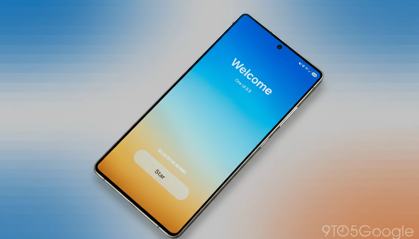
Samsung’s One UI 8.5 beta is here and we have good feelings about performance and polish, but the community doesn’t see eye to eye on the direction of the visuals themselves. There’s generally high enthusiasm for the update in a recent reader poll, though more than a healthy handful of users don’t love some aspects that seem to have been borrowed from iOS.
The Flashpoint: Controversial iOS-like One UI 8.5 design
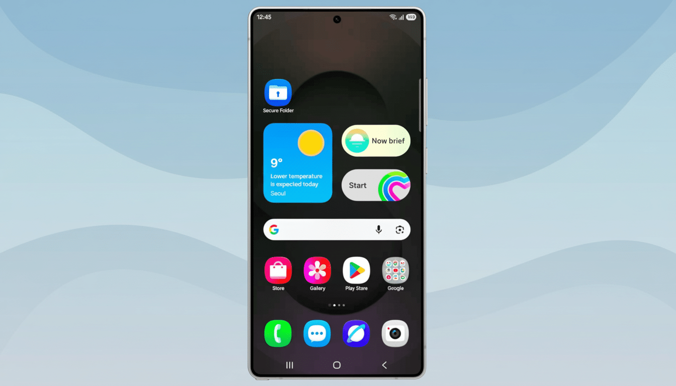
The flashpoint is a series of design changes that adopt elements of Apple’s approach in parts of One UI 8.5. The redesigned Quick Settings — with its more card-like presentation and more closely grouped controls — begs for comparisons to Control Center. Updated Samsung apps — Phone, Clock, and Calculator among them — rely on increased contrast, rounded accents, and simplified iconography that some users complain can evoke (heaven forfend) the conventions of Apple. Even the navigation bar and system typography are more familiar to anyone with an iPhone in their hand lately.
That resemblance is dividing opinion. In the poll, more than 42% said they hate the iOS-like changes and don’t want their Android phone to be an iPhone look-alike. Another 9% described the changes as a nuisance. On the flip side, about 28% took a positive view of the new look while around 20% said they either don’t care or oppose it. The message is plain: The look will tire you right out, even if the content does not.
What users love in One UI 8.5 beyond visual changes
Zooming out from the design dispute, we can at least partly commend the beta. Close to half said they love the update — it’s fast, coherent, and thoughtfully refined. Another 20 percent said it was good, with room for improvement, and just about 14 percent expressed more general dissatisfaction. That gap implies that the feature and performance improvements are finding takers even among those who don’t care for the new visuals.
It doesn’t hurt that One UI is still one of the most customizable Android skins. Power users point to Samsung’s Good Lock suite — specifically modules like QuickStar and Theme Park — as a release valve. These are the tools that let you redesign the layout of Quick Settings, customize icon shapes, alter spacing, and dial back elements you don’t like. In other words, if the iOS vibes aren’t your jam, One UI still provides escape hatches to bring back the classic Samsung look.
Usability gurus have long preached that people like systems because they reward them yet do so in a way that is familiar (so easy to learn) but with an “it’s me” twist. Nielsen Norman Group research also focuses on recognition rather than recall-based interface design, but notes that slavish mimicry may dilute brand cues. That tension is evident here: Users love the slickness but they’re afraid Samsung might lose its inherent “Samsung-ness.”
Why The Backlash Is Important For Samsung
One UI is, for a company with such a wide global reach, a strategic look and feel. Market trackers such as IDC and Counterpoint Research often point to ecosystem stickiness and brand differentiation as essential contributors to loyalty. If One UI becomes too similar to Apple’s design language, it risks diluting one of the drivers that has kept users on Galaxy devices for quite some time.
There’s another wrinkle: cross-platform migration. Research from the likes of CIRP has revealed that platform switches are still few and far between. Advocates for the new visuals have claimed that shared patterns reduce consideration friction among switchers; critics counter that similarity eradicates reasons to stay. The poll numbers reflect that disagreement — most are fine with the polish, but barely more than half want to see a look that smudges distinctions between two competing platforms.
What Samsung can do next to balance identity and polish
The best way forward is to tighten up some. Throwing in a “Classic Quick Settings” toggle, various corner radius sliders, and more specific icon set options would surely appease anyone seeking the cleaner, modern UI Samsung is pushing for without preventing Samsung from doing so. Expanding the reach of Good Lock — allowing users to return app headers or get back glyph styles or legacy spacing as well — could also soften the backlash and show off Samsung’s customization advantage.
(The company doesn’t have to lose sophistication in order to preserve identity.) Subtle cues via unique movement, type styled for One UI, and familiar button hierarchies can help the Galaxy family stand apart even as they share a rather broad design vocabulary with its rivals. Apple has swiped from Android over the years and Android has swiped from Apple, but all that matters is Samsung’s interpretation of this when you pick it up still feels like a Samsung phone.
For now, the House of Marbles judgment seems nuanced: One UI 8.5 is a hit on merit — but that iOS-style sheen is still a bit of a fly in the ointment. If it tips deeper into user choice, and doubles down on its signature touches, Samsung can keep the momentum — and the identity — without alienating fans who are why One UI was a standout in the first place.