Netflix is introducing a kids’ profile experience, including a new homepage, top navigation bar, and dynamically updated characters for children’s favorites to make it easier for kids to find their favorite content faster — and without having to scroll as much.
The update comes with the service’s new TV interface for standard profiles but adds kid-specific touches and retains familiar features that parents and young viewers are already used to.
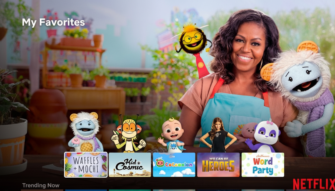
Central to the refresh is a streamlined design as well as a “My Netflix” area that aggregates what each child has seen, saved, and enjoyed. For families for whom rewatching is a given, that single repository makes hunting down Gabby’s Dollhouse, CoComelon, or a favorite animated special possible in a couple of taps or clicks.
What’s New in Netflix Kids Profiles and Features
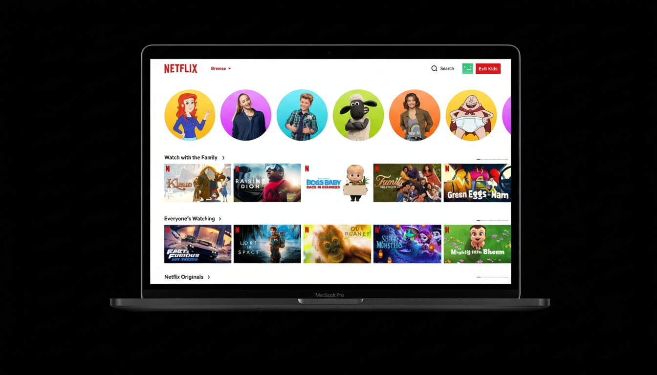
The most apparent change is a condensed top bar that connects directly to My Netflix. Rather than wade through rows, kids can leap to a personalized shelf of recent picks, watchlist titles, and evergreen favorites. The design also focuses on large art and more legible text to not only cut down on reading but decision fatigue as well.
Now, recommendations will update in real time as kids browse. That is, the homepage responds to whatever a child has just clicked or skipped — a small but significant change that can add up over time and help keep attention focused on content rather than menus. Netflix claims this reflects how its adult profiles currently respond to actions, with the model being adjusted for a younger audience.
Evergreen features are also back: Character-themed rows still allow kids to choose videos by their favorite characters, the Mystery Box that serves up surprise selections from viewing history reappears, and all existing parental controls carry over without change.
How the New Design Is Crafted for Kids’ Viewing Habits
Children often gravitate toward the same shows over and over, either for comfort, to master storylines, or just because they know that song will land. By centering My Netflix and making re-entry to familiar titles frictionless, the redesign acknowledges that repeat viewing isn’t a fringe case — it’s the default mode for many families.
The latest census of youth media use by Common Sense Media found that tweens spend hours a day with screen media, and streaming is a key activity. In that context, small UX improvements — less fiddling, clearer rows, auto-reordering — can lead to outsized benefits for children and caregivers attempting to guide choices.
The live updating of recommendations also matters for younger users, who often act fast. Rather than static carousels, the interface adjusts itself minute to minute, happily bringing up more of what connects and quietly pushing downward things that failed to land.
Part of a Wider Product Strategy Across Experiences
Netflix presents the update as laying a foundation for an increasingly flexible canvas that can accommodate new content formats. With the kids refresh, the company is investing in interactive experiences — real-time voting, live party games, and podcasts — which demand interfaces that can do more than a series of traditional rows of tiles.
One of the first examples is scheduled real-time voting for the upcoming series Star Search, after trials on Dinner Time Live with David Chang. It’s not a kids’ title, but the UI work at play serves everyone on the service — including family experiences that walk a line somewhere between passively watching and interacting lightly with what’s happening on-screen.
Competitors have been nudging in the same direction. Disney+ embraces branded hubs and strong kids’ profiles, while Amazon’s Kids+ bundles apps, books, and video all under one roof. Netflix’s decision to combine discovery with a quicker UI is an overt attempt to meet families where they are and to differentiate with how it is used, not the sheer size of its catalog.
Safety and Parental Controls Remain Central and Key
Parents will notice that content filters, maturity settings, and profile PINs are carried over from previous family experiences to this new one and will remain as guardrails — ones that have been recommended by experts and regulators for child safety — including COPPA in the U.S. and GDPR-K (the General Data Protection Regulation incorporating children’s needs for special protection) in Europe. The redesign centers presentation, not policy, so families don’t have to relearn controls or reset restrictions.
The Mystery Box offers a random selection that can be filtered to a child’s tastes (still opt-in and bound by the profile’s maturity settings). Character Rows maintain character-first navigation and emphasize well-known iconography rather than text-heavy menus to keep things kid-friendly for pre-readers.
Rollout And What To Expect Going Forward
The updated kids’ profiles are rolling out now, and availability will spread across devices as software updates arrive. There is nothing that families need to turn on; the updates will take effect automatically in your existing kids’ profiles.
Based on the service’s recent speed — first reinventing the TV homepage for regular profiles; now tweaking those principles to work for kids — look for iterative tweaks powered by what gets watched and parental input. If the adult redesign was about making TV feel snappier and more helpful, this kids update is about making it calmer, clearer, and more repeatable for how most kids actually watch.