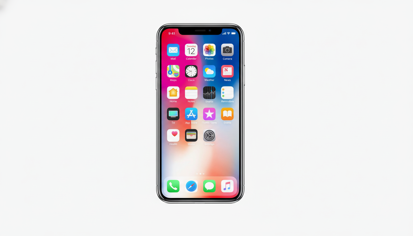
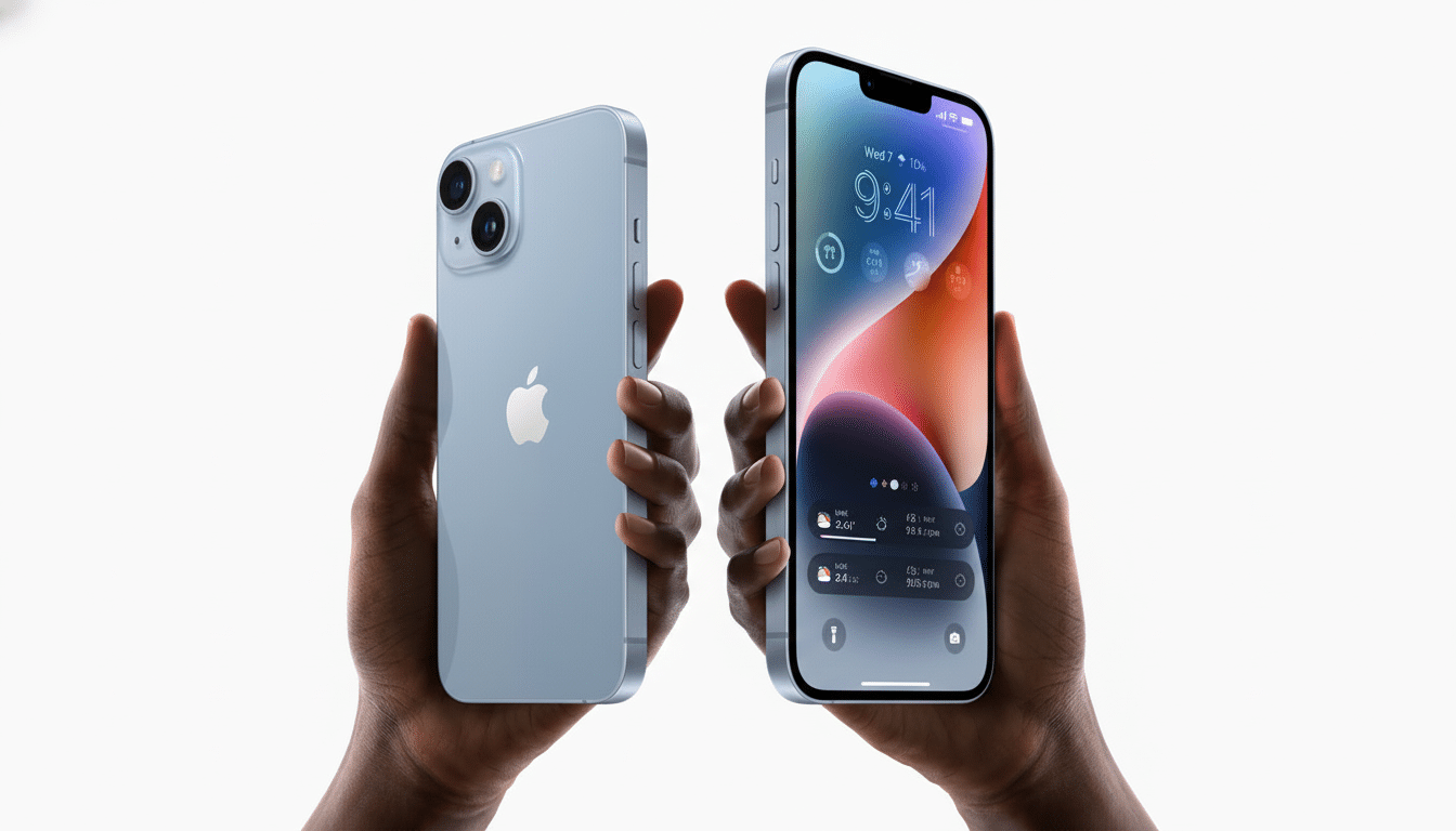
Apple’s “Liquid Glass” design language has a new visual quirk that poses an unusual usability problem for some iPhone owners: the appearance of “crooked” app icons on the Home Screen.
The reports are focused on Dark Mode, which extends the use of gloss highlights on icon tiles and could have side effects that trick your mind into perceiving a tiny tilt.

Reddit posts from the iOS community, shared widely by Apple-focused sites, include screenshots in which the top-left highlight on icon tiles creates an exaggerated sense of perspective — as though the grid of icons is leaning.
While the icons themselves are perfectly aligned, the lighting model can cue your brain into reading the shapes as misaligned — which brings us back to a classic optical illusion.
What’s behind the iPhone “tilted icon” effect
Liquid Glass depends on simulated specular highlights — those glossy, edge-catching glints you’d see on real glass — to lend depth to otherwise flat tiles. In dark themes, these accents pop out on top of a dark backdrop. The tilt illusion has been described by numerous lab-based demonstrations — it occurs when the specular line follows closely enough to the upper-left boundary at certain angles, as though it’s a variation of well-studied “lighting direction” or the “tilted frame” phenomenon.
Users point out that this effect is especially pronounced in snapshots, when the lighting cue stays static and your eyes jump back to the misread geometry. In motion, the highlight is intended to follow device movement on models with dynamic rendering enabled, which improves perceived tilt for some — but adds a new issue of smooth-motion sensitivity for certain users.
Why some people feel dizzy from icon highlights
Motion and shading cues on screens can be at odds with our brain’s expectations, and this discrepancy is a known cause of headaches and dizziness in users who are sensitive to the effect. Apple has encountered this in the past: Parallax and zoom animations were so disorienting when they debuted years ago that they triggered claims of nausea until Apple provided stronger controls for accessibility. Groups like the Nielsen Norman Group and the W3C’s accessibility guidelines have long recommended minimizing motion and providing opt-outs — because a meaningful number of users report experiencing discomfort from some effects.
The Liquid Glass highlights aren’t a full‑screen animation, and they’re still capable of simulating micro‑parallax on the icon tiles. That may be enough to make some viewers feel a little nauseated, especially if they have vestibular sensitivity or are prone to migraine; even the slightest movement or a sustained “off‑angle” cue can lead to discomfort, especially when displayed dozens of times a day on the Home Screen.

How to minimize the discomfort right now
There’s no specific toggle for Liquid Glass, but a couple of settings might put you on the right path. Some users report that Low Power Mode diminishes, limits, or eliminates some real-time highlight behavior, which makes the effect less obvious. Changing to Light Mode reduces the specular edge contrast, which can diminish the illusion on many wallpapers.
- Settings > Accessibility > Motion > Reduce Motion and Prefer Cross‑Fade Transitions cut down on parallax and zoom, two common sources of disorientation.
- Settings > Accessibility > Display & Text Size — increased contrast and reduced transparency can tone down reflective highlights.
- Some users customize icons through Shortcuts to favor flat, matte designs that circumvent the glossy aesthetic entirely.
Will Apple make any Liquid Glass design changes?
Apple frequently iterates on interface polish following large visual overhauls, especially when widespread user feedback indicates unease. Accessibility best practices would suggest providing more granular options — for example, a “reduced gloss” or “static icons” setting — to allow users to keep the new design language without motion- and shading-based triggers.
Developers have less influence over the system-imposed tile treatment, but they can check icon artwork for how it interacts with the highlight (and ensure their app interfaces respect the system’s reduced-motion preferences). For Apple, a slight change in lighting angle or lighting intensity in Dark Mode can wash out the cue and preserve the intended depth.
The bigger design takeaway for Apple’s UI polish
Depth cues help keep a modern UI from feeling flat and cheap, but they’re also strong enough to fool perception. When those cues overlap with high-contrast themes and micro‑motion, they can cross from delightful into disorienting. The lesson isn’t to avoid polish but to make it optional, predictable, and forgiving — most of all on screens that people live with all day long.
Complaints like this trickle out, so look for a software revision that dials in how the highlight behaves or adds a user-facing switch.
Until then, a couple of accessibility toggles and maybe a brighter theme (or at least some wistful wallpaper) will get it to a more stable place for your brain.

