One UI 8.5 build on a Galaxy S24 Ultra has leaked, and the amount of information we’re hearing so far about Samsung’s next interface refresh is rather out of the ordinary.
Initial hands-on testing, first reported by SamMobile, shows an overhauled look that spans quick settings, core apps, the camera, and the lock screen — pointing to 8.5 being more of a major, against-the-grain–type step up than the incremental leap from One UI 8 likely is.
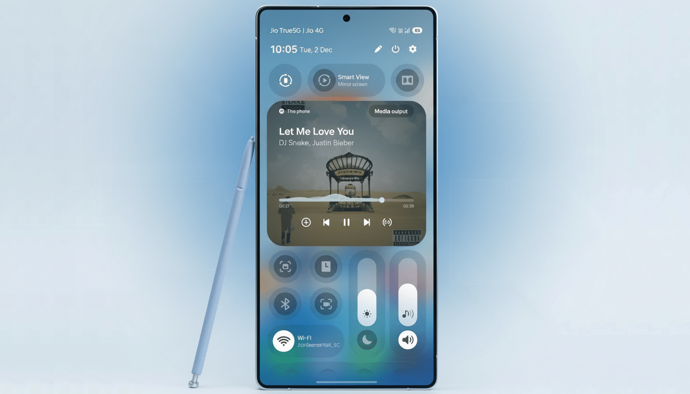
Quick settings gain a major redesign and new controls
The most obvious overhaul lands in the quick settings panel. The brightness and volume controls can be separated, resized, and turned into vertical sliders — offering similar precision and thumb-friendly reachability as the iOS-style control layout. Toggles are also categorized and can be pinned outside of the collapsed panel to make a permanent “at-a-glance” area for things like hotspot or flashlight.
All of that is a marked departure from One UI 7 and 8, where the extent of customization more or less ended with being able to reorder tiles. The new layout seems geared for larger-screen usability with less finger-sweeping, necessary on the S24 Ultra’s 6.8-inch display — a swipe-less, get-more type approach. Design researchers at Nielsen Norman Group have been arguing for bottom-weighting controls on big phones; Samsung’s vertical sliders adhere to that principle, keeping fine adjustments closer to the thumb.
Focused refinements for system apps improve clarity
Several first-party apps have been decluttered for clarity and speed. Device Care is less cluttered with larger usage bars and less text. The idea is to make navigation faster and reduce the number of taps required to get status information — for battery and storage, say — as you monitor on the go.
The Search feature in the Settings app moves to a more prominent position at the bottom of the screen and clears descriptive text from category headers. That makes the list feel lighter and easier to skim, but it might make people more dependent on search for options that are used less frequently. One UI features a new hallmark: bottom search bars, which make one-handed reach better on big phones.
The Files app changes its organization of the six top-level categories from a 2×3 grid to a single row along the top, and shifts Downloads to become a separate menu item lower down. The top-right icon is now a floating search bar, as thumbing your way through UI screens becomes the norm.
The Phone app puts keypad, recents, and contacts into a floating pill at the bottom. It’s a minute change with outsized ergonomics: it lands directly at the very place where your thumb comes to a stop, and fits nicely alongside gesture navigation and other One UI rounded, floating bits.
Camera and lock screen changes emphasize usability
There’s a restructuring of the camera app settings in general, which brings more high-impact toggles such as video format and external storage to the fore instead of being buried under “Advanced video options.” That’s good news for creators moving between social clips and higher-bitrate footage. In Pro photo and video, a new button to the left of the lens selector dismisses nearly all on-screen UI — only the shutter and lens switch remain visible — so you can take advantage of that vast viewfinder.
On the lock screen, it can now recognize faces and pets and reposition the clock and widgets so a face or pet is not blocked. It’s this sort of context-aware design that belies a more thoughtful approach to layout, which in turn translates into meaningful gains in day-to-day polish — not dissimilar to the clever masking effects you see on rival platforms.
Why these One UI 8.5 changes matter for daily use
Everything throughout the build curves to face the users and aims to provide an element of predictability. The vertical sliders, floating pills, and bottom-aligned search help its reachier body shape and make muscle memory better (especially important when the S24 Ultra is so big). The categorized quick settings also tackle a common pain point: navigating an increasingly long list of toggles.
There are trade-offs. Taking away labels in Settings might increase the learning barrier for less savvy users, although it’s something of a streamlining. But Samsung’s move nudges people toward search, which research and telemetry across the industry indicate is the quickest way to access hidden options.
What to expect next as One UI 8.5 approaches release
Since this is a pre-release build, features and appearances are subject to change before public release. Samsung usually tests significant One UI updates on its S-series flagships first, and this leak fits right into that tradition. Industry watchers expect the Galaxy S24 line to go into beta soon, with a wider release following if feedback is positive and things look stable.
For existing owners of the S24 Ultra, with One UI 8.5 it’s more about a few brushstrokes than a whitewash job: easier access in quick settings, system apps that are less bloated, and camera changes for creators. And as Samsung continues with its extended support roadmap for recent flagships (which promises years of updates), you can expect this same kind of refinement to continue, considering how they’ve iterated on the same design language rather than reinventing it.
Bottom line: if the leaked build pans out, these subtle changes mean One UI 8.5 is well on its way to becoming Samsung’s most practical, accessible update in some time; it’s centered on reachability, speed, and a more unified visual system across the S24 Ultra’s everyday touchpoints.