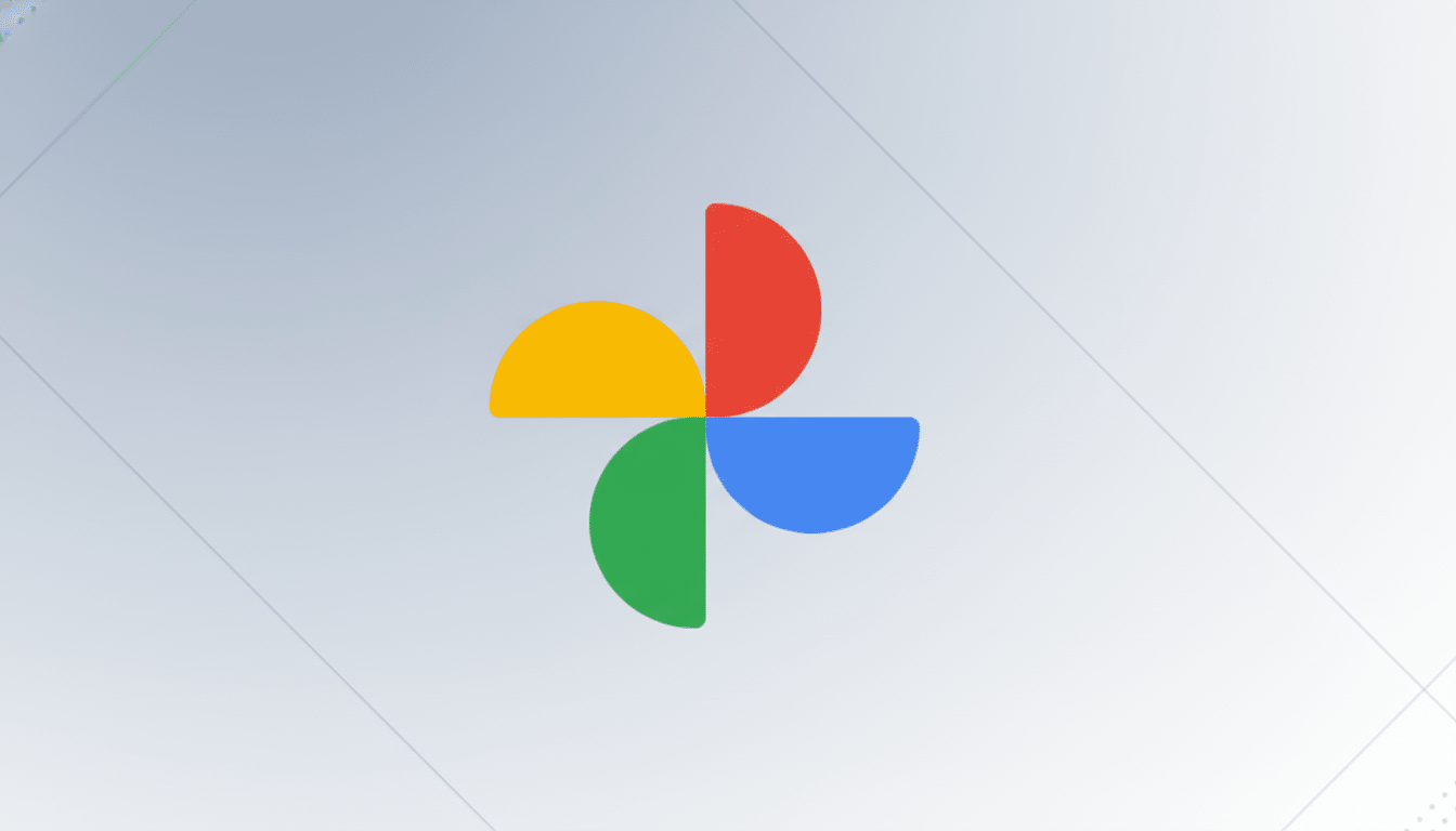
Two of Google’s most popular apps are getting a new look. As reported by 9to5Google, new Google Photos and Google Maps icons are on the way. The two are eXpected to shift to a more stylish gradient design that aligns with the company’s current branding. Photos posted on X show more polished versions of the current designs rather than complete rebrands.
At first sight, the differences might seem minor, but they are intentional. Google has been working to give its product family a uniform look focused on artificial intelligence, and these new icons contribute to that effort. For billions of users, Photos and Maps are among the most noticeable ways to experience this on their phone home screens and car dashboards.

What the new Google Photos and Maps icons look like
Although the Google Photos image has been released, the pinwheel contour and core four-color scheme persist. Rather than discrete petals, the gradients blend together more smoothly. The design does not read as “as flattened” as the previous version, introducing a subtle sense of depth.
Google Maps continues to use the map pin design. The update appears softer in its transitions between color and light and in the differentiation of shades across the various hues. The light-and-dark distinction, which guarantees readability on small displays and in dark mode, is slightly desaturated. In other words, every shape remains consistent with the previous graphic—a well-proven strategy for retaining most of the visual identity.
The imagery was reported by 9to5Google and surfaced on X through side-by-side comparisons. Google has not made an official statement, but the design direction fits with the company’s ongoing visual system update. Most of Google’s product icons have already been unified over the last few years. Notably, Google merged its productivity suite into Workspace in 2020 and subsequently shifted Gmail, Drive, Docs, and more to a four-color system. In recent years, Google has also brightened its color palette and introduced shading as part of what it describes as an AI-powered era. It makes sense to do the same with Photos and Maps.
Millions of people globally use Maps, where it appears on car dashboards, watch faces, and smartphones. Millions also use Photos, which stores trillions of images, with tens of billions added every week, making it a crucial part of people’s personal cloud computing and digital memory. In all these high-frequency touchpoints, consistency is key to brand appeal and accessibility. On a simple level, subtle gradients can enhance contrast on modern OLED displays and scale more cleanly on the densest screens.

Material Design remains a core principle across Google’s ecosystem; Material You in particular emphasizes subtlety, scalability, and a hint of depth while keeping things clean.
When the new icons could start rolling out to users
Google generally follows a staged release pattern. The first things to change are likely the app icons across platforms, starting with Google Maps and Google Photos. Updates are likely to arrive via the Play Store and App Store, followed by changes to favicons, marketing materials, and other surfaces. Android Auto and Wear OS are also likely to be updated. There are usually early beta builds or test rollouts before wider availability.
Until Google confirms the redesign, consider the images reliable but unofficial. That said, the look is consistent with the company’s most recent brand cues, suggesting a deployment in the near term.
What users should expect from the refreshed app icons
Functionality is not changing. Your saved places, navigation, backups, and editing tools will work the same. The icons, however, may read slightly differently on a busy home screen and could make visual searching a bit slower for a moment. Decades of user experience research show that maintaining stable silhouettes—something Google is doing—helps counteract that effect. If history is any guide, reaction may be mixed at first, as it was for 2020’s Maps and Photos redesigns, before swinging overwhelmingly positive. Familiar silhouettes plus new finishes are a well-proven playbook for feeling fresh without jarring change.
How the icon refresh fits Google’s broader brand update
The reported icons for Photos and Maps are part of a broader tune-up across the Google portfolio. From the polish of Pixel hardware visuals to an ongoing refresh of core services, the updates include Gmail. Material You is Google’s user-friendly interface that is identifiable and iconic. Keep an eye on official channels and the Play Store app update history; your home screen might be in for a shiny new refresh any minute now.

