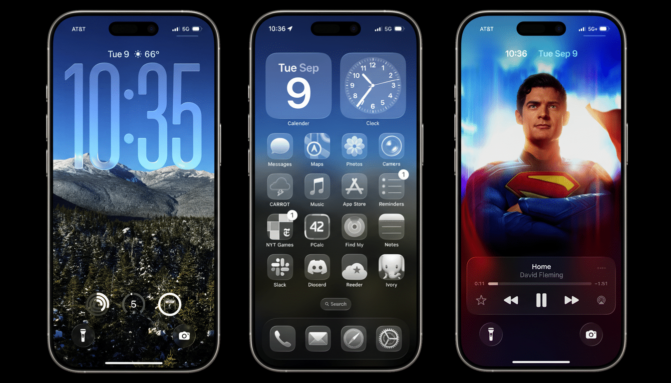
Apple’s newest iPhone update is inspiring an unexpected backlash for a trivial — yet hard-to-not-see — design flourish. iOS 26 users report that the dark mode of the Home Screen now gives app icons a faint off-axis appearance, as if they are leaning. The effect is produced by a soft glow that pools in one corner of each icon, which gives the impression of tilt, and some people find it distracting and, in a few cases, vertigo-inducing.
“Tilted icons” looks have been widely reported on Reddit, among which more upvoted threads feature reports of icons looking “off-kilter” against darker wallpapers. Mac Observer also reported the new makeover, which seems to be a part of a wider graphical refresh that gives icons depth and a nice liquid shine in dark mode. The intention is evident: make icons stand out against the inkiest of backgrounds. The reaction, less so.
What users are seeing on iOS 26’s dark mode Home Screen
Many app tiles under dark mode now display a soft, single-corner cluster of highlight combined with a faint shadow at the opposite corner. Against a black or near-black wallpaper, that asymmetry of light can be interpreted as an angle. In motion, the effect is stronger — especially if you add iSpy-level wallpaper or employ some parallax tricks that switch depth cues as you tilt your phone.
For others, it’s barely a tweak at all. For some, it’s a feast for the eye. Many users have reported that the highlight is incorrectly offset compared to the grid, which causes everything in the rows to feel a bit rotated. A minority also report mild dizziness — not uncommon with high-contrast gradients or occasional parallax. Designers who care about accessibility have warned for years that light prompts combined with depth effects can cause discomfort in susceptible users.
Why the design can sometimes feel “tilted”
Our brains deduce an object’s three-dimensional shape by analyzing its surface, the patterns of light and shadow that those surfaces catch. Add a bright hotspot on one edge and a darker falloff on the other, and the surface can appear to lean, even though it’s flat. It’s probably the culprit in this one: a stylized light source that heightens perceived depth but also brings with it a directional cue. It stands out against dark mode’s low-luminance screen background, magnifying the illusion.
This is not entirely unexpected. Apple’s Human Interface Guidelines stress how depth and lighting can communicate hierarchy, but they also advocate for harmony on the grid. Accessibility guidelines like the W3C’s advice for vestibular disorders also recommend reducing motion and high-contrast illusions for people affected. In reality, a design that appeals to one set can jar another.
Bug or deliberate aesthetic in iOS 26’s dark mode icons?
Thus far, reports by the community indicate an intentional design rather than a rendering bug. They even glow with highlights and shadows, right in line with other “glassy” elements brought around the system. That Mac Observer write-up describes the effect as part of iOS 26’s updated dark mode iconography. And there is developer chatter that leads me to believe this is a system-wide phenomenon and not just per-app.
Apple hasn’t weighed in publicly, but it has a history of dialing back controversial UI decisions after the fact. Early feedback in previous iOS cycles resulted in rapid changes to the layout of Safari and the tinting of Home Screen icons. If complaints continue — particularly with accessibility concerns tacked on — I wouldn’t be surprised by a switch or decreased-intensity setting.
Workarounds you can attempt in the meantime
It’s not immediately apparent how to turn off the new look. Rather than jumping into the Settings, long-press on the Home Screen, tap Edit in the upper-left, and select Customize. From here, either choose a lighter theme or one that ratchets down the glossy treatment. This, many users say, immediately neutralizes the “tilt” illusion.
System accessibility tools can also help offset the effect. Under Accessibility, consider (if not try) Reduce Motion to tame parallax, and Increase Contrast or Reduce Transparency to take the glow off dark backgrounds. Use a black wallpaper, not pure black but a mid-tone. This could additionally help to reduce the gradients around highlights of icons.
If you are switching to dark mode mainly for comfort and not because you like the way it looks, consider trying a scheduled theme that changes from dark at night to light by day — or even use the lighter Home Screen theme in combination with keeping dark mode in apps. Nielsen Norman Group has pointed out that dark themes can still reduce glare, but aren’t inherently more readable; the “better” option may temporarily be a matter of context or individual sensitivity.
Why this matters for iOS 26 users and Home Screen comfort
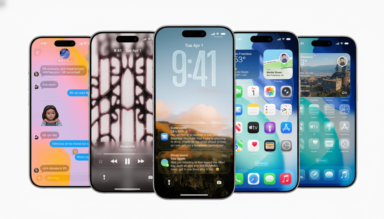
Dark mode isn’t just a fringe feature. Historical adoption figures from industry trackers have shown that the vast majority of iPhone users upgrade to new releases of iOS soon after launch, and several consumer surveys over the years suggest that a clear majority prefer dark themes at least now and then. Small visual changes in a high-use mode spread far and wide, especially when perception and comfort get involved.
To put it on its feet: That “tilted icons” look seems to be a matter of style, not a problem you can’t use your phone with, and it’s fixable through Home Screen customization and accessibility preferences. Power users might enjoy the extra dimensionality; not all of us will prefer it. The onus will be on Apple to tweak that balance more finely — striking depth without causing visual drift.