Apple is hand-delivering another dial for Liquid Glass. With iOS 26.2, the company tacks on a control to cut down the “glassiness” of the Lock Screen clock, changes that were cited in readability complaints after last year’s sweeping interface makeover. It’s a tiny switch with huge implications: Apple is iterating publicly on its headline design language, and this time the fixed position lands right where many people direct their gaze dozens of times each day.
Why Apple Is Scaling Back Liquid Glass on iOS 26.2
Liquid Glass, which arrived as part of iOS 26, took semi-transparent, refractive layers across the UI, from buttons to banners. Its effect was at once modern and spatial, possibly a stepping stone to heads-up interfaces and future wearables. But as backdrops got busier, everyday elements such as notifications and media labels could become lost. That gap was evident quickly in feedback on Apple Support Communities and accessibility discussion boards, where legibility and contrast were common buzzwords.
To its credit, Apple was first to respond with iOS 26.1’s systemwide opacity slider that toned Liquid Glass down. iOS 26.2 gets still more granular: You may now ratchet back the transparency of the Lock Screen clock without taking down the whole interface with it. Rather than calling for a global retreat, Apple is moving toward more fine-grained personalization, a trend it has increasingly embraced since the Lock Screen overhaul in recent releases.
How the New Clock Slider Works on the iOS 26.2 Lock Screen
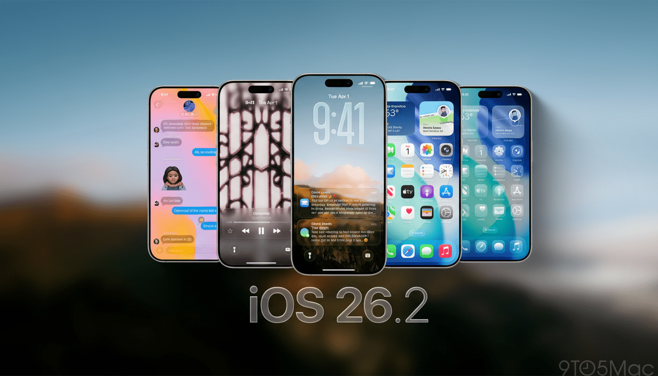
The control is in the Lock Screen customization panel. When you adjust the clock, you tune that transparency so type sits crisply against photos and dynamic wallpapers. In practice, any less glassiness is a boon for those high-detail images and Live Photos, in which motion and texture could obscure fine lines.
This is not a one-size-fits-all setting. If you like the airier Liquid Glass look then stick with the default; otherwise, if usability at a glance is more critical for you, push toward a frosted, higher-opacity style. The selection accounts for an array of settings — from low light in the bedroom to bright sunlight during the commute — where contrast demands shift over the course of the day.
Accessibility and Readability Implications
Readability is not merely taste; it is measurable. Guidelines such as WCAG 2.1 specify a contrast ratio of at least 4.5:1 for body text. Even though Apple doesn’t release ratios for Lock Screen content, the new slider can get you closer to those benchmarks on challenging colors and patterns. I firmly believe translucency should never come at the expense of critical text, especially for things like time checks and notifications where you’re taking a quick glance. Companies such as Nielsen Norman Group and WebAIM have long criticized the use of translucence to obscure important information.
The move is also in line with existing iOS accessibility options — like Bold Text, Increase Contrast, and Reduce Transparency — but without having to force users to pick a sledgehammer switch. For lots of people, a specific Lock Screen tweak is that line between a beautiful wallpaper and an actual readable phone.
Signals from a Changing Design Team at Apple
The timing adds context. Apple has recently formalized a high-profile transition away from the manager of Liquid Glass, Alan Dye, who is leaving for Meta; instead, longtime interface specialist Stephen Lemay will step up. His personal history hinging on interaction craft indicates he might bring a more practical eye in tune with touchpoints where form meets function — where users experienced Liquid Glass as overachieving. The retrenchment on the clock seems more like a surgical adjustment, rather than a rejection of the vision.
What else arrives in iOS 26.2 beyond the Lock Screen
In addition to Lock Screen tuning, iOS 26.2 introduces new AirDrop codes that let people not in your contacts become temporarily recognized as AirDrop recipients for 30 days — great for teams and events! Reminders gets alarm support, Apple News gains a Following tab for easier curation, Apple Music supports lyrics offline, and Podcasts can now accept AI-generated chapters and include a feature that name-drops other shows within episodes. Apple Watch wearers also receive a new Sleep Score that lumps together goal adherence and sleep stages into a single metric.
Security is also part of the release narrative. Apple releases patches for iPhone, iPad, Mac, and Apple TV devices in response to three security flaws under active attack. The company’s security notes make a point of calling out how quickly it deployed mitigations across platforms — a trend we’ve seen in recent cycles where feature drops ship new code with hardening work.
What It Means for Users and Developers on iOS 26.2
For users, it’s a pretty clean, bottom-line message: Liquid Glass isn’t all or nothing. iOS 26.2 puts an invigorating spin on the design language, particularly on the screen you look at most. For those of you who loved the texture but had a hard time with contrast, this is the compromise you were after.
And for developers and designers, the signal is even clearer. Apple is adopting adaptive transparency that bends to context and content rather than a fixed aesthetic. Look for even more per‑element controls and heuristics that preserve legibility as the UI scales between phones, ambient devices, and wearables. The outcome would be software that appears as glass, but reads as ink.