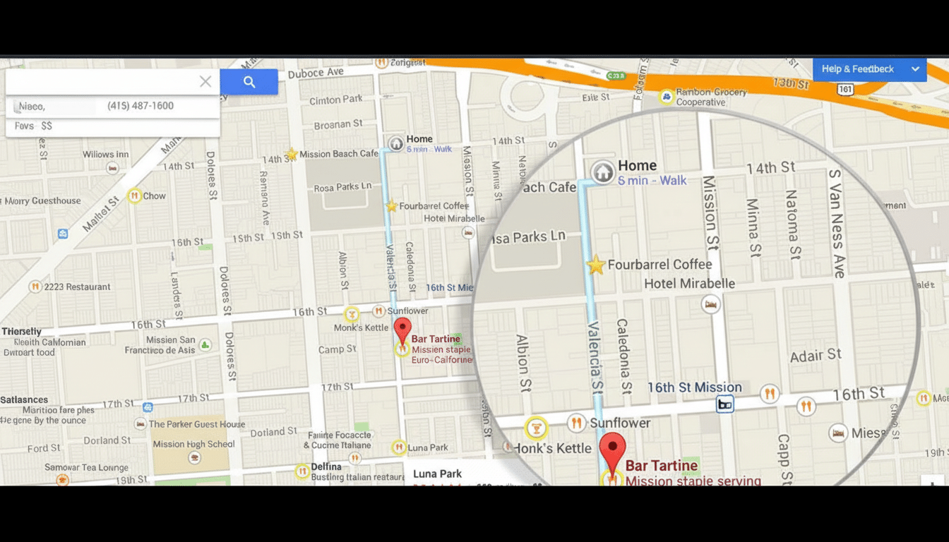
For a product whose entire purpose is to keep focused drivers from getting distracted, Google Maps on Android Auto still feels like it treats its interface like some sort of locked-in-amber museum piece.
When colors change on their own after an update or text contrasts unexpectedly, the screen requires more attention at the least opportune moment. It’s long overdue that Google allowed drivers to customize Maps’ appearance and layout in the car, bright coloring and all.
Why Customization In Android Auto Maps Improves Safety
Distraction isn’t abstract. The National Highway Traffic Safety Administration points out that taking your eyes off the road for five seconds at 55 mph is enough time to cover the length of a football field. The Virginia Tech Transportation Institute found that even just two seconds of eyes-off-road time more than doubles crash risk.
Clear, consistent visuals speed up those glances a little. For millions, availability exacerbates need: The National Eye Institute says that color vision deficiency strikes roughly 8% of men and 0.5% of women. Allowing users to select higher-contrast color palettes or other traffic colors would help them parse gridlock with a quick glance.
There are existing, well-established web standards for legibility. World Wide Web Consortium guidelines focus on contrast ratios for text and key UI. In a car, those fixed factors—glare and tinted glass and bright sun—are constant variables rather than hypotheticals, meaning the argument for adjustable contrast, font size, and line thickness is even more compelling.
The Current State Of Mapping On Android Auto
So Google Maps remains one of the better, more accurate navigation apps you can find out there, but that Android Auto experience is—it’s just too rigid. Colors, traffic line width, text size, and icon density are all effectively permanent. When a bug or back-end tweak leads to road surfaces being darkened and congestion overlays being bleached out, drivers have no choice but to soldier on.
Voice is not a complete substitute. The AAA Foundation for Traffic Safety has found that complex infotainment activities can add to a driver’s cognitive load, while digital assistants often misunderstand some commands in noisy vehicles. And visual verification still certainly can matter, which puts the onus firmly back upon legibility.
What Drivers Want From Google For Android Auto Maps
Try using a color and contrast picker navigable in real-time. Provide pre-set profiles for Day High Contrast, Night Reduced Glare, and Color Vision Assistance, as well as the ability to set road, traffic, or background hues. Place sliders for line thickness and label size, as well as a toggle to simplify the map by hiding unimportant tertiary POIs while zooming or panning.
Next, allow for layout flexibility within reasonable guardrails. You should be able to resize (or minimize) side panels, select which side turn lists show up on, and pin your favorite controls. Profiles could automatically change according to the ambient light or time of day, although a driving lock keeps you from making sweeping changes while in motion.

Crucially, changes must be predictable. If an update changes a default style, what’s saved on the user’s profile shall remain intact. That stability minimizes the need for relearning and maintains glance time relatively constant from one drive to the next.
Precedents Show Customization Is Feasible And Safe
Open-source favorite OsmAnd, meanwhile, already demonstrates a similar model with profile-based UIs and various map styles (from touring to winter sports) that surface decision-independent data.
Google’s Waze sibling has always had and continues to have day and night color schemes in addition to the theme modifications that a lot of drivers—myself included—find easier on the eyes.
Google pipes the plumbing elsewhere, too. The Google Maps Platform permits developers to heavily style maps with JSON, changing colors of roads, labels, and landmarks for apps and embedded sites. Translating some portion of that styling power into safe, filtered presets created for Android Auto is well within the software’s capabilities.
The Scale And Stakes For Android Auto Map Design
Android Auto and cars with Google built in run on a hugely diverse range of dashboards, displays, and settings around the world. And at that scale, one-size-fits-all images invariably fit no one well. By giving drivers choices, it would make variability—sun glare, tinted windshields, and aging eyes—a problem that could be solved.
There’s a business upside, too. Better access lowers legal and regulatory risk, while customizability is a point of differentiation from competing ecosystems. More importantly, improved legibility fits with Android Auto’s mission statement: reduce distractions and keep drivers’ eyes on the road.
Bottom Line: Let Android Auto Maps Offer A Palette
Google would do well not to wait for the next UI or UX stumble to reeducate drivers on how precarious a Puccini score an unchanging map can be. Provide clear, defended customization for color, contrast, typography, and layout, with easy ways to save and synchronize profiles. The technology is there, the safety case is strong, and the precedents are already on the road.
Allow drivers to configure Maps the way they do mirrors and seats—once, correctly, with confidence that it won’t change without their approval.