Google will be testing another Gemini visual flair on Android: a new overlay animation that envelops the entire display in sliding gradients.
The change is starting to appear with the latest Google app build, so this is probably one of those server-side switches that won’t require an update from the Play Store. Regardless, there’s obviously still a lot of iteration being done on how the assistant’s various snippets are presented following a “bouncy” refresh just last month.
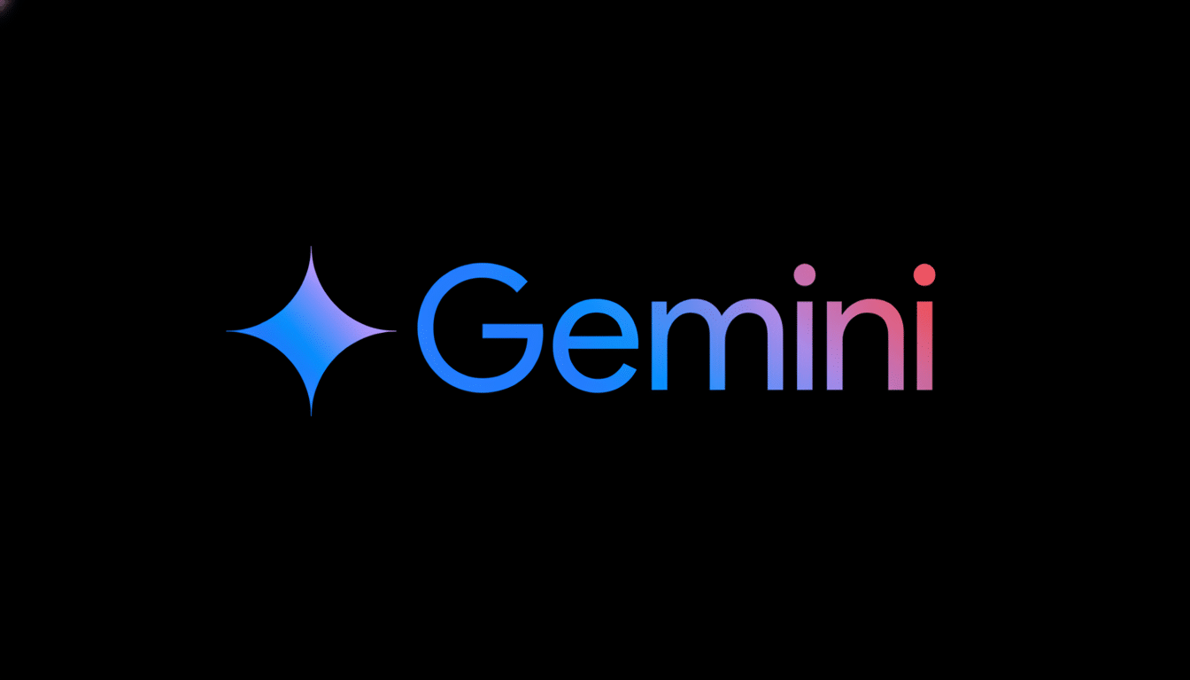
What the new Gemini overlay animation looks like
Code pointers in the Google app version 16.41.34 suggest a new animation where all four edges of the screen light up with gradient colors similar to the Gemini logo. Rather than the standard four-dot swirl in Google’s primary colors, this design plays with smooth, mixed hues that pulse along the edges as that overlay draws out and retracts.
From a visual perspective, the effect comes across as more atmospheric than the existing spinner. By putting it in a frame, it suggests that Gemini is something above the rest of the layers (interesting how this correlates with what an “overlay” is currently doing – just a very light layer which we can summon from anywhere without dismissing anything completely).
It’s a slow but significant pivot. Previously, tests had concentrated on round shapes and elastic motion; this version emphasizes ambient color and edge focus, which can suggest presence without overwhelming the contents of the center screen.
Why Google Is Always Tweaking Gemini’s Appearance
Motion is more than decoration. Usability research like that conducted by Nielsen Norman Group has repeatedly found that well-tuned animation can make things feel faster and offer clearer system feedback, especially when transitions last for roughly 200–500 milliseconds. Google’s own Material Design guidelines suggest as much in asking for motion that clarifies hierarchy and relieves cognitive load.
That context qualifies for an AI assistant whose interface bubbles up atop, but not inline, in other apps. An edge-to-edge glow can communicate “I’m listening” or “I’m working,” without requiring the user to look at a small spinner. It can also scale for different device types, from compacts to foldables, because the edges are always there regardless of aspect ratio.
There’s brand strategy here too. Gradients and subtle transitions are key to the identity of Gemini. By baking that palette into the activation and response cycle, the assistant feels consistent across mobile, web, and virtually any other form factor.
Performance And Accessibility Considerations
Edge animations are cost-light, but not cost-free. Any processing being done might keep the GPU load a bit higher, power-wise, on OLED, particularly at max brightness. In everyday use, these effects are short-lived so the effect in the real world should be small. Still, users who want as little action as possible can depend on Android’s system-level controls like Remove Animations or Reduce Motion, which tend to quash these flourishes.
Color also does double duty. Gradients can convey state changes without the need for text labels, making information clearer to users who look at their phone or tablet in passing or while working on something else. The correct contrast is still important, and Google’s design spec generally has minimum luminance requirements for overlays and keylines.
What the Gemini overlay animation might look like
The feature is seen behind flags in the Google app, indicating it’s a server-side controlled rollout. That’s how the company often tests experiments: code gets placed within the app, a small subset of people have it turned on in an active state to collect feedback and telemetry. Not all of the tests make the final cut, but a few consecutive design passes signal that Google is approaching a stable visual language for Gemini’s overlay.
If it’s released, be prepared for staggered availability by region and device family and app version. In the past, such tweaks have rolled out to Pixel phones first and then made their way over to other Android hardware once compatibility and performance testing took place.
How it compares to other mobile and desktop assistants
Rivals have chosen similar paths to signal state without forcing distractions. Apple’s assistant employs a waveform orb that harvests breath during capture and response, and meanwhile, Microsoft’s Copilot relies on a gradient pulse styled to look Fluent. Gemini’s border framing is a unique approach and one that could potentially come in handy when you need to keep your content clear of any obstacles, like reading or navigation (or transcription).
Bottom line for users: what to expect from this change
It’s a subtle change at face value, but it embodies a larger ambition: to make Gemini feel fast, confident, and consistent no matter where it can be found. The polished overlay is one of a few touchpoints every user sees, and Google is clearly investing in getting that moment right.
This is a running experiment until Google confirms details. If and when it arrives on your device, expect a smoother activation flow, more subtle color treatment, and an overlay that feels more integrated with the rest of Android’s visual language.