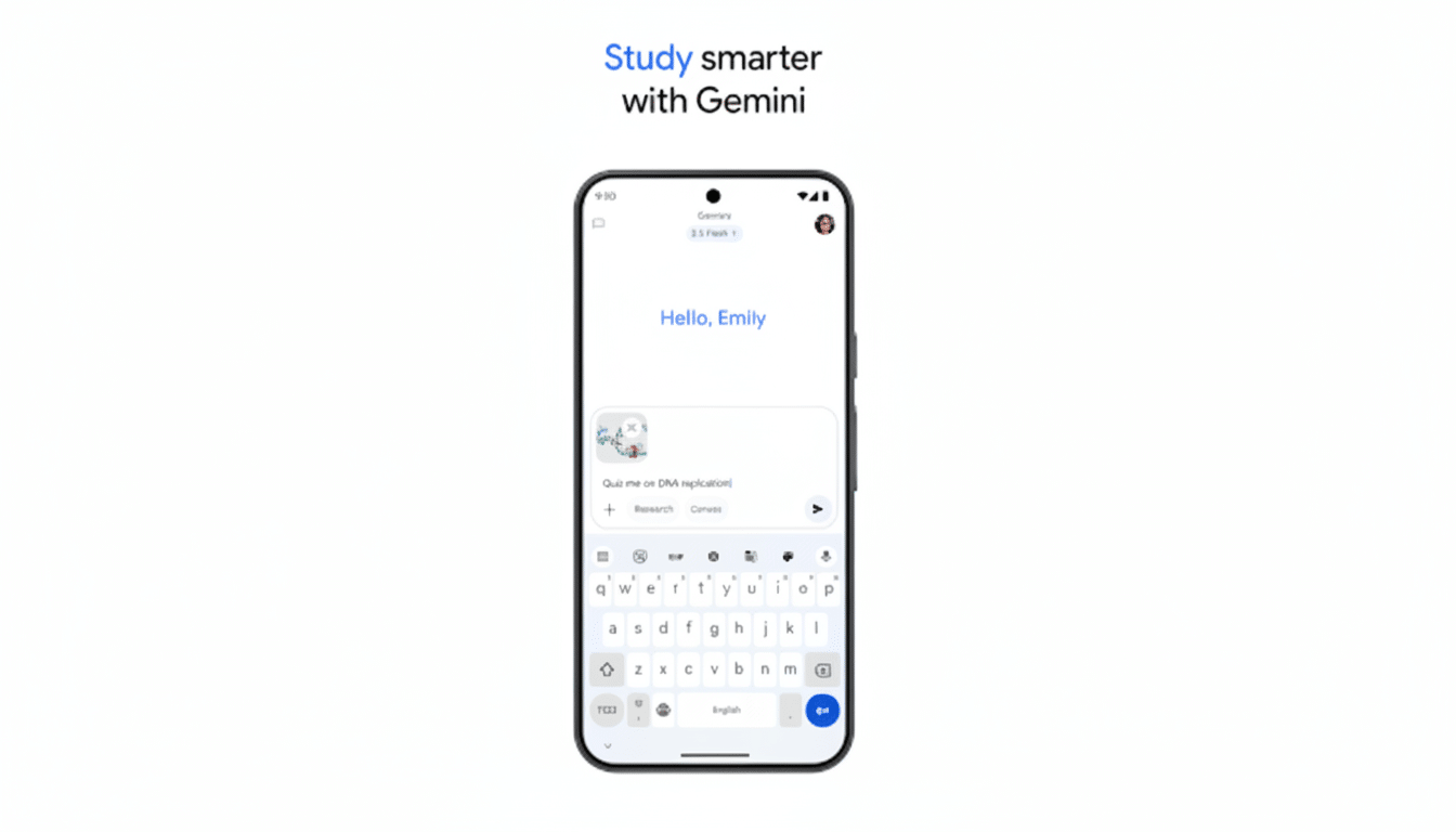
Google is making a major overhaul of the Gemini app experience, with an executive from the company confirming a “massive investment” in what they’re calling “Gemini App UX 2.0.” The comment, posted by Logan Kilpatrick, product lead at Google AI Studio, came in response to user feedback on X that lambasted the current interface and implied it was preventing people from using it. Kilpatrick also mentioned that there’s a macOS app in the works, which suggests an effort to further polish Gemini across different devices.
Why Google Is Reconsidering the Gemini App UX
Models in Gemini have been developed at a rapid pace, but the user experience hasn’t kept up with state-of-the-art and consumer AI experiences that people are accustomed to. Early adopters often offer critical feedback and emphasize friction in multimodal flows, tool discovery, and thread management — areas where competitors have honed patterns that make complicated behavior seem simple.

In this category, UX quality is not a veneer: it has an immediate impact on trust, the perception of intelligence, and retention. Studies from usability researchers such as Nielsen Norman Group have demonstrated for some time now that users are more confident in AI when they can understand affordances, know what state their interactions are in at all times, and recover easily from errors. Industry POV reports from Adjust and Localytics have also found that 20–25% of users will immediately leave an app after just one session — a clear indication that a bad first-run experience can overshadow the strongest underlying functionality.
The feedback loop is particularly tight in the case of AI chat apps doubling as productivity tools. If users can’t do the things they need to — attach files rapidly, hand off a task to a plug-in, understand what the model is “seeing” and “remembering” — they simply leave. That’s the hole Google seems hellbent to plug.
What the Gemini App UX 2.0 Update Would Bring
Google has not published screenshots or timelines, but there are trustworthy indications about the direction. Kilpatrick’s framing, of a “huge investment,” implies it would be a ground-up rethink, not just incremental polish. There are independent APK teardowns that have also indicated the existence of a compact overlay for Gemini Live, which could mean faster and less obtrusive voice and on-screen assistance that can float over apps instead of pulling users out into full-screen pop-up chats.
An updated UX/UI will probably highlight multimodal capture, activation of context control, speed, and tool invocation. Look for a tidier camera and screen capture regimen with state-of-navigation indicators; constant context controls that let you easily see what the model is keeping in its head while eliminating switches between extensions, actions, and other third-party tools; and improvements to perceived latency, including more responsive streaming and snappier turn-taking.

Some potential features for power users and teams in Gemini App UX 2.0 might be project-based workspaces, richer file handling, or clearer provenance cues on the generated content. So too will accessibility improvements: better contrast, larger touch targets, and voice-first flows are table stakes for the mass market.
Competitive Stakes and Desktop Plans for Gemini
The UX arms race is heating up among peers in the industry. ChatGPT’s mobile and desktop apps have established a new bar for easy tool switching, reliable memory controls, and clear sound. Microsoft’s Copilot has the advantage of deep Windows integration. By validating a macOS app, Google is indicating it believes Gemini should find its audience in the workplace, not just on the web or within a tab in a mobile browser.
Cross-platform parity matters. Users increasingly want an AI that’s accessible from a status bar or system-wide shortcut — and it isn’t confined to listening for a wake word; it’s contextually aware of what’s on screen. Google has shown off bits of this “live,” really-knows-you assistant in earlier Gemini Live demos. Even if you don’t carry on an ongoing chat with it, presenting that functionality in a slick, less intrusive UI might be the step needed to push Gemini out of competent and into compelling.
What to Watch Next as Gemini App UX 2.0 Nears
Google has made no promises on when we’ll see the rollout, but there are clues to watch for:
- Public previews of the overlay interface
- New onboarding flows that put multimodal use in reach within minutes
- Expanded settings around memory, data controls, and model selection
- Developer hooks through Google AI Studio that let third-party tools cleanly surface in the chat canvas
The proof of this overhaul should be measured in fewer taps, clearer state, and faster results. If Gemini App UX 2.0 nails those basics — and the promised desktop app launches in style with considered system integration — Google will have little trouble converting skeptical test pilots into daily driver users. The models are there; now the interface has to get out of their way.

