Google is rolling out a high-contrast upgrade for its At a Glance widget on Pixel phones, addressing a long-standing readability issue when text blends into busy wallpapers. Early sightings suggest the feature is beginning to appear for some users, delivering a subtle but meaningful change to one of Android’s most visible surfaces.
The enhancement adds a shaded backdrop behind the widget’s text, letting key info—weather, calendar events, commute updates, deliveries, timers, and more—stand out at a glance on both the home screen and lock screen. It’s a simple design tweak with outsized impact, particularly for users who favor vibrant or high-contrast wallpapers.
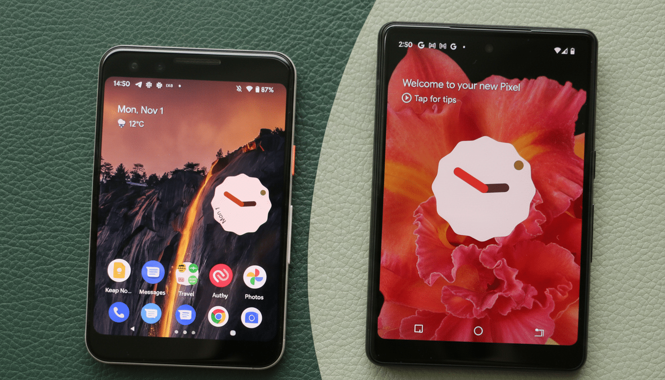
What the High-Contrast Mode Changes on Pixel Phones
Previously, At a Glance text relied heavily on the underlying wallpaper for legibility. Dynamic color and adaptive text often helped, but bright highlights or patterned backgrounds could still swallow important details. The new mode applies a translucent pill-style background that works with both light and dark text, improving clarity without overwhelming the rest of the interface.
The effect is most noticeable in sunlit conditions or on OLED displays where deep blacks meet vivid colors. In practical use, it means fewer missed calendar alerts on a beach photo wallpaper and clearer weather readouts over abstract art. Crucially, the setting is optional; if you prefer the cleaner, text-only look, you can keep it off.
Rollout Details and Compatibility for Pixel Devices
Reports indicate the feature is appearing first for some Pixel users running recent Quarterly Platform Release builds, consistent with how Google often stages interface changes. As with many Google app features, activation likely combines a client-side update with a server-side flag, so timing can vary by device and account.
To increase your chances of seeing it, make sure the Google app and Pixel Launcher are up to date, then check At a Glance settings within your Home settings. If the toggle isn’t visible yet, it may arrive automatically in the coming days as the rollout widens.
Why This Matters for Accessibility and Readability
Legibility isn’t just a matter of taste—it’s an accessibility issue. The World Wide Web Consortium’s WCAG 2.1 recommends a minimum 4.5:1 contrast ratio for normal text to ensure readability across lighting conditions and visual abilities. A subtle scrim behind text is one of the most reliable ways to maintain that threshold regardless of the underlying image.
Better contrast also helps users with color vision deficiencies. Color Blind Awareness estimates roughly 8% of men and 0.5% of women experience some form of color vision deficiency, which can make low-contrast overlays and certain hues difficult to parse. The new background treatment reduces reliance on color alone, boosting comprehension at a glance.
Design Context with Material You and System Theming
The change fits neatly into Google’s Material You philosophy, where personalization is balanced with legibility. Dynamic color pulls tones from your wallpaper to theme the system, but content like time, weather, and event reminders must remain readable no matter how bold the palette. A background scrim is a proven approach—Google already uses similar treatments on lock screen elements and media controls in various builds.
By focusing on At a Glance, Google is polishing a surface that users consult dozens of times a day. Small improvements here have an outsized impact on perceived smoothness, reducing friction without demanding behavior changes.
How to Try It Now on Your Pixel Phone Today
If you’re eager to test the high-contrast mode, update the Google app and Pixel Launcher, then restart your phone. Open Home settings, find At a Glance, and look for a High Contrast or similar text background option. If it’s not there yet, patience is key—server-side availability often rolls out in waves.
For users in beta programs, keep an eye on release notes and community reports. Historically, features like this stabilize in preview builds before arriving on the stable channel, though timelines can shift based on feedback.
The bottom line: this is an understated upgrade that solves a daily annoyance. By making essential info easier to read in all conditions, Google is nudging the Pixel experience closer to the ideal—useful, glanceable, and reliably there when you need it.