Your Android phone’s signal bars may be having you on. An Android carrier-controlled switch can slap an extra bar on the status icon and make weak coverage look stronger. Another user noticed the option present on primetime U.S. networks, raising yet more questions about transparency from both platform and carrier.
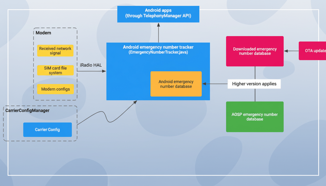
At the heart of the trick is a Google-supplied setting in the Android carrier configuration system. Even though the option is turned off by default, carriers can turn it on remotely — in many cases neither the phone maker nor user has a say — when locked or unlocked devices have the carrier’s SIM profile installed.

How the signal gets blown up by a carrier config flag
At the center of this controversy is a flag that exists in Android’s CarrierConfigManager called KEY_INFLATE_SIGNAL_STRENGTH_BOOL. So, when a carrier has gotten around to turning WCDMA on and you look at the UI, it just shows one more bar than the radio conditions would mandate. On a five-bar scale, that’s a 20 percent increase in apparent strength — completely cosmetic and not an actual improvement in radio quality.
The change is present in Android’s open source repositories and is system-wide. Carriers can push the configuration through an over-the-air update or load it from the SIM. That’s why even unlocked phones can be impacted. It doesn’t actually change the measurements themselves; it changes what the measurements look like.
Bars are a level of interpretation on top of raw measurements like RSRP/RSRQ (5G/LTE) and RSSI (legacy). For a rule of thumb, somewhere around -65 dBm is great, down to -85 dBm is good, and around -105 dBm is the low end; you lose signal below about -110 dBm. The inflation setting can hide those marginal situations by pushing a “one bar” into “two,” even “two” into “three.”
Which carriers are using the signal bar inflation option
We’re screencapping those documents and doing a log report with pro NickvsNetworking, who got access to the live carrier configuration files, currently using that inflation flag for AT&T and Verizon phones. Because these values are transmitted as part of the carrier layer, handset makers don’t have much leverage in preventing them from being pushed out, and users rarely get notice when such UI adjustments are enabled.
It’s not clear who asked first for the toggle, but that it appeared in Android means Google approved and shipped the capability. This isn’t the first time carriers have preemptively dictated signal UI: Android also added support for carrier-determined bar thresholds, and many took heat for “icon inflation,” a classy case of rebranding advanced 4G as pseudo‑5G in status bars.
Why inflating signal bars matters for consumers and trust
Bars drive snap judgments. If your phone displays three bars, you’re unlikely to edge out toward a window, toggle airplane mode or file a dead zone report — even if the connection is in fact pretty spotty. At scale, it can blunt complaint volumes, soften the pressure to build networks out and muddle comparisons among carriers.

Independent analytics providers like Opensignal, Ookla Speedtest Intelligence and RootMetrics usually use the raw radio and performance data rather than those on-screen bars, so their readings won’t be fooled. But consumers have long come to see the bar icon as a shortcut for service quality, and marketing materials often include the familiar five-bar glyph.
The practice also reprises previous disputes. AT&T’s “5Ge” branding, which referred to some 4G networks as though they were next‑gen, prompted widespread ridicule for being misleading. UI fripperies are not merely cosmetic, and when they transform expectations they can bend the market to their will.
How to check real signal strength when bars seem inflated
You can’t remove the inflation flag in default settings, but you can check for real signal strength. On the majority of Android phones, “About phone” or SIM status settings include signal strength in dBm (closer to 0 is stronger). Some devices also offer a testing menu you can reach through the phone dialer, and legitimate field test apps can show RSRP, RSRQ and SINR.
Here are some loose rules of thumb you can use for a quick sanity check:
- -70 dBm is fantastic.
- -85 dBm is very good, and anything below it starts getting coverage holes.
- Around -100 dBm tends to be pretty sketchy.
- Beyond -110 dBm, connections are often practically unusable.
If your bars seem inflated in comparison with those figures, you might be seeing the inflation at work. And if we report dead zones through carrier apps, or the FCC’s Speed Test app, that might contribute to a little more accountability.
What Google and carriers should do to ensure honesty
There’s a simple fix: make the signal UI honest by default. Google could set bar thresholds against a public standard, expose dBm next to the icon and require that carriers specifically tell you when they change the locking. For their part, carriers should commit to actual indicators and not window-dressing pufferies.
Regulators like the FCC, along with consumer protection agencies, could also consider whether overblown meters are deceptive design. At least, consumers deserve transparency about network quality — there should be no extra bar between them and the truth about their coverage.

