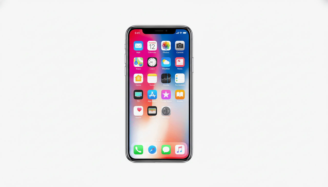
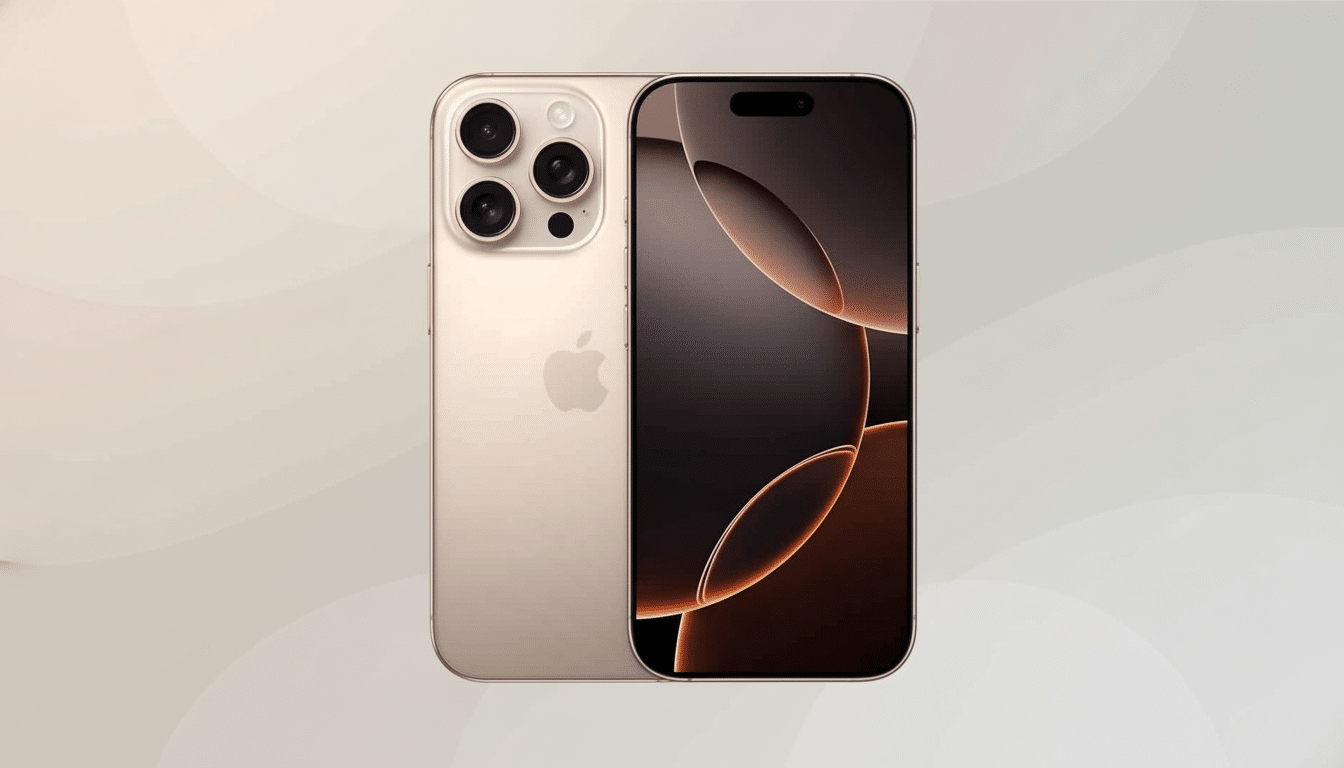
Apple is testing a new feature that lets you choose how translucent its Liquid Glass interface should be on iPhone, iPad, and Mac. The control is present in the latest developer builds of iOS 26.1, iPadOS 26.1, and macOS 26.1, a simple visual selection between Clear and Tinted that would essentially allow you to dial in how much transparency frames menus, sidebars, and system surfaces.
Clear maintains the see-through, blurring effect that shipped with the original Liquid Glass as it rolled out of factories, while Tinted tends to lean more opaque for added contrast and cleaner edges. The change is consistent throughout the system, early testers point out, so your notifications, widgets, and much of the app chrome adopts the preference without their own tinkering.

What Changes on iPhone, iPad, and Mac With the Toggle
On iPhone and iPad, the new control resides in Settings > Display & Brightness, while on Mac it lives inside System Settings > Appearance as a Liquid Glass menu. Apple even provides on-screen previews to display what the impact will be before you toggle it in your everyday setup.
Per Apple’s guidance shared with TechCrunch, third‑party apps are supposed to automatically honor your system preference, since it doesn’t get hard‑coded per app and is instead implemented at the material level.
In practice, that includes nav bars, tab bars, sheets (modal content cards), and sidebars that make use of Apple’s standard materials—in other words, a whole lot—and they will simply flip between Clear and Tinted without developer effort.
YouTube creator Zollotech has already shown how the behavior is exhibited in the developer beta, and how it looks across built-in apps as well as common UI patterns. As useful as the examples in Settings are, you’ll want to test drive your everyday apps to see where it’s a good idea to apply extra opacity — and where you’d rather keep Clear’s airy look.
Why a Transparency Control Matters for Usability
Transparency can be lovely as well as distracting. Usability research, including from organizations like Nielsen Norman Group, has long railed against unhelpful screen elements such as background clutter and low contrast that cause user errors and slow users down in their task accomplishments. Annual reviews by WebAIM also reflect poor contrast as one of the most consistent types of accessibility violations to WCAG conformance criteria.
Tinted gives Apple a middle ground: you keep the depth of dimension with current UI materials without losing out on readability against busy wallpapers or in front of bright content. That’s particularly meaningful in glare, on smaller screens, or for people with contrast sensitivity. And it has implications for the millions who have color vision deficiencies (the commonly reported figure near 8% of men), allowing them a clearer figure–ground separation.

There’s precedent here. Windows provides Acrylic and Mica with transparency controls, while Android OEMs are increasingly exposing blur and translucency sliders. Apple’s is more prescriptive — only two options — but firmly in the company’s usual middle ground between user control and design consistency.
Lifting the Bonnet — Performance and Materials
Liquid Glass is made out of Apple’s system materials and vibrancy effects, composited through Metal. Clear uses some live scene sampling and Gaussian blur to give that glossy depth. Toned-down Tinted minimizes the background content’s impact, which can help edges pop and makes text appear a bit sharper.
Will this affect battery life or smoothness? Any differences should be subtle. Apple’s compositor is very well optimized, and both of these modes use hardware acceleration. And because overscrolling will cause this heavy translucency effect to become partially transparent, folks with older devices may see a marginal decrease in rendering overhead on Macs, but don’t expect anything life‑changing. The more significant effect is cognitive: less to look at can mean faster recognition and smoother reading.
How It’s Different From Reduce Transparency
The iPhone, the iPad, and the Mac already have an Accessibility feature called Reduce Transparency that will largely eliminate glass effects systemwide. It’s not merely an accessibility kill switch; the new Liquid Glass control is a design decision that maintains depth and material cues while allowing you to opt for a higher-contrast version. If you think that Reduce Transparency is a bit heavy-handed, Tinted might be a happy compromise.
Apple’s Human Interface Guidelines have encouraged using system materials rather than rolling your own for years. Immediate compatibility with this toggle is a reward for that guidance—users are given control without the appearance being fragmented across apps.
What to Expect Next as Apple Expands the Feature
The transparency option is in developer betas at the moment, and will inevitably be coming to the public beta next. Apple hasn’t confirmed a final release window yet, but the company often keeps visual options consistent across its software once they ship, so I’m anticipating Clear and Tinted options for iPhone, iPad, and Mac in time.
It’s a little toggle with big implications. For anyone who loved the glossy, transparent nature of Liquid Glass… Not to worry! Nothing has changed. For everyone else — particularly those desiring clearer boundaries and improved contrast — this may be the setting that makes Apple’s newest design work.

