Apple has introduced a subtle yet significant change with iOS 26.1, bringing iPhone users a new way to moderate Liquid Glass, a translucent interface design spread across system surfaces. You still can’t turn the effect completely off, but you can now opt for a darker “Tinted” appearance that not only enhances contrast and improves legibility but, instead of looking washed out and dull, retains its modern design.
What Liquid Glass Changes Across iOS 26 and 26.1
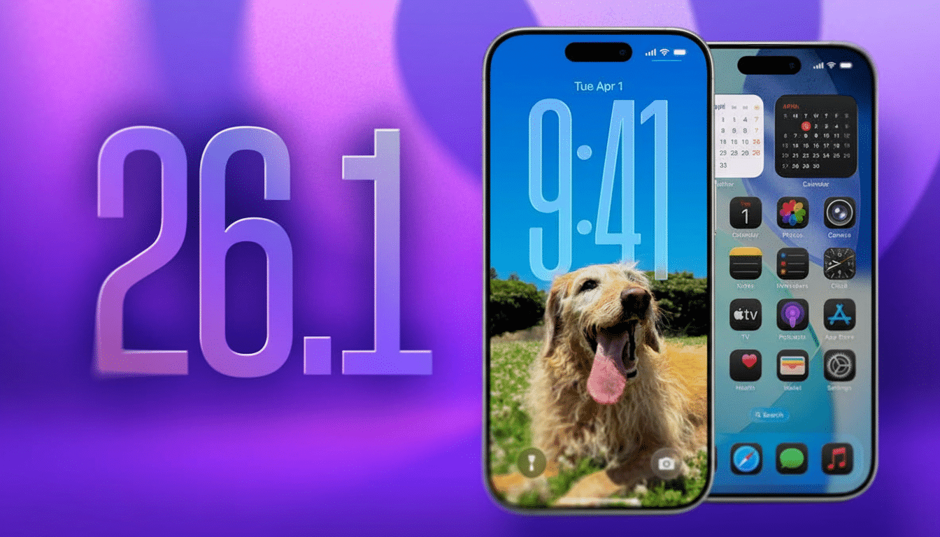
Liquid Glass arrived as a signature look in iOS 26, mixing blur, transparency, and color sampling from your wallpaper. Notifications, widgets, Control Center panes, and sheets now sport a glassy sheen that reflects what is behind them. It’s a good-looking arrangement, but with busy or bright wallpapers the text can melt into the background.
iOS 26.1 provides a more effective happy medium. By adding a built-in tint, system components are given increased opacity and a neutral color that lets on-screen content pop more at a glance.
How to Adjust Liquid Glass Tint in iOS 26.1
iOS 26.1 or later is recommended. When you’re on the new version, the setting is a three-tap switch.
- Open Settings.
- Tap Display & Brightness.
- Select Liquid Glass, then choose Clear or Tinted.
Clear maintains the full transparent, color-sampled style introduced with iOS 26. Tinted overlays a layer of opacity and very slight desaturation to make text and icons pop. The change takes effect immediately for notifications, widgets, and most system panels such as Control Center and Now Playing.
Where the Liquid Glass Tint Applies in iOS 26.1
The biggest improvement by far is on the Lock Screen, especially if you have photo-heavy wallpapers. Banners, stacked notifications, and widgets retain their depth effect, though with a bit more distance to the background. In-app sheets and system menus also shine, while customized UI used within third-party apps might not follow the new tint if developers are using their own materials.
If you have an Always-On display, Tinted mode can help retain readability when your screen dims. For Focus modes with custom wallpapers, the effect applies universally across each one, so you won’t have to change tint per mode.
Accessibility and Readability Gains with Tinted Mode
Apple’s Human Interface Guidelines have long preached visual hierarchy, and the Tinted option pushes Liquid Glass a step closer to that.
Usability studies from outfits such as Nielsen Norman Group repeatedly demonstrate that greater contrast increases how quickly you can scan for and perceive bits of information — especially for quick-glance tasks like triaging notifications.
For deeper separation, you can couple Tinted mode with Accessibility settings. Switch on Reduce Transparency and Increase Contrast in Settings > Accessibility > Display & Text Size to darken or neutralize any translucent layers. This can help achieve the target contrast ratio of 4.5:1 for text in the Web Content Accessibility Guidelines, while maintaining the general look and feel of iOS.
Troubleshooting and Pro Tips for Liquid Glass Tint
If Liquid Glass doesn’t appear in Display & Brightness, make sure you’re on iOS 26.1 by going to Settings > General > About. If it doesn’t come up after the update, a fast restart can bring the control to the surface.
Wallpaper choice matters. Highly saturated or high-frequency images (think fireworks or bright neon cityscapes) are the most challenging for Clear mode; Tinted fixes this, but you can also choose a wallpaper with more subtle gradients, or switch on Depth Effect only where you want it. On the Lock Screen, going from Clear to Tinted, photos with shallow depth of field seem to work best.
If you’re into color-coded Focus notifications, Tinted mode also helps minimize errant bleeding of wallpaper colors onto app badges and banner tints. That can help cut down on misreads when flipping through multiple notification streams.
What You Still Can’t Do with Liquid Glass in iOS 26.1
There still doesn’t have a system toggle to turn off Liquid Glass entirely. The design language isn’t quite out of iOS’s main window, and the new setting is about finessing, not deleting. Developers can choose to opt into more opaque materials, but systemwide at least we have Clear and Tinted.
The good news is that performance is still very fluid. Current iPhone GPUs are designed to compute blur and layer in real time; switching to Tinted doesn’t make a significant difference in responsiveness anyway because the general graphics workload is so well-mannered. That means more readable surfaces with no apparent trade-off.
For many, that makes iOS 26.1 the most sensible update since Liquid Glass: not a regression, but a far better balance of style and clarity.