If Android pulled the plug on home screen widgets tomorrow, I wouldn’t reach for a tissue. That sounds heretical given how central widgets once were to Android’s identity, but the ecosystem has moved on. The tools that now deliver timely, contextual, and actionable information do a better job than static boxes camped on a grid.
Why Android home screen widgets lost their edge
Widgets were brilliant when smartphones were slower, apps took longer to open, and surface-level information saved precious seconds. Today, phones are instant, background services are smarter, and notifications and quick actions cover most utility use cases with less clutter. Data.ai reports that people regularly engage with roughly 10 apps a day and about 40 in a month, reinforcing a simple reality: it’s faster to jump straight into the app that does the job than to babysit a panel that does a partial version of it.
- Why Android home screen widgets lost their edge
- Fragmentation and design drift across Android widgets
- Static by design in a dynamic era of mobile use
- Better system tools already replace most widget uses
- The one Android widget that consistently works well
- Why developers don’t flock to building Android widgets
- The bottom line on Android widgets in today’s ecosystem
Fragmentation and design drift across Android widgets
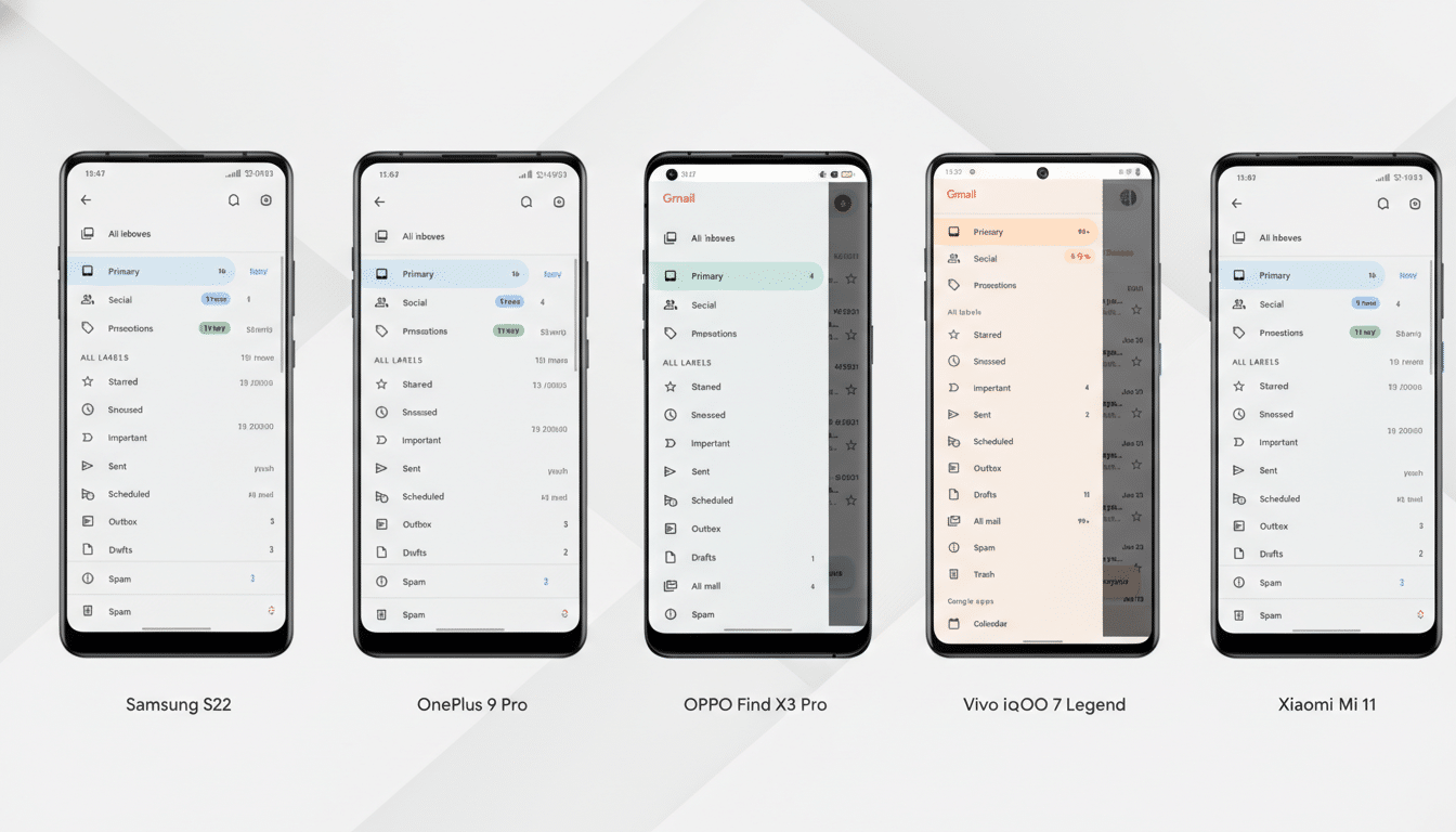
Even after the push behind Material Design and Material You, widget design remains the Wild West. Google’s own components have become more coherent, but consistency and usefulness are far from guaranteed across the board. Third-party offerings are especially uneven—some ignore theming, others look dated, and many prioritize aesthetics over function.
This isn’t purely a taste issue; it’s a platform one. The widget framework leaves wide interpretive space, while Android’s diversity of launchers, grid sizes, and OEM skins complicates quality control. Google’s Jetpack Glance and Material Design 3 guidelines were meant to modernize development, yet adoption is patchy. The result is a shelf of mismatched boxes that rarely feel like a single, intentional system.
Static by design in a dynamic era of mobile use
The bigger problem is that most widgets are static in a world that expects context. A calendar widget doesn’t need to sit there on empty days. A music widget shouldn’t occupy space when nothing is playing. A battery widget shouldn’t sprawl just because earbuds happen to be paired sometimes. We have the compute and the on-device intelligence to adapt content and size on the fly; the current framework largely doesn’t.
That limitation isn’t just a missed opportunity; it’s structural. Android’s power-management systems like Doze and App Standby deliberately throttle background updates to save battery, which is good for users but bad for “always-fresh” widgets. App Widget update periods are constrained by the platform, so developers often fall back on manual refreshes or infrequent updates. The outcome is predictable: stale info and rigid layouts that don’t earn their footprint.
Better system tools already replace most widget uses
Notifications, ongoing activities, and quick settings tiles have quietly replaced the best reasons to use widgets. Media controls in the notification shade are app-agnostic, instantly available, and vanish when not needed—already more elegant than dedicating home screen real estate to a single service. Trip tracking, ride-hailing, and navigation now surface as live, contextual notifications that appear when relevant and disappear when done, delivering the right layer of information at the right moment.
Quick settings tiles handle smart home toggles, hotspot controls, and device modes without requiring a big slab on the home screen. App shortcuts jump directly into the screens people actually want—favorite playlists, saved places, or camera modes—skipping the widget middleman and reducing tap count. In practice, these system features are what users try to make widgets do, just with less friction and fewer visual trade-offs.
The one Android widget that consistently works well
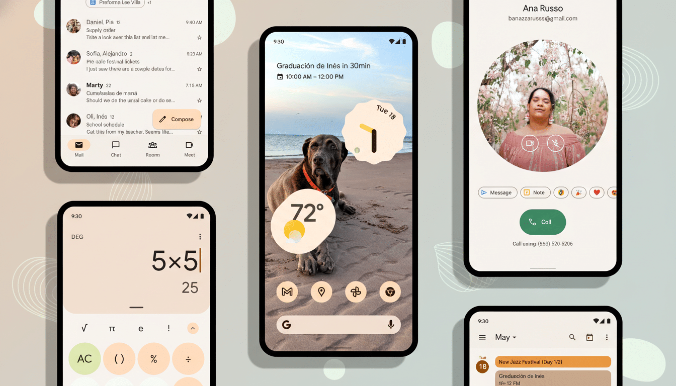
Google’s At a Glance stands out precisely because it behaves like a system-native, context-aware layer rather than a decorative block. It quietly shows date and weather most of the time, then promotes useful information—flights, timers, alerts, or commute hints—only when it matters. It doesn’t demand attention; it earns it. If Android applied that philosophy widely, we’d be having a different conversation.
Why developers don’t flock to building Android widgets
Building a great widget is surprisingly high-effort, low-reward. Developers must juggle resizable frames, multiple aspect ratios, theme compliance, and OEM quirks while staying under background execution limits. Meanwhile, everything users want—deep links, media controls, proactive alerts—is better served by notifications, shortcuts, or in-app surfaces that offer richer interactions and analytics. Given that resources are finite, teams prioritize the experiences most users actually touch.
The bottom line on Android widgets in today’s ecosystem
Widgets helped define Android, but the platform outgrew them. Design inconsistency, static behavior, and power constraints make them feel like relics from a slower era. The features that matter—timely information, quick actions, and glanceable context—are now delivered more cleanly through notifications, quick settings, At a Glance, and app shortcuts. If widgets disappeared, most people would keep moving without a hitch. I certainly would.