The media interface in Android Auto is adding a pinch of personality. Code found in version 15.9.6551 hints at a Material 3 Expressive-style wavy progress bar for the Now Playing screen, a relatively minor but noticeable tweak that’ll make the playback timeline feel more active. It hasn’t been made available to users just yet, but it seems connected to Google’s larger push to standardize how music and podcast apps look in the car, and how they interact with you.
What’s Changing In The Now Playing Screen
The familiar straight seek bar will make way for a new wildly wavy timeline not unlike the animated progress indicators seen elsewhere on other more recent Pixel devices. You can probably expect it to follow Material You aesthetics, too — that means accent colors picked up from the media app for a consistent feel. The rest of the playback UI stays the same, with big buttons and clear labels as you remember them, but this new bar adds movement and a shape that makes progress more glanceable without obfuscating your screen.
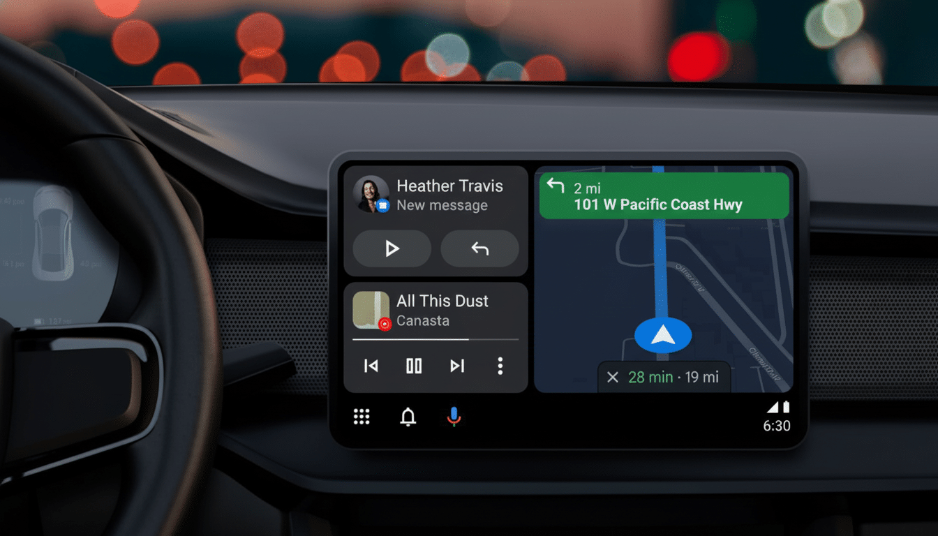
This would fit perfectly with the templated media experience that Google has been testing out with key apps. Early tests with Spotify and YouTube Music have demonstrated how a standard layout can provide users uniform controls — play, pause, skip, seek — no matter the service. The wavy bar is just an extra coat of polish on that template, adding flair and feedback without requiring developers to build from the ground up.
Why A Progress Bar Is Important When You’re Driving
On the road, small UI decisions have outsized stature. The National Highway Traffic Safety Administration driver distraction guidelines highlight the importance of low visual-manual task time and supporting designs that convey state at a glance. Finding your place in the timeline without skipping ahead is then easier by not looking for timestamps, letting our unique moving progress bar show how far into a track you are at any particular time so you know if it has just begun, reaching its end or even paused.
Consistency helps, too. J.D. Power’s research has consistently found infotainment to be one of the top problems in new vehicles, typically because it is too complicated or functions slowly and erratically. A common media template across apps facilitates the shared mental model: once a driver masters the design in one app, it becomes available to them for other applications. My only quibble with that pattern is now solved, as the wavy bar adds a clear visual identity to it, and improves scannability while keeping controls consistent.
Part Of A Wider Media Overhaul For Android Auto
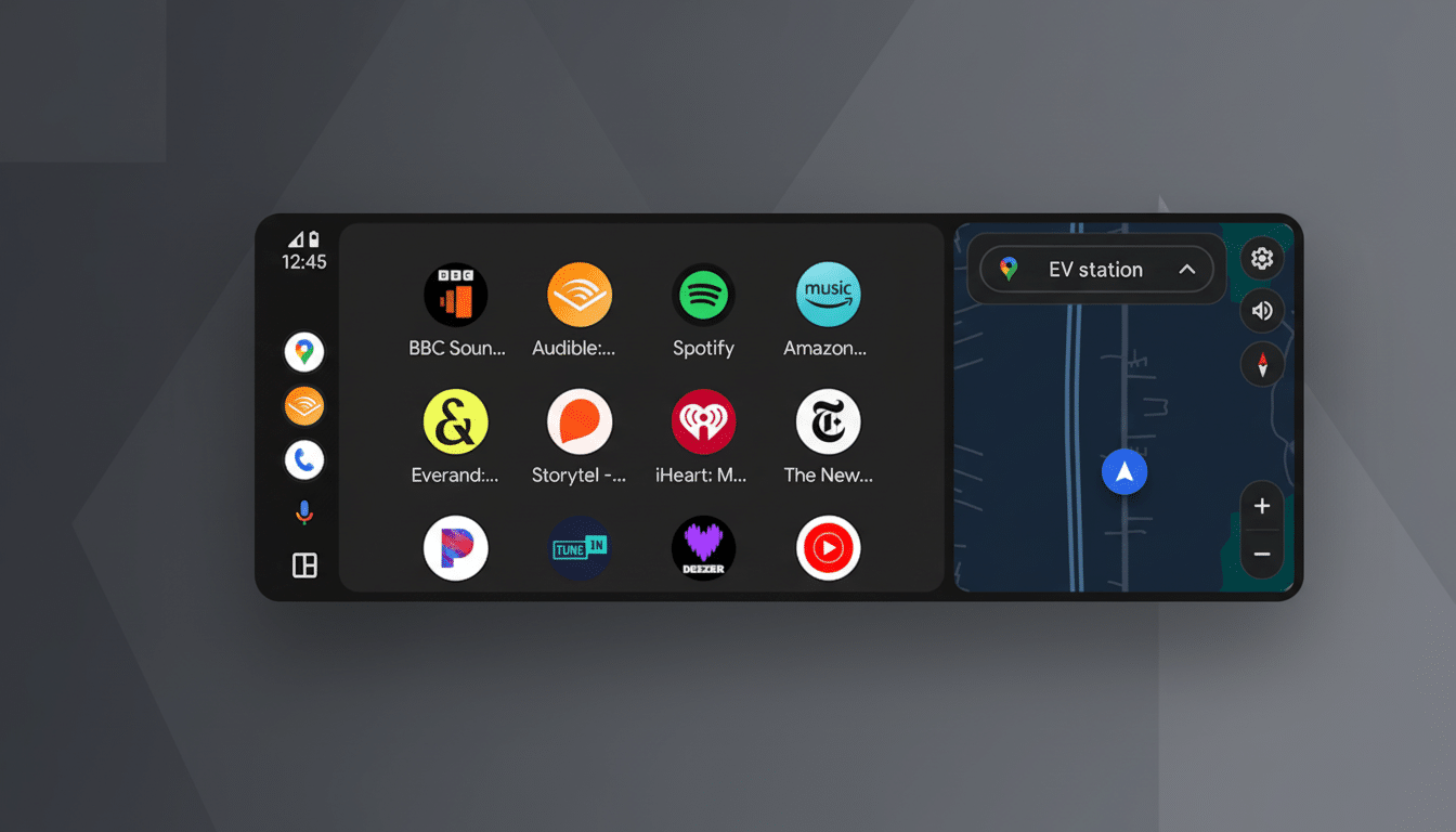
The new progress bar is just one of many under-the-hood changes that will speed up all kinds of media playback in Android Auto. Google has been developing a cross-app template and enhancing app-switching while also making icons, labels and seek behaviors consistent so that music, podcast and audiobook apps feel interchangeable from a control perspective — from an editing standpoint. This is presumably controlled by the Android for Cars app’s libraries and switched on and off by server-side flags, facilitating that gradual A/B testing ahead of a broader deployment.
The reward for developers is less bespoke UI care within the car space and more time on content features. For drivers, it’s about trust and speed: the play button is always where you expect, the scrubber works consistently across services, and visual flourishes retain good taste and legibility across many head units.
Rollout And Compatibility Expectations For Users
Given that Android Auto’s projection experience depends largely on the phone app and server flags, expect the wavy bar to roll out slowly; it may even be released piecemeal for select apps and users.
It ought to be adaptable across most vehicles without necessitating head-unit updates. Considering automotive safety guidelines as well as Android accessibility settings, you’d expect that motion will be subtle and respect reduce-motion preferences in order to not distract.
When the template arrives, expect it to reach beyond music into podcasts and audiobooks, where a more dynamic scrubber can provide cues for chapter breaks or long-form progression. About time FFWD and REWIND were standardized for developers, too (they mean a lot more for spoken word tracks).
Why It Matters Now For Drivers And Developers
Most drivers still default to phone projection. According to industry analysts like S&P Global Mobility, more than 90% of new vehicles in North America now ship with smartphone integration and Android Auto is a key part of this experience. Tiny changes to interfaces add up fast when they’re shipping out in the millions of cars, and design decisions that reduce glance time or confusion about where something is can meaningfully contribute to day-to-day safety and satisfaction.
Simply put: This isn’t just eye candy. It’s also an indication that Google is snapping the design language of media on the dashboard tighter — making it more expressive without losing clarity. When the wavy progress bar shows up, if that feeling seems right to you, then that’s what I was going for — it’s Android Auto leveraging proven patterns from phones and making a world of difference one glance at a time.