Google seems to be rethinking one of the most contentious Android Auto design changes it made, and that is getting rid of the fan-favorite album art background. The newly spotted code in an Android Auto beta build hints that we may soon see an option for drivers to swap between the new single-hued Material You background and the previous album artwork-backed blur.
What changed — and why it mattered for drivers
Android Auto’s latest visual refresh brought the interface more in line with Material You, pushing for more consistent color palettes and increased contrast. Functionally, nothing much changed in how you would play media; aesthetically so much did. In place of the gently blurred art that changed for each song, users were presented with a solid color behind their album art based on the system theme.
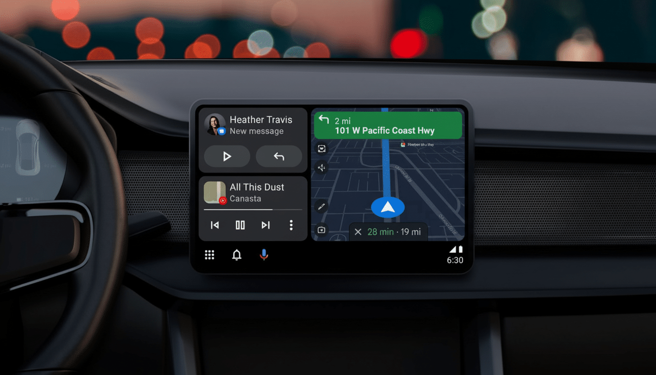
For a number of folks, it was a small but significant step down to lose the dynamic artwork. The cycling backgrounds helped to visualize some sort of motion and personality in the media card, and for certain drivers it also aided them in recognizing what was playing at a glance. The monotone design focused on legibility and uniformity, but it also made the interface feel more flat and drab.
Evidence the choice is coming back to Android Auto
Android Authority analyzed strings and flags in the latest Android Auto beta, which point to a setting that would allow users to toggle between the single-color theme and blurred album art background. Hidden in the depths for now, being able to spot a toggle like that featured above with my very own eyes running code today means we can more or less confirm this feature is in active development and prepping for a staged rollout.
Similarly, the beta also tweaks other UI elements: a decision to make navigation buttons just a touch smaller, album art a bit bigger and the seek bar more prominent. Those tweaks indicate to me that Google is still working out the right touchscreen balance, of some visual hierarchy — essential considerations for car design.
Safety, design and the case for a toggle
There’s a reason that Google went for the simpler background in the first place. Visual distraction through in-vehicle interfaces should be minimized, yet readability should be preserved. The U.S. National Highway Traffic Safety Administration’s Visual-Manual Guidelines outline text that is legible, high contrast, and low visual complexity. Material You’s monochrome background defaults help simplify that.
That said, carefully blurred low-contrast album art in the background of an interface can be safety-friendly if text and controls have high contrast and touch targets are large enough. Even Google’s own car experiences guidelines say 48dp is the minimum for touch targets; even with smaller navigation buttons, you still should be OK in Android Auto, I imagine. A switch could allow safety-minded drivers to opt for the high-contrast theme, but let everyone else restore a little visual flair.
Why Google may reconsider album art backgrounds
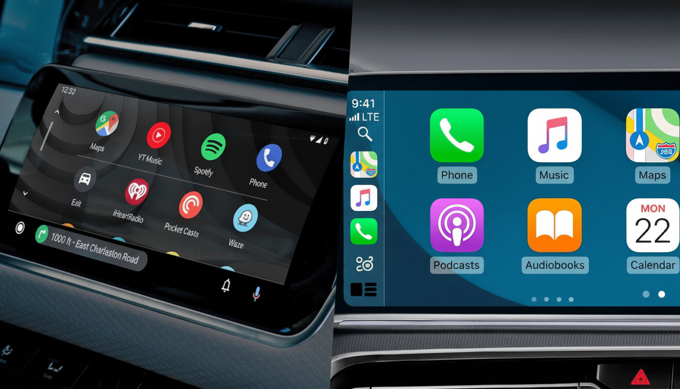
The user experience is important in the car. Android Auto is an Instagram-like contrast to embedded systems and Apple’s CarPlay, whose Now Playing screen tends to favor the artwork. But when people live in hacker homes and spend hours each day commuting, little design touches can impact how “premium” or frictionless an interface feels. Even forgoing isn’t necessarily a negative: Allowing choice is a low-cost way to optimize good will without sacrificing safety-first defaults.
There is also, more broadly, a trend at work. Google introduced personalization more broadly across phones, tablets, and car interfaces — from dynamic color to flexible layouts and context-aware surfaces. A background style selector fits that trend, and it would complement feedback loops that Google, automakers and app partners use to tune media experiences for various cabin displays and lighting conditions.
What to watch for as Android Auto tests roll out
As of late, even when features reach a beta stage Google will often phase them in over time via updates to the app and server-side flags. That could mean that some drivers will have access to a new “media background” setting before others. You wouldn’t be remiss to expect that, and some UI sweeping changes to the sizes of the buttons and progress controls can come in tow, since Google likes tacking on interface updates as whole deals.
Remember, behavior can differ from one vehicle to another. Screen size, aspect ratio and automaker integration all affect how Android Auto screens are displayed. If the toggle does land, I would guess it will live in Android Auto’s settings menu via the phone app, similar to where many more customization options live today.
The upshot: Beta signals strongly suggest the album art background is set to return — albeit as an option this time around. A pragmatic compromise that respects safety guidance and what drivers have been clamoring for since the redesign. For Android Auto, that’s a victory for both usability and joy.