Android’s themed icon project is going wide. Google is gradually working on making every app in the Play Store recolorable to match a user’s system theme, and developers who sell their apps through Play won’t be able to opt out. The change marries a policy update with a technical requirement in Android itself, offering cleaner, more consistent home screens through the platform without depending on developers to participate.
What Google changed in Play policy
Google updated the Play Developer Distribution Agreement of Themed Icons, and this spec now includes that developers should allow users to override the colour of their app icon, when Themed Icons are enabled. Most importantly, it also allows the use of these modified icons in screenshots and screen recordings — an area that had previously sat in a gray zone for brand guidelines.
Per notices shared with Play Console owners, the updated terms are effective for new developer accounts right away and will apply to existing developers as of Oct. 15, 2025. If you publish on Google Play, you are assenting that Android can algorithmically recolor your app icon and publicly display it in this modified form.
How Android will create themed icons
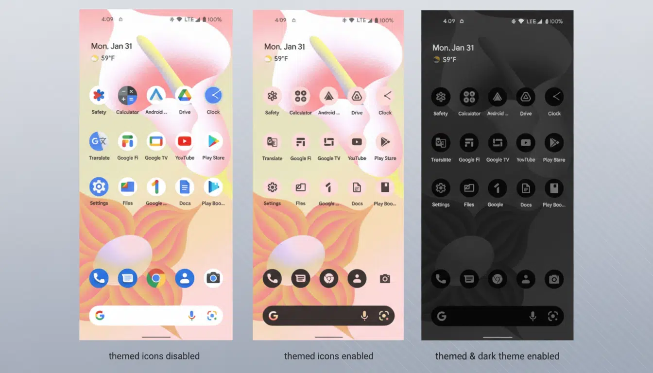
Themed Icons are a feature that shipped with Android 13, in which icons can adopt Material You colors based on the wallpaper. Adoption was spotty since developers needed to provide a separate monochrome icon asset. New ArtResource APIs for Android 16 QPR2 Beta – the operating system can generate a monochrome version if you don’t provide one from the app. That tends to mess up a little with the color. This are both 2048x resolutions (one in png and other is WebP). Android actually tints it (see icons) + that’s algorithms as well, giving a look out of palette/colors – pure but not good looking enough.
Users are still in control of allowing Themed Icons. If the toggle is off, nothing happens. But if it’s enabled, the system will auto-fill any gaps in its available color choices so that all apps — first‑party, third‑party and games — fit with the selected theme. Developers can still ship their own hand-drawn monochrome asset through the adaptive icon’s monochrome layer for better results, or else the OS will create one for them.
Why consistency was difficult on Android
Android home screens are well known for being eclectic. Real reasons teams steered clear of the monochrome asset include: complex game art doesn’t rasterize well to one color; brands want feeding into to stand out; and there’s overhead in keeping up with one more visual deliverable. The end result for users was a checkerboard of themed and unthemed icons — particularly evident on Pixel devices and third-party launchers that embrace Material You.
Aerorhythmics is improved when the Icon field is not spicy. Studies into accessibility often suggest that predictable colour and shape systems reduce cognitive strain. While Android still permits distinct silhouettes thanks to adaptive icon masks, a common palettemakes the launcher look more calming and less chaotic.
What it means for developers and brands
The policy update resolves the legal issue: Play-distributed apps need to make their launcher icons visually changeable in color, as well as allow those icon visual modifications to show up in public captures.
That lessens the risk of takedown threats over themed screenshots, which creators and reviewers have had to contend with for years.
From a design view, teams have the option to provide their own curated monochrome asset that still communicates what we know/have already from an asset, or simply let the OS auto-parse and convert. Material Design knowledge’s recommendations to test objects for legibility when really small and high in figure/ground contrast? Those guidelines grow more significant when tested under monochrome. If your logo have multicolor gradients or complexity, it may require simplified shapes to achieve the best outcome by the algorithm.
There’s no opt-out on Play, though distribution off of Google Play is not affected by the agreement. However, if a user turns on Themed Icons, Android has the ability to create a monochrome presentation for any app you have installed no matter where it originated from. And the Play requirement is mostly about permissions and public display rights–not that OS’s technical capability.
What users should expect
However, on Android 16 QPR2 devices or higher, enabling Themed Icons will now (finally) produce an end-to-end consistent grid — even for holdout apps.
More of a consistent look will be coming to Pixel Launcher and compatible OEM skins from the likes of partners Samsung and OnePlus that have adopted Material You color systems.
And the experience is still an option: Turn it on for a coordinated look, or keep your icons in full color. The key difference is that now, from this point onward, a single dev can’t shred the theme by going off alone.
The bottom line
Google is doing just that, marrying policy and platform to lay down the law on icon inconsistency. Between auto-generated monochrome icons and a Play agreement that takes brand friction out of the equation, themed icons are poised to become how most people see them by default—without any developer-side hoops to jump through, and few trade-offs for users.