Android’s latest test build is quietly changing a familiar interaction on the home screen. In Android 16 QPR3 Beta 2, widget resizing now offers dedicated plus and minus buttons, giving users a tap-friendly alternative to dragging the edges. It is a small tweak with big implications for accessibility, precision, and overall polish.
What’s New in Widget Resizing on Android 16 QPR3
Until now, resizing meant grabbing the widget’s handles and nudging the borders across the grid. The new approach layers context-aware + and − controls on the widget frame. Tap to expand or contract horizontally or vertically, and when you hit the widget’s maximum or minimum size, the corresponding button simply disappears. The behavior mirrors the previous size constraints you already know—only the interaction changes.
- What’s New in Widget Resizing on Android 16 QPR3
- Accessibility and usability gains from widget resize buttons
- How it works in practice with Android widget resizing
- What developers should watch for in the new resizing UI
- Where this fits in Android’s release cycle and QPRs
- Why it matters for Android widgets and home screen use
In line with Android’s design language, the controls adopt the system theme colors, matching the wallpaper-driven dynamic color system commonly referred to as Material You. The result is a resizing experience that feels native rather than bolted on, with clear affordances and immediate feedback.
Accessibility and usability gains from widget resize buttons
For many users, taps are easier than precise drags. Material Design’s guidance recommends a 48dp minimum touch target, and dedicated buttons make it more likely that people will hit the intended control on the first try. That is especially helpful on large screens, in one-handed use, or for anyone managing tremors or other motor challenges. The World Health Organization estimates that roughly 16% of the world’s population experiences a significant disability, so small interaction improvements can have outsized impact.
The clarity of limits is another win. Instead of guessing whether a widget can stretch one more column, the absent button makes the boundary obvious. This reduces trial and error and keeps the layout tidy, particularly in dense setups with multiple widgets and app shortcuts.
How it works in practice with Android widget resizing
Place a widget as usual, then long-press to enter the resize mode. You will see directional + and − controls aligned with the widget’s edges. Tap to grow a calendar to show more weeks, compress a weather card to a compact glanceable view, or widen a notes widget to reveal additional list items. The underlying launcher grid rules still apply, so changes snap cleanly into columns and rows.
This approach should feel instantly familiar to anyone who has used step-based controls elsewhere in Android—think volume or zoom increments—only now applied to layout. For power users, the drag handles remain a fast path; for everyone else, the buttons turn resizing into a low-friction, repeatable action.
What developers should watch for in the new resizing UI
The change respects existing widget metadata. AppWidgetProviderInfo entries defining minWidth, minHeight, and resizeMode (horizontal, vertical, or both) continue to set the boundaries. The new UI simply exposes those constraints more transparently. Developers should verify that their widgets scale gracefully across common breakpoints and ensure responsive layouts that handle additional rows or columns without clipped content.
Testing on the beta is a smart move, especially for information-dense widgets like calendars, email, to-do lists, and media controls. Consider how typography, padding, and image crops adapt as users step through sizes. Clear state changes—showing or hiding extra rows, switching from compact to expanded layouts—tend to fare best with tap-based resizing.
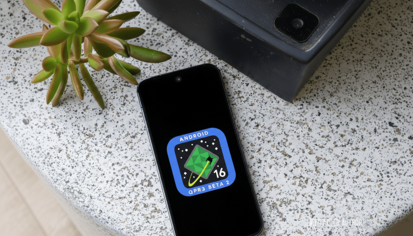
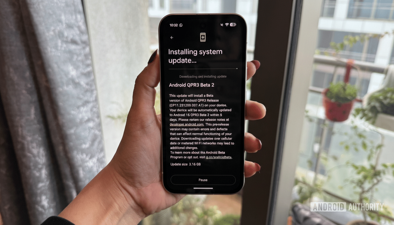
Where this fits in Android’s release cycle and QPRs
QPRs, or Quarterly Platform Releases, typically bundle bug fixes, polish, and selected feature tweaks for Pixel devices on the beta track. As always with pre-release software, the look and behavior could be refined before stable rollout. Even so, the addition sits neatly alongside Android’s ongoing quality-of-life improvements that align system interactions with Material You.
Why it matters for Android widgets and home screen use
Widgets have enjoyed a resurgence as glanceable, personalized surfaces. With over 3 billion active Android devices reported by Google, even minor friction in common tasks adds up at scale. A clearer, more accessible resizing model lowers the barrier to customizing home screens and helps users get more value from the widgets they already use daily.
It may be a subtle tweak, but it is the kind that sticks. When resizing becomes a predictable, one-tap action—with visual cues, theme-aware styling, and explicit limits—more people experiment, refine, and ultimately keep their home screens organized. That is the hallmark of a good platform change: simple, discoverable, and quietly transformative.