YouTube Music is rolling a new Now Playing UI out via a server-side update, and it doesn’t reset your muscle memory as much as the previous change did.
Buttons have shifted, tabs disappeared and a dual-pane configuration pops up on wider screens. The underlying app is the same, but how you access to everything isn’t.
The refresh, which 9to5Google first reported on following months of limited testing, doesn’t require an app update. Google usually turns on interface changes with remote toggles, which is why some have spotted the new design before others using the same version.
What actually changed
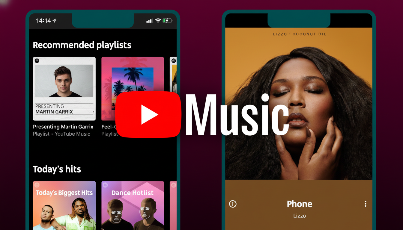
The most dramatic change is a new control carousel, which resides directly below the scrubber. What once sat at the top — like the toggle between Song and Video — now rides in this horizontal strip alongside Quick Actions like Lyrics. The usual back arrow, Cast button and overflow menu retain their posts in the top bar.
Playback transport controls-shuffle, previous, play/pause, next, and repeat-are now located underneath the track title and artist which once housed the carousel. That centering of the transport cluster makes it look a little more purposeful, but may put some buttons further from your thumb if you own tall phones.
The scrubber itself has been squared off a bit, with no obvious playhead nub. It’s a small thing, but it affects how accurate your scrubs feel overall once you’re used to grabbing onto a handle instead of any part of the bar.
Good on a big screen, bad for thumbs
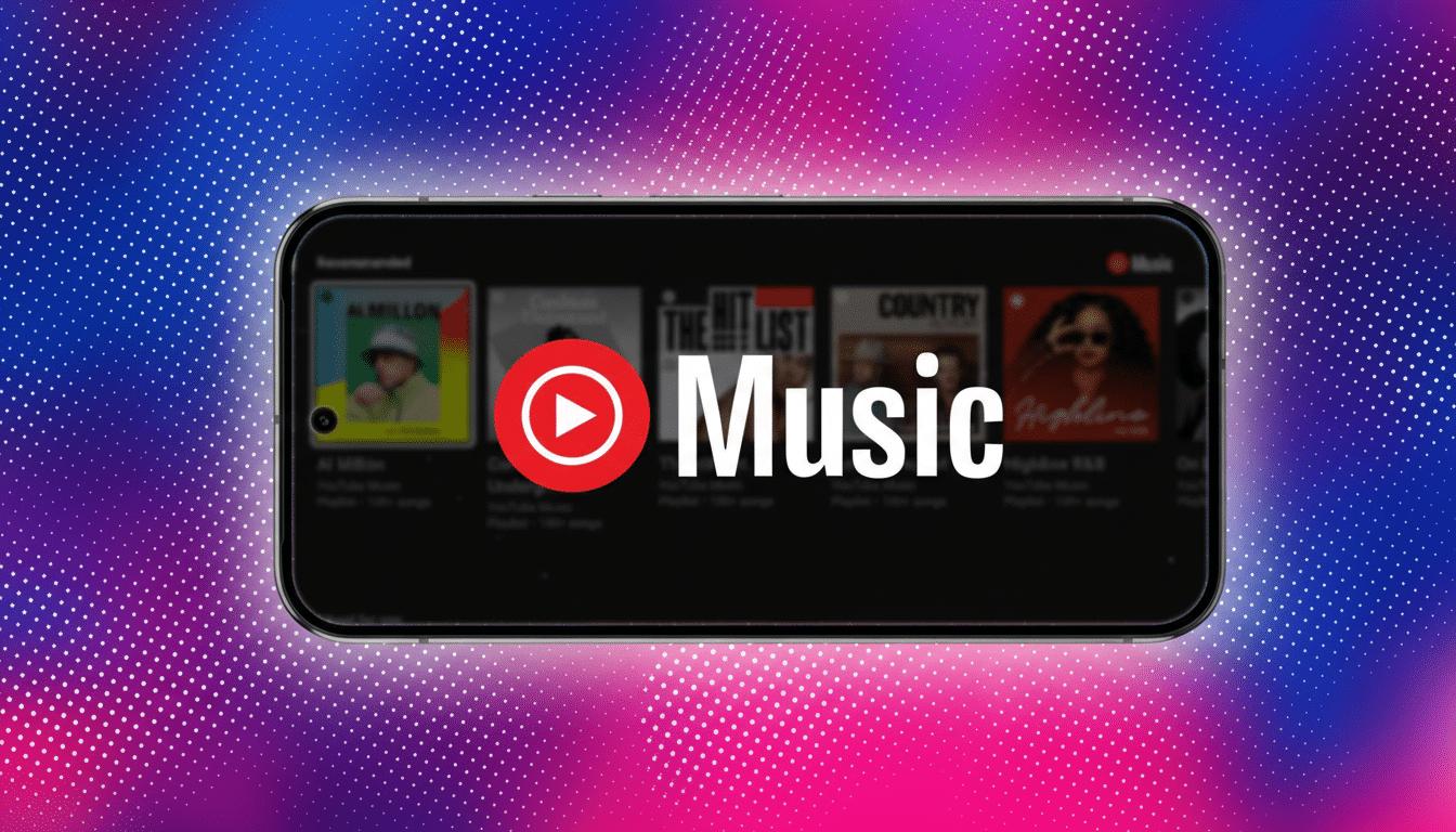
There’s also a dual-pane layout you’ll see on tablets, foldables and landscape, following Google’s Material You advice for responsive layouts. Larger devices like the Pixel Tablet or Galaxy Z Fold you’ll be able to see more information at once and won’t need extra taps.
Meanwhile, bottom tabs that once served as points of stability for the experience — Up Next, Lyrics and Related — are gone. Up Next now lives behind a new drag handle for queue, and Lyrics and the Song/Video switcher has been folded into the carousel. You also have access to the Related view, which can be accessed by tapping on the track title, a less-obvious navigation than a tab that’s labeled but one that keeps the main screen cleaner.
Another small but nice touch: the redesigned Lyrics and Related sheets keep it plain, ditching their old thematic backgrounds. They can still grow, but the stripped-down styling seems to suggest a push for consistency across devices and modes.
No more tabs: where to find Lyrics, Queue, Related
If you open Lyrics during a workout at the gym or on your way home, you’ll find the carousel down there just below the scrubber; it’s one tap away, not a swipe to a tab. The queue scrolls up from the bottom through the drag handle; pull it higher to find out what’s next on your playlist or radio.
For discovery, tap the title of a track and Related appears with the similar tracks, mixes, and artist content. It’s one extra tap than before but helps to ensure the main screen is about listening and not surfing.
What it says about strategy
The tell here is that the Song/Video switcher has been moved into prime reach. And leaning into video is one of YouTube Music’s major differentiators, while making that toggle more prominent reiterates the service’s “audio or video on demand” pitch. And it reflects how YouTube itself treats the watch page: content first, controls nearby, context one layer away.
The redesign also coincides with a limited experiment that limits lyrics for free listeners — an added benefit to upgrading to Premium. YouTube recently announced that Music and Premium have collectively crossed the 100 million subscriber mark globally, and pushing high-intent features like lyrics to the fore is a tried-and-true funnel strategy. Competitors pick their own fights: Spotify clumps queue and lyrics together on dedicated screens; Apple Music makes it one tap away, but heavily prioritizes the Up Next list.
Getting the bundle and using it: tips
The update is being rolled out server-side. If you don’t see that, force-close the app and open it again to check. Ensure you are on the latest app version, but note timing will vary by account and region as Google rolls out flags.
Once it lands, here are a few things to remember: The Lyrics and Song/Video switch lives in the carousel under the scrubber; the queue resides behind the drag handle; you can tap on song or video titles to get Related content; Cast and three-dot menu haven’t gone anywhere.
Just give it a couple of sessions — most listeners will adjust quickly when core controls don’t change, even if their positions do.
Not everyone wanted a new Now Playing, but it’s here — and built so obviously for the screens and subscriptions that YouTube Music cares about most. If the design sticks, then expect refinement and small tweaks as Google sees how people really use it.