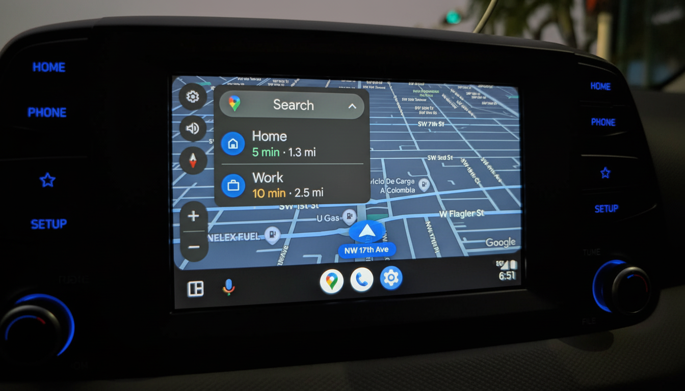
Google seems ready to give it another go and reintroduce a centered map layout in Google Maps on Android Auto. Multiple users have reported that the map now centers itself, with the destinations panel and other overlays no longer obscuring vital parts of the route. Testers say the view persists even in turn-by-turn navigation, making it feel like a more stable feature rollout, though they seem to call out intermittent reversion to the previous view. There’s been no formal announcement from Google about the change, but this is how many Maps features often launch after they’re tested in people’s daily use in a staged rollout by Google. When users do not like what they see, it might simply be removed.
This new test centers the map without overlapping controls, which also keeps vital visual information visible. Some Reddit users say that this layout “sticks” relative to other elements as they drive around and that they can make it come back even after disappearing by tapping the three-pane button, which reveals Android Auto, and tapping Maps. This is quite possibly another sign that this is an A/B experiment flipping flags on the fly. As Reddit user u/G7J8R13 put it, the method better aligns with Google’s Android Auto design guidance, which encourages large touch targets, information that can be read quickly, and as little blocking as possible around turn cues. Particularly for drivers in cars with wide, ultrawide infotainment displays, or the split-screen “Coolwalk” layout, the centered map can reduce the amount of head and eye movement needed compared to views that are weighted toward the edge.

Why centering matters to safety and UX. In-car UI placement is not just an aesthetic concern: it’s a safety concern. The AAA Foundation for Traffic Safety’s studies have found that glances of two seconds or more make a crash 23 times more likely, and the NHTSA reported that 3,308 people died in distraction-affected crashes in the US in 2022. Consequently, navigation apps need to minimize visual search and put as many vital cues as close to directly in front of the driver as possible. A map that centers can help with driving during complex interchanges, where lane-level details and split exits reveal themselves rapidly. When a UI panel hides the route, drivers may steal glances or hunt down the cues repeatedly. Removing more of that obstruction slices away cognitive load, which is crucial during maneuvers like roundabouts or rapid-succession exits. Competitors show us this is possible. Waze’s Android Auto experience favors an unobstructed map and very lightweight, quickly dismissible overlays, and Apple CarPlay’s Maps layout shifts panels out of the way contextually to avoid steady interference. In other words, the best practice is coming to be “adaptivity”: UI elements ought to only appear when they are needed and then try to get out of the way.
- Expect a staggered, server-driven rollout. Google Maps feature changes frequently arrive without app updates, toggled via account or region-based experiments. That would explain why some drivers see the new layout sporadically, and can trigger it through layout toggles. Signals of a full launch would include consistent behavior across routes, retention of centering after car restarts, and appearance of subtle refinements—such as smarter auto-hiding of destination chips and context-aware placement of bottom sheets. If this experiment concludes as Google planned, these refinements would likely land within weeks.
- With Google Maps’ massive footprint—over a billion users—and Android Auto’s deep integration across major automakers, even a small navigation UI change would materially affect millions of daily drives. A polished centered view without blocking panels as an option would be a significant tangible quality-of-life upgrade, and a sign that Google has internalized feedback from last August’s missteps.
- For now, the smart move is to treat the centered map as a preview. If you see it, note whether overlays vanish when guidance starts, and whether lane and exit prompts stay fully visible. That is the final test if Google has truly found the balance between clean aesthetics and deliberately minimizing distractions.