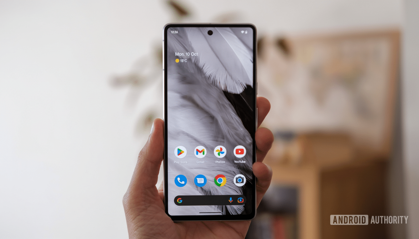
I’ve used the Pixel 10 Pro for weeks, and it gradually becomes a game of whiplash going from joy to frustration. The interface still nails grace notes of cleverness and intelligence, but it also stumbles on tiny, intransigent design decisions that make everyday tasks feel a bit more leaden than they should. It’s brilliant, but more often than not, it’s brilliant on Google’s own terms.
What the Pixel UI gets right, and why it feels so smart
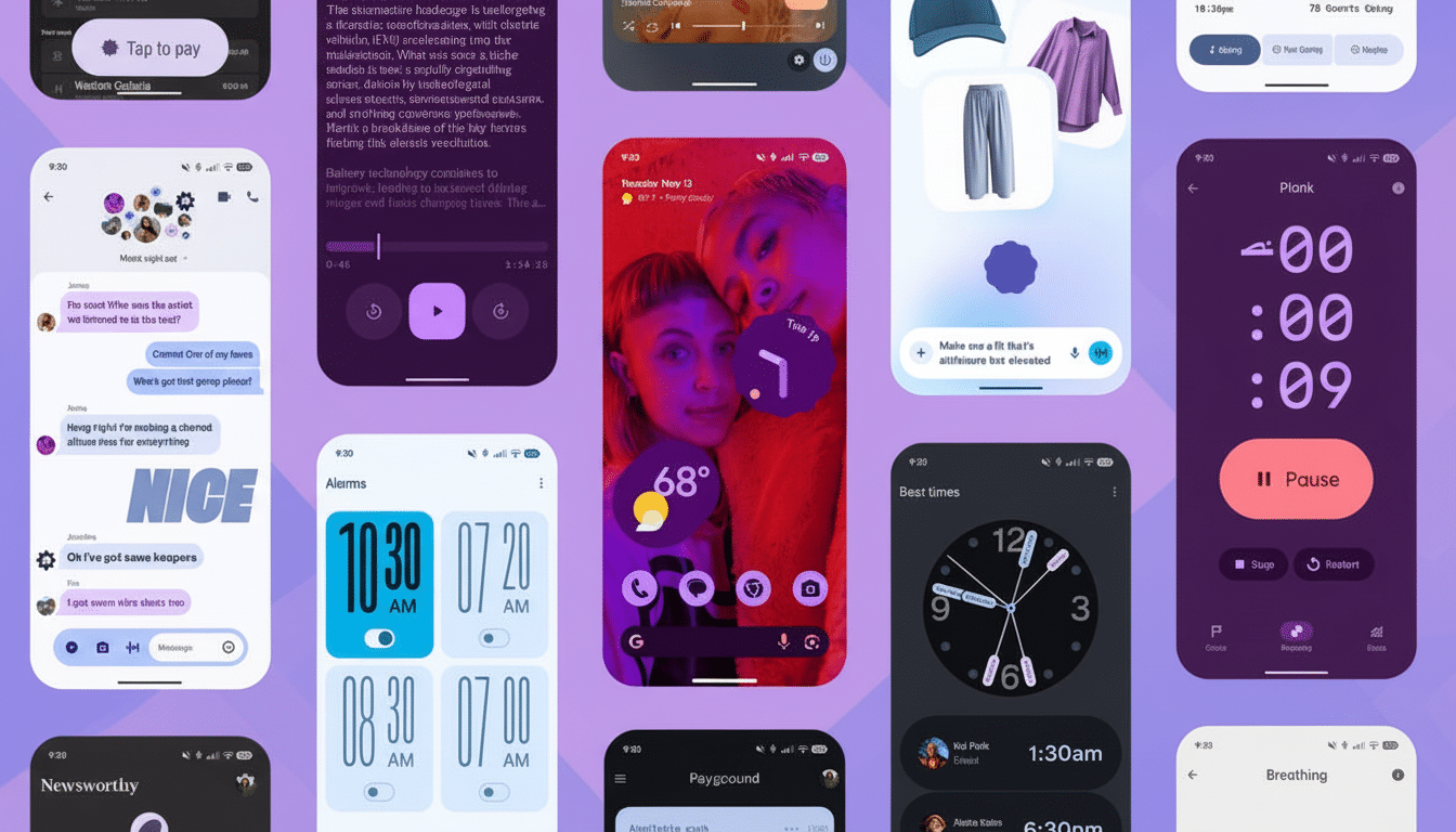
Material You has grown into something that is truly cohesive. The new Material 3 Expressive touches also finally make home screens feel cohesive, with iconography and system accents matching in a way that truly gives the phone its own personality. The animations are snappier, the transitions feel intentional and the entire system has an extra veneer of polish to it.

This is where the phone earns its “smart” designation: with contextual AI. Rather than hiding features in menus, the UI exposes these items when you need them. Chatting in a non-English language? A note to translate them comes at once. Skimming an event message? Magic Cue gets the right action up when it really counts. This is the kind of assistive behavior that removes cognitive load rather than inflating it.
The multitasking interface, for instance, is another silent victory. You can grab a screenshot or snag some text from within the app without opening it, directly from your app switcher. Copying a line from WhatsApp into a note, or snatching up a booking code from email, falls away from being a sequence of taps to just that quick glance-and-grab. It’s a tiny little workflow adjustment that pays time dividends dozens of times a day.
And yes, glanceable information is still a Pixel ace. Weather, calendar appointments and travel information appear on the lock screen with relatively little language. As the system stretches toward this “at a glance” idea, it starts to feel more like a helpful assistant than a running themed launcher.
What hurts you every day in Pixel 10 Pro’s software
Then there’s the Internet tile. Instead of letting you switch Wi‑Fi or mobile data on and off with a tap, it funnels them into the same sheet now which requires an extra step. It’s a small thing until you’re dealing with flaky network connections or shifting between Wi‑Fi and cellular for banking apps. For a long time, human-computer interaction research has taught us that more actions add friction; this is the textbook example.
The way notifications behave is another slow burn. If you don’t like heads‑up popups, you need to disable them app by app. There’s no centralized switch, and the setting is surprisingly difficult to locate through the search system. Given that the average person has dozens of apps installed, according to industry reports, this quickly becomes a task measured in minutes — not seconds. It is the kind of housekeeping a “smart” phone should save you from.
The camera introduces its own forehead-slapper: portrait mode that won’t consistently take advantage of the telephoto lens. A longer focal length also yields a more natural-looking portrait, with compression that flatters faces. The Google computational pipeline can counterfeit depth, but physics are still a thing, and you get different-looking results when you crop the main sensor versus relying on optics.

Customization lags behind the major rivals
Pixel UI is still too stiff when everyone else is flexible. Widget transparency, in fact, is restricted to some rather clunky presets where rivals let you dial in opacity exactly to match your wallpaper and theme. It’s a subtle distinction, but it can pack a hell of a punch when you’re crafting a home screen that feels like your own and not someone else’s.
Widgets themselves could do with fresh thinking. Other Android skins serve up one‑tap utilities—such as a QR scanner app, or more extensive system toggles—on the home screen itself. Pixel’s approach is cleaner, if more limited; you’ll often need an extra tap to get simple actions done.
And there’s that bottom search bar always, forever present and immobile. It’s “a signature element,” as Mr. Newton said, but a signature shouldn’t be mandatory. And for those users who carefully arrange layouts, a stubborn bar is a design tax that never expires.
Why this design tension matters for Pixel owners
They might be dwarfed in terms of shipments by heavyweight brands (IDC and Counterpoint Research both place them consistently in the low single digits across most regions), but their software direction shapes the wider Android ecosystem. And when the “reference” phone bakes in friction, that friction usually spreads.
Long support windows, fast feature drops have raised all boats in the industry and the Pixel 10 Pro carries that legacy forward with on‑device AI that feels genuinely useful. But it does so in a way that also buries basic toggles, limits how much you can customize and makes some camera choices that prioritize pipeline consistency over your preferences. The product can be a mind‑reader one moment and second-guess you the next.
None of this takes away what the phone gets right. The design is striking, its UI is cohesive, and the contextual smarts frequently save time. However, if Google could just ease up a little – forced elements be more limited, defaults smarter, a touch more user choice – the Pixel UI might move from brilliant‑but‑brittle to just brilliant.

