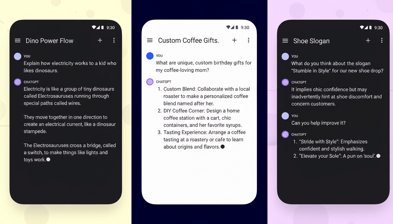
OpenAI is testing a new-look attachment menu in the ChatGPT mobile app that tidies up the screen but introduces an extra swipe to access many tools. The change, early testers say, prioritizes a few of the headline features and pushes everything else into a scrollable pane — a compromise that may bother some heavy users.
What’s Changing in the ChatGPT Attachment Menu
The new feature compiles the options to attach things into a neatly arranged, scrolling sheet that pops up on top of the message box. Popular, quick-action buttons — such as Add Photos, Web Search, and Create Image — are superimposed directly above the input field itself, creating a one-tap experience. Everything else, including file uploads and lesser-used utilities, lies in a vertically scrolling list below.

The refreshed panel takes up less space on the screen than the current full-height menu. That provides you with more of the conversation at a glance as you write — an obvious win for readability and context. But now that the list is more limited, users may have to swipe farther to get to options that used to be a single tap away.
The test has been observed in the Android app (version 1.2026.006) and appears to be enabled via a server-side flag. It is visually similar to the mobile web version of the service, which delivers those same options without the added scrolling.
Why Power Users Might Resist the New Menu Design
Power users care about speed and predictability. A swipe to access commonly used actions is an increment in interaction cost (the number of gestures one must make before the task at hand is achieved). The Nielsen Norman Group has been warning forever in usability research that hiding your controls behind scrolling or overflow menus can harm discoverability and slow experts down, even if it simplifies the surface for casual users.
Next, though: think about any of these relatively common advanced usages — uploading a set of PDFs to analyze in sequence, moving between code files and images, or rapidly toggling data sources during a research session. In these cases, a taller, tap-first menu reduces friction. A scroll-first pattern adds variance: the relative position of your options varies as your list grows, which can leave a user without consolidated muscle memory.
There is also a Fitts’s Law wrinkle. When controls are squeezed into tight clusters, tap targets tend to be closer together and therefore more prone to oversize tapping. Material Design and even Apple’s Human Interface Guidelines suggest raising your most common actions while keeping secondary tools “one gesture deep,” though the “right” set of elevated actions will differ a lot depending on who you ask for expert audiences.

A Nudge Toward Multimodal and Web Tools in ChatGPT
Web Search and Create Image as top-level buttons are no accident; they are there for a damn good reason. OpenAI has been nudging people toward native browsing and image generation, which help with engagement and also show multimodal capabilities. That is a subtle onboarding move for newcomers who are likely to ignore those parts.
Other messaging and productivity apps have gone down the same path. Telegram and Google Messages elevate camera and gallery actions, diminishing document or location sharing behind overflows. That strategy increases approachability for the average user, but veterans often request access to customization so that they can bring their favorite tools back to the top row.
Parity With the Web, But the Experience Isn’t Identical
Consistent look and feel compared to the mobile web interface minimizes cognitive switching when moving between devices. But its interaction model is a bit different: it shows more options at the same time on the web, because we have a larger canvas size and no need to scroll. On mobile chat, the collapsed panel maintains chat context, but it moves more actions below the fold.
If the new look does roll out beyond a few users, expect A/B testing to establish whether more streamlined views make it easier for some users to discover top-row features or instead prompt them to drop off. The metrics they are likely to be watching include time to first action, taps per task, and completion rates for uploads and searches.
What Power Users Want Next From the Attachment Menu
Flexibility is the simplest route to consensus. A customizable toolbar — that is, one that would let me pin to the top row my most-used actions — could maintain the clean layout while respecting power user workflows. Maybe some keyboard shortcuts, the ability to keep recent apps permanently visible, or just a swipe-up gesture that makes the panel full screen may further make up for the difference.
For now, the test build hints at a clear order of priority: keep chat within view, showcase multimodal traits, and tolerate a modest tax on navigation for everything else. Casual users may barely notice. Power users will, and they are going to demand control.

