Samsung once built One UI around a simple, brilliant idea: make huge phones usable with one hand. The One UI 8.5 beta suggests that guiding principle has faded, and the result is a scattershot experience that chips away at what made Samsung’s software distinct.
The One-Handed Promise That Set One UI Apart
When One UI arrived in 2018, it rethought Android’s ergonomics. Large headers pushed content downward, primary actions sat near your thumb, and clever “overscroll” let you tug top-of-screen items into reach. It wasn’t just a fresh coat of paint; it was a systems-level stance on usability.
That stance mattered as phones ballooned. Research from firms like IDC and Counterpoint has chronicled the march to bigger displays, with 6.5-inch-and-up devices now dominating shipments. Designers like Steven Hoober and Luke Wroblewski have long shown that the lower screen quadrants are the comfortable “thumb zone” for most people. One UI aligned with that reality in a way competitors did not.
What One UI 8.5 Changes and Why It Misses
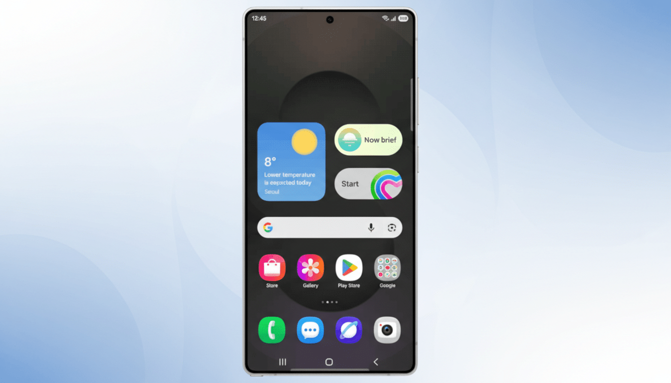
In 8.5’s beta, Samsung moves the Settings app search to a bottom bar. That’s the right idea. But the same search control remains marooned at the top in other Samsung apps like Phone, Calendar, and Gallery. It’s a small inconsistency that becomes a daily speed bump, breaking muscle memory from screen to screen.
Quick Settings tells a similar story. Samsung’s revamped panel is otherwise excellent: customizable toggles, optional vertical sliders, and a flexible layout. Yet crucial controls—Settings, Power, and Edit—stay locked at the top, a reach-stretch that undercuts the one-handed mission. Google’s Pixel builds put key buttons at the bottom edge; Samsung hands you the tools to rearrange almost everything except the pieces that matter most.
Consistency in Core Controls Is Not Cosmetic
UX fundamentals are clear here. Nielsen Norman Group has repeatedly emphasized that consistent placement of core controls improves task completion and lowers cognitive load. When a user cannot predict where search or power lives, every interaction becomes a micro-decision. Those micro-decisions add up to friction, even if each change seems minor on its own.
One UI still includes one-handed mode, but that feels like a band-aid, not a philosophy. The original insight was to make one-handed use the default state, not an optional gesture that temporarily shrinks your screen.
Rivals Are Quietly Closing the Reachability Gap
Competitors have learned from Samsung’s early lead. Pixel’s Android builds emphasize bottom affordances and predictable system buttons. Apple moved Safari’s address bar to the bottom for a reason, and many iOS apps now favor tab bars over top-heavy toolbars. Even Android skins like OxygenOS and Nothing OS have leaned into bottom navigation and unified search placement.
Meanwhile, the average Android phone is taller than ever, and foldables add their own reachability wrinkles. Counterpoint notes steady growth in large-screen segments across regions—exactly the environment where One UI’s original ergonomics should shine. Instead, 8.5’s piecemeal tweaks muddy the story.
How Samsung Can Course-Correct One UI Quickly
- Unify search. Make a bottom search/action row a system pattern across Samsung apps, with an API that third-party developers can adopt. Consistency across core apps would immediately reduce reach and retraining costs for users.
- Unlock the last mile in Quick Settings. If users can resize toggles and sliders, they should be able to pin Power, Settings, and Edit to the bottom corners. That single change would improve daily reachability more than any visual flourish.
- Codify a “reach-first” design language. Publish updated guidelines that define bottom-priority zones for primary actions, with telemetry-informed defaults. Samsung has the data—through Samsung Members and device analytics—to A/B test optimal placements and roll out ergonomic presets per device size.
- Rethink one-handed mode as a persistent aid. Instead of a temporary shrunken view, offer adaptive UIs that dynamically shift key controls downward when the system detects one-handed use, similar to reachability patterns documented by mobile UX researchers.
Why This Matters For Samsung’s Identity
Samsung is investing heavily in long-term software support and on-device AI. Those are meaningful advantages, but they’re also areas where rivals can catch up. Ergonomics is harder to copy because it is a thousand careful decisions, applied relentlessly. That was One UI’s edge.
The 8.5 beta doesn’t erase Samsung’s progress, but it does signal drift. Phones are getting larger, not smaller. If One UI stops putting reachability first—every time, in every app—it risks becoming just another skin. The fix isn’t flashy, and that’s the point. Bring the basics back within thumb’s reach, and One UI will feel special again.