Google is starting to roll out a revamped, one-handed-friendly context menu in the Messages app for beta testers, streamlining small tasks and making the interface more accessible on today’s large-screen phones. The update moves core message controls right underneath the selected bubble, minimizing the thumb-stretch that would send users to the top of their screen.
What’s Changing in Google Messages’ Context Menu
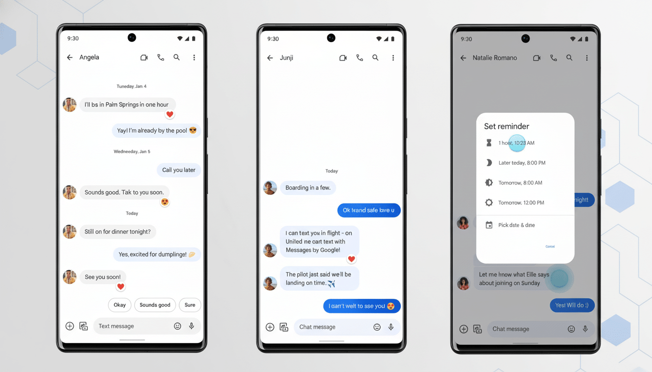
Long-pressing a message will still show emoji reactions alongside the bubble, but other actions — Reply, Forward, Copy, Delete, and Save — will now appear in a sleek toolbar just below it.

At best, options that used to be buried in the top app bar or a three-dot menu are now comfortably at hand, reducing the need to shimmy the phone around in your grip.
Several beta testers have now seen the change in recent builds, and reports are filtering out on Reddit (where else?) as well as from notable Android hounds like AssembleDebug: Those links to stuff outside the Play Store don’t work anymore. Beta testers report multi-pick still lives on in Select More, allaying confusion that bulk actions had gone missing.
Why It Matters for Reachability on Large Phones
Nowadays, high-end Android flagships typically have displays that measure anywhere between 6.5 and 6.8 inches. Counterpoint Research analysts also see big screens, with more than 70 percent of phones shipping today measuring at least 6 inches. That’s good for media types and multitaskers, but it complicates one-handed ergonomics.
UX researcher Steven Hoober has for some time been demonstrating that we are one-handed (.pdf) users of phones 49% (slide three here) of the time, and designs for thumbs – squishy or not squishy – reduce completion time and cause fewer errors. This new placement follows Luke Wroblewski’s “thumb zone” model that suggests placing most of the common actions in a spot where you can reach without actually shifting your grip.
More generally, this is in line with Material Design guidance on accessible touch targets and the industry trend towards bottom-aligned controls. Apps like Signal have shown off similar under-bubble toolbars for years; and many Android apps have been moving key actions closer to the bottom edge to reduce thumb travel.
Early Feedback and Real-World Use of the Redesign
Testers’ early takes tend to be positive. Faster access to reply and copy, fewer accidental top bar taps, a more logical flow when reacting and then replying to a message. In practice, the revised layout fixes a common source of friction: hopping among a bubble, a top toolbar and an invisible overflow for basics like delete or save.
There are still edge cases. If you intend for the reactions row above the bubble and the action bar below it, the touchable area becomes dense. But in use, testers say the spacing and iconography are clear enough to prevent mis-taps, and it feels like a win once you get used to pulling up from different points on the screen.
How to Try the New Context Menu in Messages
The rollout is currently underway via the Messages beta channel and seems to be gated by a server-side flag, so timing may be different for your account. There are ways to increase your chances of joining the beta via the Play Store and getting pushed an update to the latest build though. If you don’t see it right away, force-close the app or clear your cache, but no guarantees.
If history is any indication, the feature will make its way to the stable build once telemetry and beta feedback are favorable. There is no official timeline, but the more a beta build is visible, the closer it typically is to wide deployment.
A Small Tweak With a Large Impact on Daily Use
Messaging apps are made or broken within their context menus. Shuffling high-frequency actions closer to your thumb may not grab headlines like new chat features, but it significantly affects how people use the app every day. With the spread of big-screen phones and enduring one-handed habits, polish like this is the kind that reduces friction for millions.
If you like to hit reply quickly, copy all the time or clean up threads constantly, the new design will feel instantly familiar. And for Google, it’s a simple, user-friendly win that fits in with other ongoing UI updates to modernize Messages without introducing clutter.