Google’s Material 3 Expressive design language is now appearing in core Android apps, but a noticeable proportion of the community is registering their disapproval. While a considerable number praised the vivid, color-forward transformation, another group is increasingly agitating for the design alterations to be reversed, claiming that they made tasks slower, less dense, and, on occasion, perplexing in exchange for personality.
What Material 3 Expressive Changes Across Core Android Apps
Material 3 Expressive expands the characteristic vividness borrowed from your wallpaper, the rounded geometry, the inflated type scales, and the pill-shaped controls. It introduces more vivid, distinctive iconography through the Material Symbols and uses a gentler, more amusing color palette to create the impression of something that is “human” and adaptive.
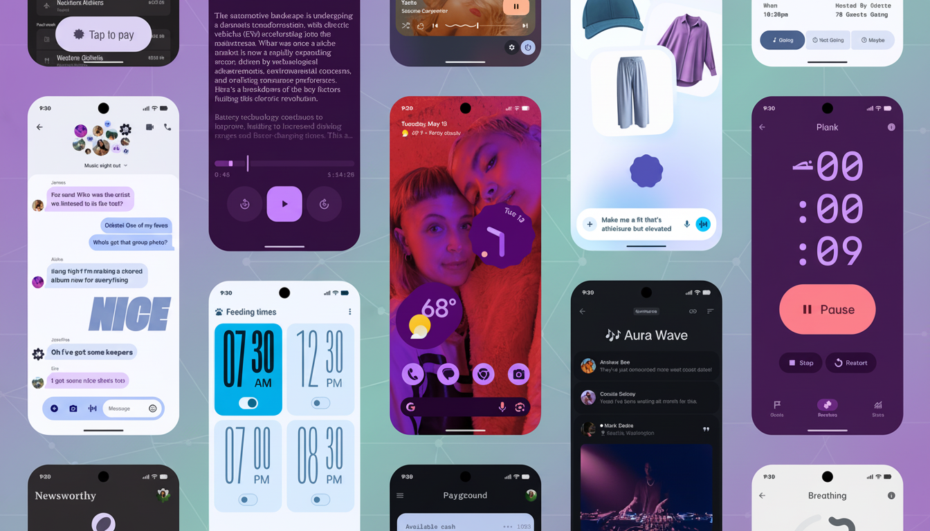
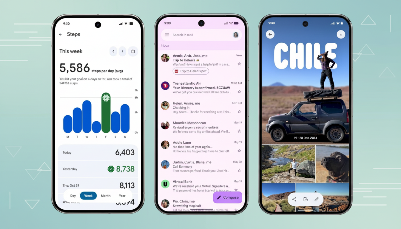
You may notice it in Gmail, Photos, Calendar, Clock, and the Phone app, with more to come as developers employ Material 3 components and tokens. Several applications were upgraded to accommodate digital-era technology, including foldables, large screens, and different DPIs — as well as permitting a design system to be more straightforward for your team. The expressiveness guideline produced by Google emphasizes accessible touch targets and a consistent master theme that follows the user, not the brand color.
Why Some Users Disapprove of Material 3 Expressive Changes
The most common grievance is about information density. Larger padding, taller list items, and oversized buttons often result in fewer emails, chats, or calendar entries displayed on the same screen. A new age of many or tall interface components implies that power users must scroll more and click more frequently to do so. In utilities like Settings, the new spacing might cause scanning to feel slower; this is especially true for users who were used to the previous locations of various functions.
Color is another sticking point. The vibrancy of the color palette can skew pastel or low-contrast, and while that’s visually coherent, it can blur the lines between what you can and can’t interact with. Nielsen Norman Group has been claiming for years that reduced contrast and ambiguous affordances add cognitive load, especially to expert users who rely on quick visual parsing. Accessibility enthusiasts also suggest that increasing or at least matching the WCAG contrast suggestions enables consumers with low vision.
Then there’s the vibe check. Some Android veterans call the appearance “childish” or “toy-like,” which is a shift from the previous Material versions’ clean, no-frills style. When the fresh paint comes with feature adjustments or deletions — like compressible densities or activity moving behind a menu — it’s much more distressing. Critics also argue that criticizing the color is simpler and that removing functionality is more of the same if it occurs in the same rebranding product suite.
The case for Material 3 Expressive is made by many designers because the new scheme is more accessible. The bigger touch buttons are more user-friendly, particularly on large gadgets and foldables, and the font is simple to read. Users’ customization of dynamic color gives people a sense of personalization, shared experiences between apps feel cohesive, and businesses don’t have to be concerned about creating individual surfaces’ themes.
There’s also a practical side to it. Material 3 gives a more comprehensive token mechanism for color, elevation, and movement. Similar to the way applications mature from wearables and cars to computers and TVs, this reduces things falling apart, making adaptations, and shortening development, from one UI to another.
Two levers would likely calm the turbulence for users
- Density controls. Gmail has long offered Default, Comfortable, and Compact views; extending similar options to more apps would let power users reclaim information density without derailing the broader aesthetic.
- Contrast and theming controls. A simple “increase contrast” or “reduce expressiveness” toggle—aligned with accessibility settings—could preserve the look while improving legibility and hierarchy for those who need it.
Per-app flexibility matters. OEM layers like Samsung’s One UI already let users pick from multiple color extractions and intensity levels. If Google’s own apps exposed comparable controls and avoided burying key actions in overflow menus, much of the backlash would likely soften.
The lesson from past Android eras is clear: choice wins. When users can tune density, contrast, and layout, new design languages face far less resistance. Material 3 Expressive isn’t a dead end; it’s a negotiation between personality and productivity. The design system advances cross-device coherence and accessibility, but its success will hinge on how gracefully it accommodates expert users. If Google pairs the aesthetic with robust customization and avoids functional regressions, the conversation could shift from “Why did you change this?” to “This finally feels like mine.”