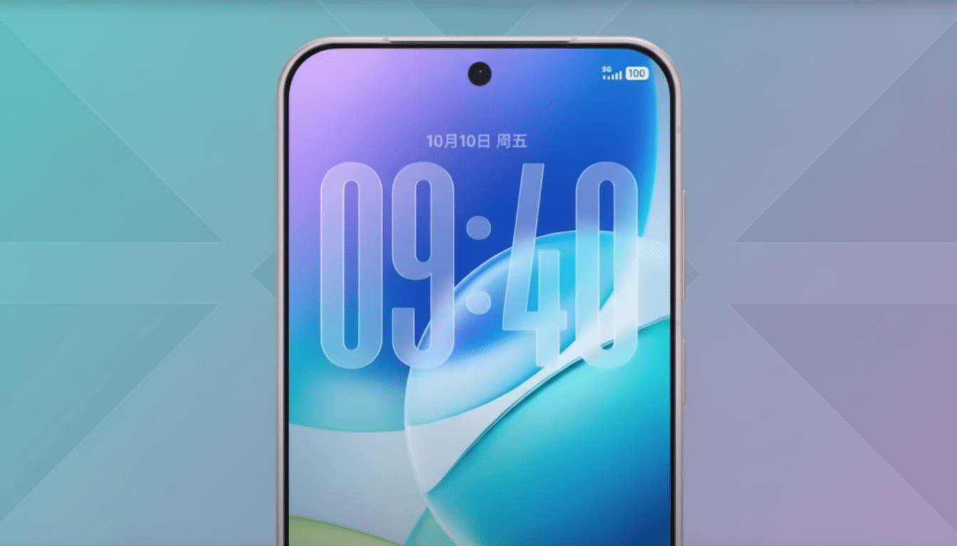
Apple’s new Liquid Glass look is hardly out of the gate, and already major apps are in a dash to match it on iPhones. And the speed of that uptake is eye-popping — and it shines a very unpleasant spotlight on an unfortunate truth: Android app design remains, all too frequently, an afterthought.
Telegram’s iOS app has new frosted, translucent elements in its tab bar featuring fun motion cues. WhatsApp has been experimenting with a more comprehensive iOS refresh in this vein, complete with translucent panels, redesigned pop-ups, and iconography tailored to Apple’s tinted palette. A few could also be working on iOS icons so they have a matching new dark and tinted arrangement ready for their Android icon if they get even the most basic theming support.
Meanwhile, on Android, lots of these same apps are still somehow avoiding the platform’s custom design language and conveniently overlooking features Google introduced years ago. Both Material You and the newer Material 3 Expressive guidance would offer a cohesive, “decidedly Android” appearance. A case in point: too many marquee titles still haven’t adopted it.
Why iOS Is the First to Get Rapid Design Changes
Developers chase users and revenue. Android dominates nearly 70% of global smartphone share, yet data.ai tells us that iOS continues to lead in worldwide consumer app spending, frequently over 60%. When the dollars are on a platform, design resources follow — quickly.
Apple enhances that incentive by creating a denser ecosystem. Exactly one line of hardware, a predictable OS adoption curve, an iron-strict set of Human Interface Guidelines, and App Store editorial visibility give an unambiguous reward for aesthetic concurrence in all cases. When Apple adopts a look like Liquid Glass, alignment is not just cosmetic — it’s marketing.
Material You Still Waiting in the Wings on Android
Google introduced Material You in 2021, with color that is dynamic and shifts to a user’s wallpaper, as well as strong motion and shape systems. But many heavyweight apps on Android still ignore dynamic color, holding onto brand greens and blues that clash with the rest of the phone.
Telegram continues to be a prime example, with aging UI patterns: dated toggles, floating action buttons that don’t adhere to modern guidelines, and attachment menus reminiscent of time capsules. WhatsApp has visible progress on the navigation and layout front, but its Android UI falls short of fully embracing the system’s expressive, system-derivative palettes and motion.
Material 3 Expressive goes even further with more vivid color, even livelier motion, and updated component behavior. It’s not a matter of painting everything pastel, but the best apps are about consistency, accessibility, and a native feel that ties apps to the phone you actually own. The pieces are there. Adoption isn’t.
The Double Standards Applied to Android Themed Icons
Icon coherence reveals the hole in the starkest terms. When Apple nudges toward flat or tinted iconography, lots of developers scramble to update iOS assets. On Android, themed icons — which have been supported since Android 13 to create a more cohesive home screen experience — are still oddly missing for scores of well-known apps.
This isn’t a technical barrier. Material libraries, design tokens, and icon packs from Google make it easy to create themed alternatives. The absent follow-through does not indicate that this is impossible; it clearly indicates which priority is null and void. Even some Android OEMs are copying Apple with their transparent panels in the skins that they produce, yet first-party app support for Android’s own system color theming is almost nonexistent.
Fragmentation Is a Thing But We Can Resolve This
Yes, Android is fragmented: different OEMs, screens, and API levels. But the tooling has matured. Jetpack Compose in combination with Material 3 components is a huge improvement when it comes to the UI variability across devices. Dynamic color can be switched off. Play Console’s quality guidelines and testing per device help you ensure your app offers the same experience on all devices.
None of this clears away the complexity, but it does make the cost of doing the right thing a whole lot less. Then, if teams can ship frosted-the-hell-out tab bars on iOS within weeks of a keynote, they can commit to backgrounds that change color, updated patterned components, and themed icons on Android within a single release cycle.
A Smarter Approach for Achieving True Android Parity
Parity is not cloning iOS onto Android. That means executing first-class design on all of those platforms. Concretely, that looks like:
- Adopting Material 3 components throughout the app
- Implementing a themeable color toggle with reasonable fallbacks
- Shipping themed icons when it makes sense
- Following platform-specific guidance on motion
- Iterating around Pixel as a baseline plus one or two major OEM skins
There’s also a business case. A smooth, native Android experience on those devices can boost satisfaction and retention, especially in regions with a preponderance of Android handsets. If Liquid Glass can spur developers to action in a few sprints, Android shouldn’t have to wait that long for the same treatment.
Liquid Glass isn’t the issue — its reflex to favor only one platform is. Android users notice when their apps are ports. The fix isn’t sexy — it’s follow-through. Just embrace the tools that Google already shipped and make Android a first-class citizen again.