Apple’s latest iOS 26.1 beta update offers a new way to live with Liquid Glass, the layer of transparency added to the interface in iOS 26. The update introduces Tinted as a storage design option alongside Clear, thereby improving readability while maintaining the layered, depth-forward look. The same toggle is making an appearance in macOS Tahoe 26.1 betas, which seems like a design parity tweak happening across all platforms.
Liquid Glass is Apple’s new material system that blurs and intersects UI surfaces with the wallpaper and app content beneath. Although visually appealing, the Clear option came under fire from users who claimed banners, widgets and notifications were made harder to read on busy backgrounds. Apple’s answer is the Tinted option: a higher-opacity treatment that maintains the look while dialing back visual noise.
Which elements are different in the Tinted mode
With Tinted activated, the base opacity of system elements is boosted slightly (allowing text and icons to sit on a more solid visual plane). Then in applications, the bleed of ambient content and edges are less visible in notification cards, Control Center modules and widget stacks. The blur would still be there, but the stuff will darken or lighten to just the right degree to keep contrast in check and not totally flatten out the boundary.
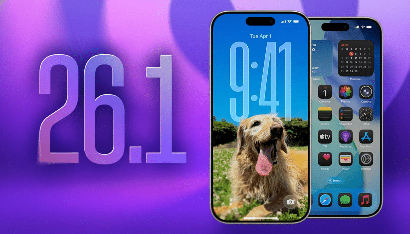
Beta testers will find the control in Settings under Display & Brightness, then Liquid Glass; Clear and Tinted are available as side-by-side options.
It’s called System Settings under Appearance on Mac. The system-wide nature of the setting means you don’t have to micro-manage per-app displays.
Why this change matters for accessibility and legibility
Translucency reduces effective contrast, particularly on complex images or gradients. That flies in the face of long-held usability advice: The Web Content Accessibility Guidelines recommend a contrast ratio of at least 4.5:1 for body text, and research from Nielsen Norman Group finds that contrast is one of the top predictors of reading convenience and task performance. By lifting the opacity, Tinted mode helps surfaces clear those thresholds more regularly in real-world use.
The stakes aren’t theoretical. The W.H.O. estimates some 2.2 billion people have vision impairment of some kind and about 8 percent of men and half a percent of women have color-vision deficiency, according to Prevent Blindness. Through comments to TechCrunch, Apple has confirmed that feedback from beta testers prompted the company to incorporate a bit more flexibility directly into Liquid Glass. Previously, if you would seek relief from it, then that would be by going into Accessibility and Reduce Transparency and a wallpaper of careful selection to simulate a tint; now there’s a first-party dumb switch with reliable results.
Availability and rollout for iOS 26 and macOS Tahoe
The Tinted feature is available now to developer and public beta users of iOS 26.1 and macOS Tahoe 26.1. It hasn’t been added to the general release, but settings picked in the beta should come with it when the update does ship. Supposing you aren’t interested in getting directly to the rendering hardware, Apple still doesn’t provide any option to disable Liquid Glass or revert back to a pre-26 material system, so my feeling is that Tinted contains the officially sanctioned fallback for those who prefer it less about pure translucency than clarity.
Testers who come across unreadable text in certain apps are encouraged to report it via Feedback Assistant. Wallpapers, app color schemes and ambient light are all different factors, and capturing edge cases now helps Apple and third-party developers tune their defaults before public release.
App development and design impact of Tinted mode
For developers, the switch is mainly additive. Apps that depend upon SwiftUI’s Material, or UIKit’s UIVisualEffectView, will be getting this new tint behavior automatically, but teams will still need to verify contrast in light and dark mode, inspect Dynamic Type sizes, and test out custom blur stacks. Media-intensive screens — maps, camera previews, video, album art all qualify — are prime candidates for verification because they take what would normally be background complexity and make it the foreground.
The things that follow Apple’s Human Interface Guidelines should also have new examples updated to feature the Tinted alternative. (Practical takeaway: keep transparent materials to decorative surfaces and prioritize solid or largely see-through materials where text, controls, or data density are critical.) That advice reduces the number of per-screen exceptions, and keeps UI behavior consistent between iPhone, iPad, and Mac.
The bottom line on Apple’s Tinted Liquid Glass update
Apple’s Tinted Liquid Glass doesn’t reverse the design direction of iOS 26; it refines it. By providing users with an explicit, system-level means of amping up legibility, the company walks a line between visual panache and day-to-day utility. Unsurprisingly, early tests find notifications over bright, detail-heavy wallpapers (such as the butterfly one below)—a common user pain point—are much easier to parse out. For most users, that one change is enough to ensure the new look feels less like a statement and more like a comforting default.