Google is preparing a Google Wallet refresh that elevates your starred passes while pushing everything else behind an extra screen. It’s a tidy idea on paper, but it also means accessing less-used tickets, loyalty cards, and transit passes will take more taps than before.
What Changes On The Google Wallet Home Screen
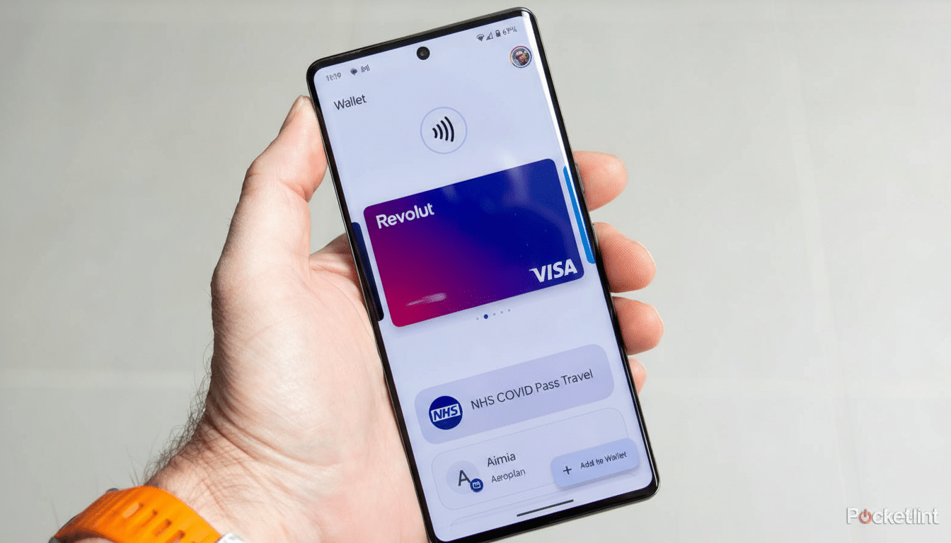
In the upcoming version of Google Wallet, the home view centers on favorites. You’ll be able to star passes, and those starred items appear prominently the next time you open the app. Payment methods and quick-use cards still sit up front, but the broader library is moving out of sight.
A new View More button on the home screen no longer opens your full collection immediately. Instead, it leads to a management landing page with a search bar and settings. From there, a second View More Passes button finally reveals your complete list. In short, it becomes a two-step journey to reach everything you’ve saved.
The star icon is your gatekeeper. Starred items populate the home screen; unstarred items require the extra trip through the management page. For anyone who stores dozens of loyalty cards or multiple transit passes, what used to be a single swipe could now be a small detour.
Why The Extra Step For Passes In Wallet Matters
When you’re boarding a flight or rushing through a turnstile, seconds count. Moving rarely used passes into a secondary view reduces home screen clutter, but it also introduces friction. Usability researchers at organizations like Nielsen Norman Group have long noted that each additional step can slow task completion and increase error rates, especially under time pressure.
Imagine carrying a mix of airline, event, and parking passes. If your boarding pass isn’t starred in advance, you’ll tap View More, land on a management screen, then tap again to see all passes and scroll to find the right one. It’s manageable at a desk, less ideal at a gate when you’re juggling bags and a passport. The new search bar will help in a pinch, but it doesn’t replace instant access.
New Tools To Keep Google Wallet Passes Organized
To balance the added step, Google is bundling better organization controls. You’ll be able to reorder passes and choose which ones appear on the home screen via a Manage Passes On Home section. There’s also a sorting option in the full list, letting you arrange items alphabetically or by recently opened. Archived passes get their own section at the bottom, reducing noise in the main view.
For power users, that matters. Wallet has grown well beyond payments, with support for transit cards, event tickets, vaccination records, digital car keys, and, in select regions, government IDs. The ability to curate a “fast lane” of essentials should make Wallet feel quicker day-to-day—provided you take a few minutes to star and reorder your top items.
How Google Wallet’s Approach Stacks Up To Rivals
Apple Wallet and Samsung Wallet both lean on a single, scrollable stack where your most recent or relevant pass floats to the top. Google’s new approach is more opinionated: personalization through starring, with a clear separation between favorites and everything else. It’s a pragmatic way to tame large collections, though the extra navigation hop is the trade-off.
From a design perspective, this aligns with Material You’s emphasis on clarity and customization. It puts intent front and center—what you star becomes your Wallet. It also sets Google up to surface contextually relevant passes more reliably, such as a transit card during your commute or a gym membership when you’re nearby.
Version Clues And Google Wallet Rollout Expectations
The changes have been spotted in an upcoming build of Google Wallet, version 26.5.862583415, suggesting a staged rollout tied to a server-side switch. Google frequently A/B tests design tweaks before a wider release, so availability may vary by region and device.
If you rely on Wallet for travel or daily transit, now is a good time to audit your library. Star your most critical passes, drag them into your preferred order, and familiarize yourself with the new View More flow. That prep will make the transition smoother when the redesign hits your phone.
The bottom line is clear: Google is streamlining the front door of Wallet around favorites, trading immediate breadth for curated speed. For many, that will feel faster. For others, it introduces an extra step at precisely the moments when speed matters most. Thoughtful setup will determine which side of that trade-off you land on.