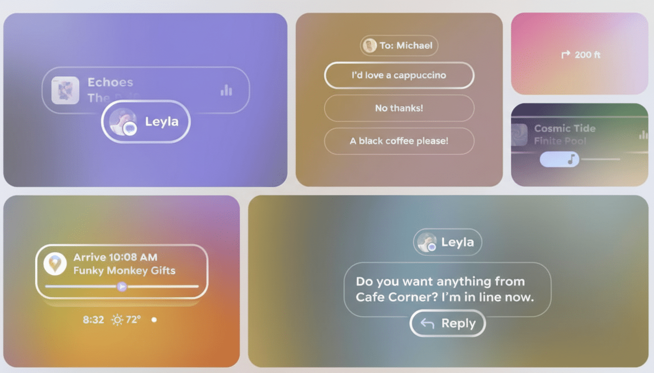
Google has pulled back the curtain on Glimmer, a new design language tailored for Android XR glasses with transparent displays. The system prioritizes legibility, subtlety, and spatial awareness, setting a clear direction for how interfaces should look and behave when they live on lenses instead of phone screens.
What Glimmer Brings to Android XR Interfaces
Glimmer arrives as a library of Jetpack Compose components and patterns built specifically for see-through optics. Rather than porting Material Design from phones, Google is defining a UI that treats the lens as a window into the world, not a canvas to be painted opaque.

A core principle is placing the interface “at arm’s length.” Elements are rendered to appear roughly a meter in front of the user, a distance that balances readability with comfort and helps reduce accommodation changes as eyes shift between real and virtual content. This matches long-standing AR usability research that favors mid-range focal planes for lower visual fatigue.
Glimmer also leans on gentle depth cues. Shadows, soft outlines, and scale changes communicate hierarchy and proximity, helping users understand what’s near, actionable, or simply informational—without cluttering the view.
A Neutral UI for the Real World and Bright Light
In bright environments, see-through displays must fight halation, where intense background light washes into darker UI elements. Google’s answer is a “neutral” look: primarily light text and controls supported by subtle, adjustable shadows. The approach creates local contrast without dropping opaque panels over your field of view.
That choice isn’t cosmetic. Outdoor illuminance can exceed 100,000 lux under midday sun, making standard dark-on-light treatments unreliable. Traditional contrast targets from web guidelines like WCAG assume a controlled background; XR doesn’t have that luxury. Glimmer’s shadow-backed light elements are designed to preserve legibility as surroundings change moment to moment.
Typography gets similar attention. A thicker, rounder cut of Google Sans improves stroke visibility against busy scenes, while variable sizing helps signal depth and importance. Notifications rely on soft fade-ins and fade-outs to mitigate motion blur during head movement, inviting attention rather than yanking it—an important safety consideration when users are walking or navigating.
How It Differs from visionOS in UI and Philosophy
Apple’s visionOS leans into frosted glass, rich color, and high-contrast surfaces that feel like floating windows. Glimmer takes the opposite tack: lightweight, minimally tinted UI that avoids blocking passive vision. Where visionOS clarifies with opacity, Glimmer clarifies with focus, distance, and shadow—subtle techniques that keep the world visible while making text and controls pop just enough.

This divergence reflects platform bets. If XR glasses are worn in public and on the move, the interface must disappear until needed, cooperate with shifting light, and respect peripheral awareness. Glimmer is engineered to be present but not imposing.
Implications for Developers Building Android XR Apps
For app makers, Glimmer is more than a visual refresh. It implies new layout logic, interaction pacing, and semantic use of space. Variable-strength shadows act like “spatial elevation,” suggesting what’s closer to the user and therefore more urgent. Larger tap targets balance precision with head or gaze input. Text styles aren’t just typographic choices; they communicate distance and function.
Google is providing Compose components and reference guidance, along with Figma resources to prototype quickly. Expect patterns for common use cases such as turn-by-turn overlays that hug the horizon line, translation captions that sit comfortably near a speaker’s face without occluding it, and lightweight controls that remain readable without tinting the world.
Performance and comfort are baked into the guidance. Subtle animations, restrained color, and consistent focal depth can reduce cognitive load and eye strain. Small choices—like easing notification ramps or avoiding aggressive parallax—matter when your UI shares space with the street, a crosswalk, or a conversation.
Why This Matters for Android XR and Transparent Glasses
As Google and partners like Samsung prepare XR hardware with transparent lenses, a coherent design language is essential to avoid a flood of mismatched, hard-to-read interfaces. Consistency accelerates developer onboarding and helps users build trust in on-eye software, a prerequisite for everyday wear.
Glimmer signals a strategic commitment: Android XR will not simply miniaturize phone apps. It will favor spatially aware utilities, glanceable information, and interfaces that yield to the world. With toolkits in Compose and clear UX principles, developers now have a map for building apps that feel native on glasses rather than ported from rectangles.
Look for Google to expand on Glimmer’s components, interaction models, and accessibility guidance at upcoming developer events. If the execution matches the vision, Android XR could gain a UI identity that’s both distinctive and pragmatic—exactly what transparent displays need to thrive outside the lab.

