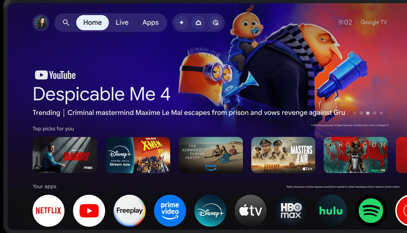
Google TV is testing out a refreshed home screen that streamlines navigation into condensed, pill-shaped categories and pushes more prominent actions closer to the top. It’s worth pointing out, however, that the redesign (as spotted by 9to5Google) is being tested as a server-side change on Google TV Home version 1.0.806977084, so this could be more of an experiment than a wide-ranging rollout right now.
What’s changing on Google TV home screen
The change you’ll most notice is at the top: two gumball-like navigation clusters now sit above the rows of content, replacing tabs that were spread out. The first group contains Home, Live and Apps, along with a search shortcut. A small in-UI note mentions “For You” has been renamed to “Home,” with Search now residing in this quick-access glob.
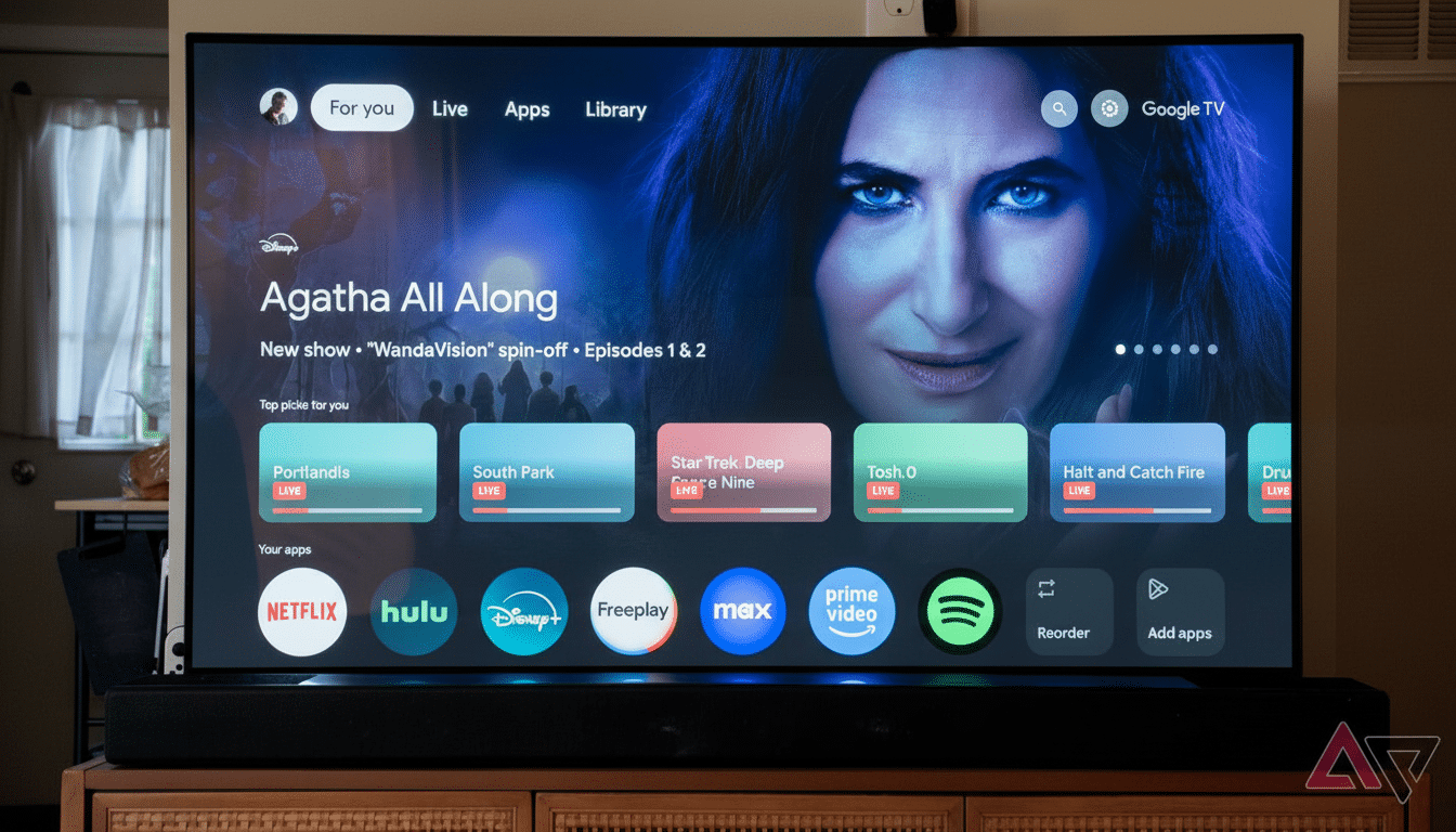
The second cluster groups system-level actions including settings and the screensaver. It’s a small but nice change—common controls no longer have you jumping out of the content feed or digging through deep menus. The layout looks more contemporary, and for TV remotes with directional pads, the reduction in lateral clicks should mean quicker navigation.
A quicker route through profiles and preferences
Google is also redesigning the profile experience. Selecting the profile icon to the left now opens a menu that includes a profile switcher and direct shortcuts for Watchlist, Library, Your services and Content preferences. The latter two were already buried within Settings, so this tweak brings audience tuning and provider management down to a single click — an unsurprising, household-friendly quality-of-life upgrade for the growing legion of audiences juggling multiple users and subscription bundles.
Currently, surfacing Watchlist and Library takes a cue from how people use TV interfaces, jumping between unfinished shows, rentals, and owned content. By bringing those destinations closer to the home screen, Google hopes that it will reduce friction for its users — particularly, I would think, those who graze rather than browse.
Why do we care about this UI refresh so much at the moment?
Google TV is in a crowded living room. But in the U.S., platform share is overwhelmingly tilted toward Roku and Amazon; Roku regularly reports over 80 million active accounts; Amazon said it has sold over 200 million Fire TV devices globally. Google, for its part, has stressed momentum in the larger Android TV OS ecosystem, including 150 million monthly active devices spanning TVs and operator set-tops globally. In the U.S. in particular, Google TV’s footprint has remained relatively small.
This context is important, since the home screen is the money page. It determines how fast viewers find something to watch, how often they come back, and which services get consideration. Advertisers have also embraced video on large screens, and within Google’s own ecosystem, YouTube holds a dominant position. A cleaner, more efficient home screen is table stakes for engagement and, ultimately, revenue.
Preliminary signs indicate a phased rollout
At present, only a limited subset of devices seems to be receiving the redesign, suggesting it’s being put through an A/B test. Given this is a server-side change, most users won’t need to take matters into their own hands — these new layouts can appear on compatible builds without pushing out a full firmware. That said, it can never hurt to stay up to date with your Google TV Home app, and features may be added at different times depending on where you live, which device you own, and who made the device. Look for a staggered adoption across both Chromecast with Google TV and partner brands like Sony, TCL and Hisense.
Subtle design changes with big potential impact
This isn’t a complete reboot — more like style evolution than revolution. That said, shrinking the size of navigation bubbles and adding a more intelligent profile dropdown would shave significant time off getting to content. It’s about more than just recent cosmetic tweaks (like the transition from square to circular icons), though, pointing toward a wider attempt at unified visual language and smoother remote-first ergonomics.
Two things to watch: whether Live gets deeper integration with free, ad-supported channels, and how search continues to progress. If Google can strengthen the bridge between universal search, personalized recommendations and profile-level content controls, its discovery engine might seem more deliberate — especially for multistreaming households bouncing around streaming services and FAST lineups.
Bottom line: a small, focused redesign with real benefits
This tested redesign is small and thoughtful, tackling gripes shared by all types of users without changing the interface in frightening ways. If the test is successful and expands widely, users of Google TV ostensibly will gain quicker access to what’s important — content, preferences and controls — directly from the top of the screen. It’s a timely and pragmatic move in a market where seconds to stream can dictate which platform users reach for first.