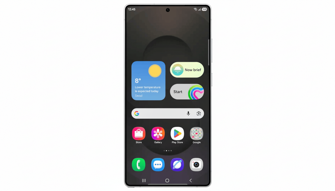
Quick Settings gets a notable redesign in Samsung’s latest One UI 8.5 beta for the Galaxy S25 series, with iOS-style vertical sliders and more fine-grained layout controls that make switching necessary options front and center. It’s an incremental change with huge implications for usability, especially when you’re dealing with big-screen handsets and more advanced users who have a preference for the way they need the panel to conform with their daily routine.
What’s New in One UI 8.5 Quick Settings Layout
The headline change is flexibility. It is now possible to break out brightness and volume sliders into separate controls (rather than having them combined together in one module). Every slider is resizable on its own too, and, more importantly, can be changed to a vertical view much like the sliders in Apple’s Control Center. Which way feels better? “[That orientation] is more natural to have finer control and reach around the display on taller devices.”
And Samsung changed the organization of toggles. Unlike collapsible-paneled companions, toggle widgets need not live exclusively within those containers and may be pocketed when added to stay organized. The category view is similar to the way iOS organizes controls, but it doesn’t crib wholesale from that and instead strikes a balance between comfort and flexibility, which is what Android excels at. By comparison to One UI 7 and early releases of One UI 8 that largely only allowed the ability to change the order, it feels like quite the leap in control.
What’s at Stake in the Quick Settings Design Overhaul
Ergonomics is governing a lot of these decisions. With taller, narrow screens, horizontal sliders are an inconvenience to hit and modulate with a thumb. Sliders also can be aligned vertically for the same natural thumb placement, and positioned near the edges of the screen so you can control with one hand. Vertical controls, too, remain consistent on devices that often switch between portrait/landscape swapping (think DeX or in-car mounts), again minimizing the mental overhead.
More than ergonomics though, the panel’s new modularity allows for task-based arrangements.
Next to a screen recorder and Do Not Disturb, a creator might dock a vertical brightness slider. Next to Mobile Hotspot, Quick Share and an NFC toggle could fit for the traveler. Those micro-optimizations shave seconds off mundane tasks that users do dozens or even hundreds of times per day.

How to Test the New Controls in One UI 8.5 Beta
Owners of the Galaxy S25 series in the One UI 8.5 beta program can access the features on their devices as of now through Samsung Members. And as always with prerelease software, expect the occasional glitch and consider backing up before you opt in. After installing, go to Quick Settings in the device settings and press the edit or layout button, then add and remove toggles using the customization screen. You can split brightness and volume, resize each control, and flip the orientation with a single tap.
Where it’s useful
- A set of tall connectivity toggles
- A separate volume slider for media control (without taking up extra space)
- A long brightness widget on the display edge you’re most likely to be able to reach that makes up for the interactions lost in Edge Panel
Practical starting points
- Keep your required connectivity toggles together
- Move sliders one above the other
- Tuck regularly unused items (like Nearby Share or Ultra-wideband) into a secondary screen
iOS Inspiration Without Having to Lose Android Identity
The similarities to Apple’s Control Center, of course, are obvious enough, but Samsung’s interpretation is thoroughly Android. You’re still getting deep control placement, size, grouping, and layout, and it dovetails with wider One UI elements like Routines, Material You theming, and per-mode layouts. The beta also introduces a few quality-of-life features—the adaptive lock screen clock and Storage Share—while one of the more highly anticipated Bixby upgrades related to generative assistance remains missing in action.
Even small interface tweaks can pack a big punch, given the scope of Samsung’s reach. IDC frequently reports Samsung as being at the top or very near the top in global smartphone shipments, with StatCounter showing Android holding around a 70% share of the worldwide market compared to about 30% for iOS. When UI/UX concepts are utilized from one ecosystem to another, success standards become industry-wide.
What to Watch Next as One UI 8.5 Nears Release
Animations, spacing, and default layouts will be polished by Samsung ahead of the stable release. The company will probably expand the feature to tablets and foldables, where vertical sliders and organized toggles could offer even greater improvements. Developers might also find ways to more intelligently surface app-specific toggles, relying on the widget categories. The S25 beta is a smarter, more flexible Quick Settings interface that feels familiar without feeling derivative—and it’s a solid step in the right direction for an Android control panel that makes ergonomic sense.