In a refreshingly candid act, Amazon has updated the FAQs on its Kindle Colorsoft page to tell us something that many veteran e-reader enthusiasts had long assumed: While Kindles with black-and-white screens are better for reading crisp text.
The message is not coy: Colorsoft reigns when it comes to color content, but monochrome models like Paperwhite and Scribe feature sharper type.
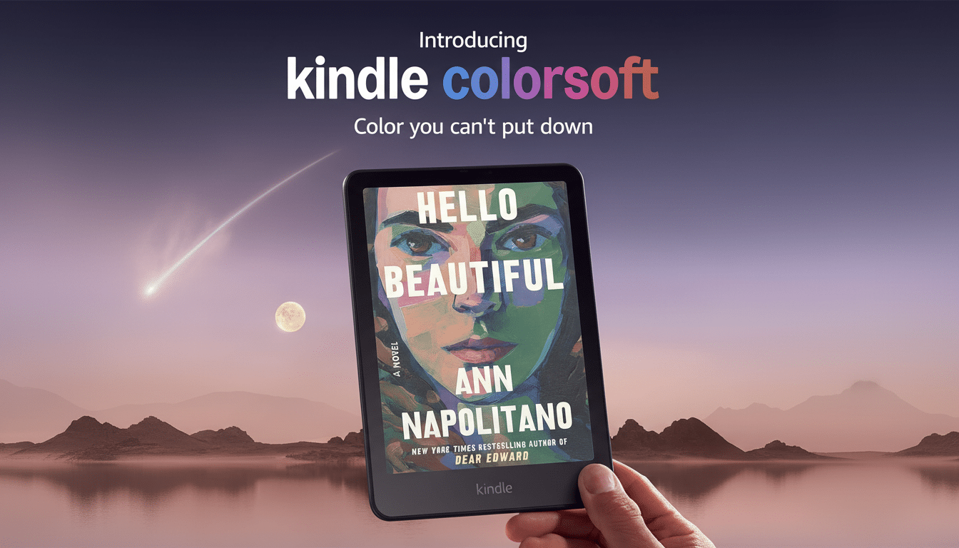
Amazon Levels With Bookworms on Kindle Colorsoft FAQs
As spotted by Good e-Reader, the new Kindle Scribe Colorsoft and its lower-capacity counterpart both have near-identical guidance added to their respective FAQ pages.
The color layer that makes illustrations pop also tweaks screen texture and lowers effective luminance, therefore softening the presentation of black-and-white text, the company explains. It is a rare instance of a manufacturer pushing some buyers to the older, arguably better fit for straightforward reading.
Why Color E Ink Can Appear Softer Than Grayscale Text
Kindle Colorsoft devices use E Ink’s Kaleido 3 tech, which positions a color filter array in front of a 300 ppi monochrome panel. Under color, the actual resolution for colored materials is 150 ppi, although it does have an extra layer that adds a little bit of fuzziness and contrast. E Ink Holdings touts Kaleido 3’s increased saturation and support for 4,096 colors, but even with those enhancements, the optical path can’t compete with the raw clarity of an unadorned grayscale display in that same lighting.
The difference is easy to see in long-form text. On a Paperwhite or Scribe with 300 ppi, small serif outlines have no fuzz (the hairlines and counters are clean). Front-lighting goes right at the pigment particles. On a Colorsoft screen, the same letters roll through the filter layer; edges can look a little fuzzier and the page plane is sometimes less organic-looking, especially at smaller font sizes.
Who Ought to Pick Which Kindle for Different Reading
If the majority of your time is spent with novels, nonfiction and articles, there’s no better option than a monochrome Kindle. The Paperwhite’s 300 ppi panel and uniform front light are made for marathon sessions with minimal eye strain, and the larger Scribe adds pen-friendly note-taking without sacrificing text sharpness.
Colorsoft, on the other hand, excels with content that works well with color cues. Consider comics and manga with spot color, magazine layouts, children’s picture books, study PDFs with charts and highlighting, and handwritten notes where ink colors are relevant. You get the usual E Ink benefits — battery life measured in weeks, low glare and readability in daylight — applied to a color space dominated for years now by LCDs, with only a well-meaning yet inferior take on monochrome type.
Rivals Are Bound by the Same Physics of Color E Ink
Amazon isn’t the only one making these trade-offs. Kobo and Onyx Boox are also putting out color e-readers based on Kaleido 3, and independent reviewers have consistently pointed out the contrast gap with grayscale panels. Here the messaging is what’s different. Though many brands would rather trumpet their color abilities without making a fuss over text clarity, Amazon’s advice hits differently — less of an encouragement to spend now than a nudge to pick up whatever model best suits your reading habits, even if that means ignoring the latest tech.
This is a candor that’s much more in line with how display experts speak of reflective color. It is nothing but nonsense when researchers and product designers repeatedly claim that a CFA does lower reflectance, thereby requiring increased front-light power to obtain the same perceived brightness. That extra light can help to counteract the softness, but doesn’t completely deliver the sharp, ink-on-paper reading experience of a monochrome E Ink stack.
Bottom Line for Page Turners Choosing a Kindle Today
Color E Ink has finally grown up as a practical option for readers who switch between comics, PDFs and notes, and Kindle Colorsoft is the most credible manifestation of that maturation. But if your evening routine involves text-heavy chapters on small fonts, you’re still getting a screen in the 300 ppi Paperwhite and monochrome Scribe that’s second to none when it comes to legibility and comfort. Even Amazon’s own FAQs come to that conclusion now — a rare acknowledgment that the best Kindle will depend on what, exactly, you read.
For buyers, the choice is easy. Let your library lead: from rich color images to basic text, or whatever you read most. Either way, knowing the display science behind the decision can make it a little easier to get the screen that will be right for both your eyes and your books.