I’ve spent months using divided notifications on my Android phone, and the friction has never gone away. The concept felt neat on paper: a single swipe for notifications, another for Quick Settings. When I’m in a hurry, however, it slows me down, throws unnecessary swiping into the mix, and erodes more of the flexibility that was part of what made Android different.
What Split Notifications Really Change for Users
The old Android used to combine notifications and Quick Settings into a single shade. Many companies have started splitting them into two panels that are activated by dragging down from either side of the status bar. Swipe from the left for notifications, swipe from the right for controls, then sweep horizontally back and forth to switch between them.
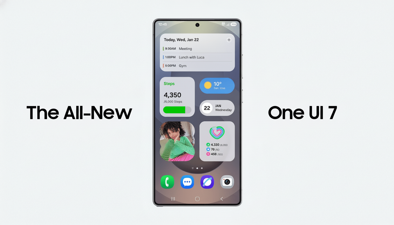
And this iOS-like approach to Control Center has been around for quite some time on MIUI but now manifests as Xiaomi’s HyperOS. It’s the same with Honor’s MagicOS. In contrast, Samsung gives you a mix in One UI: You can access Quick Settings from the top-right, but the panel is unified if opened anywhere else. OnePlus provides toggles. Google has also played around with bigger, more differentiated Quick Settings stacks in more recent Android builds, suggesting broader platform-level changes could be on the way.
The thing isn’t the idea, it’s the absence of a universal off button. You can select a combined panel in certain skins. Others don’t. If your device locks you into the split, you’re training your thumbs and your brain around a layout you may never like.
Why the Split Layout Slows You Down in Daily Use
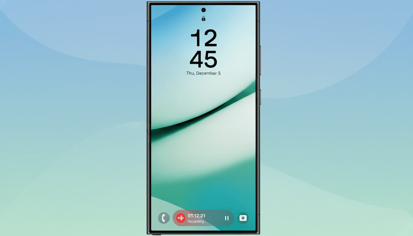
On large phones, reachability matters. Decades of ergonomics research, from Steven Hoober’s thumb-zone studies to findings that most input methods are designed for right-handed people, show that right-handed people often hold a screen device in the left hand—and then operate it with their dominant hand. About 90% of the population is right-handed, so a swipe from the right-hand side will work well for most users. If the “right” side actually opens Quick Settings but what you meant to check was a message, well, congratulations: You’ve just tacked on another swipe and a mental beat of friction.
Friction is compounded because specifics vary by skin. Some of them display the clock and date only in the notification tray, but keep it hidden from the control panel. Others fence power or settings shortcuts into the control center. Small as they are, these inconsistencies demand context shifts — look here for time, swipe there for Wi‑Fi, then back for the message — which is exactly the kind of micro‑interruption that usability experts at Nielsen Norman Group warn that it raises cognitive load.
Over the course of days and weeks, that cost adds up. Muscle memory is good for the left/right swipe dance that turns off alarms, but it does not eliminate the reach problem or its extra steps. The bigger our displays, the more any extra gesture becomes a tax on one-handed use.
Not Against Choice But Against Losing It
Some users really do want a split. If you’re only trying to toggle a setting, it’s nice not to have notifications fighting for your attention. That’s valid. The issue arises when manufacturers take the decision to merge panels out of buyers’ hands and treat a style choice as an edict.
Accessibility standards promulgated by organizations like the W3C’s Web Accessibility Initiative focus on minimizing interaction cost and providing workarounds. Android’s Material Design officially encourages consistency and predictable results as its own middle name. For those with ADHD, or chronic pain, or motor impairments, fewer gestures and fewer mode switches aren’t just “nice to have” — they’re the difference between a tool and an impediment.
How OEMs Can Implement Splits Well for Everyone
- Bring back a basic toggle: grouped shade or individual panels.
- Let users customize which side takes what, with corner-only gestures for Quick Settings.
- Copy the basics — time/date, battery percentage, and power icon with gear — on both panes so you don’t have to bounce between them.
Manufacturers could also add a persistent “switch pane” tile, or make it so a short swipe would take you to notifications and a long swipe to controls (similar to customizable gestures already present in many launchers).
The one-handed modes could also electromechanically drive the shade to favor the thumb-reachable region. This doesn’t involve ripping out the split; it just acknowledges that people use their phones in different ways.
The Bottom Line on Split Notifications and Choice
Split notifications offer order, but often supply only friction. When I’m in a rush, the extra swipes, the stretch, and the irregularities make me more paranoid than any combined shade has ever made me. Android gained loyalty by allowing users to personalize their experience. If you like, keep the split — but make it a decision with an alternative, not an edict.