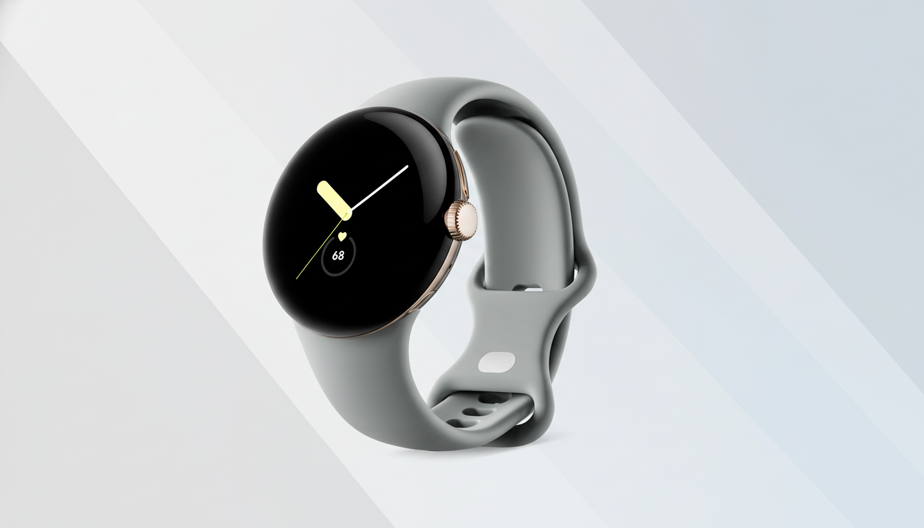
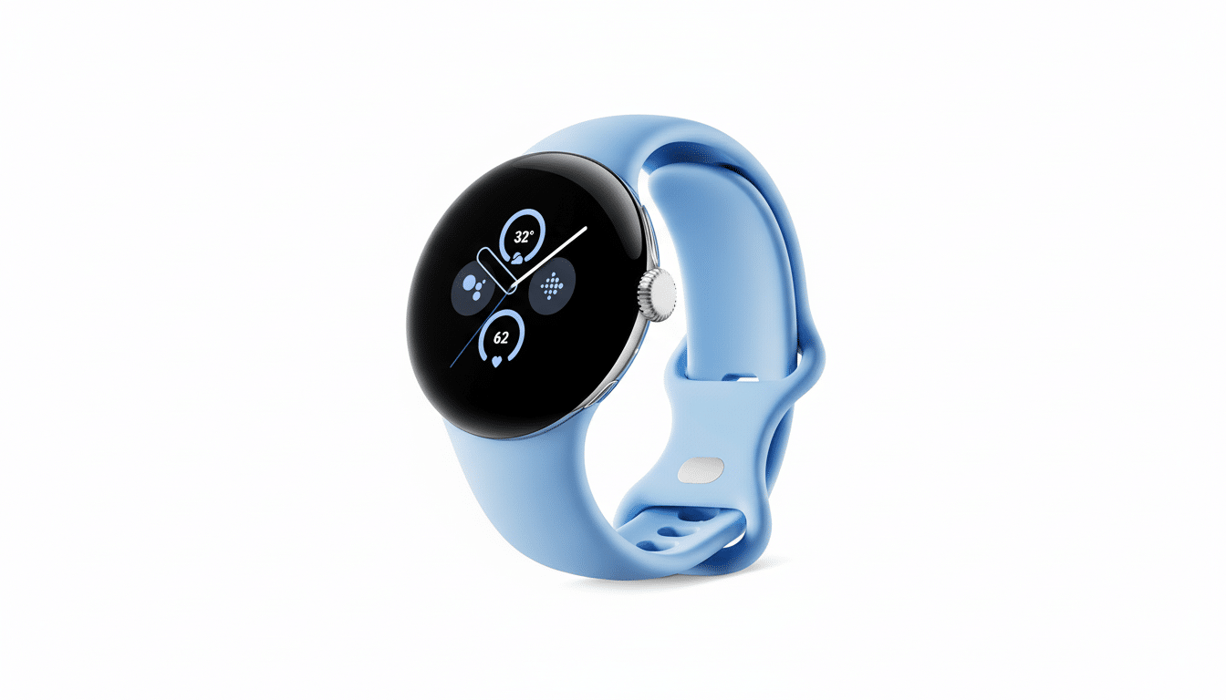
As a new community poll would have it, design fatigue isn’t really an issue for most Pixel Watch owners. Even after four design generations that are strikingly similar to its original aesthetic, respondents overwhelmingly say Google’s minimalist, domed look continues to click.
The Poll’s Key Takeaways From 1,935 Respondents
Of a total 1,935 responses, about 975 voters, or some 50 percent of them — don’t want a second look because they love the current design. Another 614 voters, or 31 percent, prefer the current style but would be open to Google testing an alternative. Only 349 voters, or 18 percent, said they are unhappy with the appearance of the lineup.

Put another way, over 80 percent are satisfied with the design in some form. That’s a good endorsement for Google to continue with the round case, domed glass, and clean lines generation after generation.
Why the Pixel Watch’s minimalist design still works today
Its design is immediately familiar: a stumpy, round body with a rounded dome and conservative lugs that break away to make way for a bespoke band system. The result is a watch that can transition from gym-ready to dressy with the change of a strap — a factor many owners point to as an asset.
Consistency also builds equity. Designers of products and architectural structures are generally interested in a stable design language that can convey brand image or product familiarity. It seems like that’s what is taking place here; the Pixel Watch’s shape is now just a part of who and what it is, in the way the Apple Watch has its rectangular face or Garmin its tough/trainer aesthetic.
What Pixel Watch fans want in a secondary design option
Among those open to a second choice, the asks were of the practical and not visionary variety. A “pro” or “ultra” version was much requested — a longer case, larger battery, and hardier materials such as titanium or stainless steel. Requests for a slightly raised bezel or flatter crystal to minimize edge impacts were routine, as were demands for heartier finishes for outdoor use.
There’s also interest in a more affordable build, so a design featuring polycarbonate or aluminum is on the table to hit different price points. Crucially, even these suggestions don’t reject the brand’s core look; they extend it. Picture that same familiar dome and crown, but retooled for different priorities like staying power, affordability, or battery life.

How rival smartwatch makers frame the design decision
Competitors have already divided their rosters along persona lines. Samsung has its contemporary and Classic looks, Apple pairs its mainstream Watch with an Ultra for those who like bulk, battery life, or durability. Garmin slants toward a more outdoor-forward design across several tiers. This approach gives shoppers a choice without watering down brand DNA.
Market watchers such as Counterpoint Research and IDC have emphasized design recognizability as a major purchase motivator in the smartwatch space, particularly at the top of the market. An alternate look can bring in sidecar segments, but too much change risks sacrificing the visual signature that also forms a large part of its wallop.
What this means for the Pixel Watch design roadmap
These results imply that Google is fine to iterate rather than overhaul. And tweaks — slimmer bezels, stronger glass, enhanced comfort, and battery efficiency — will probably be enough to satisfy most of the hands that already crave this watch.
Simultaneously, a second option could satisfy the 31 percent who want something new and maybe even convert some of the 18 percent who reject the status quo.
A Pro-style version with a bigger case, larger cell, and tougher materials would ape successful moves by rivals while also retaining the Pixel Watch’s iconic dome and circular face.
The takeaway is pretty simple, in case you didn’t get the point: fans do not tire of the Pixel Watch design. They’re embracing it — with a formal invitation for Google to grow the family mindfully, rather than jettisoning what unarguably works.

